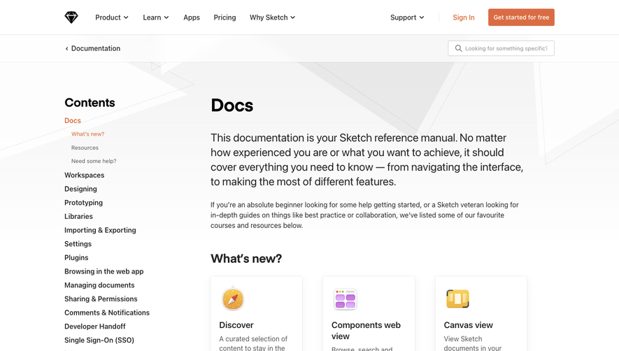
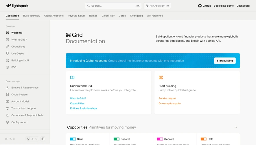
Generate a new design based on this screen using your own content.
Thank you! Your submission has been received!
Oops! Something went wrong while submitting the form.
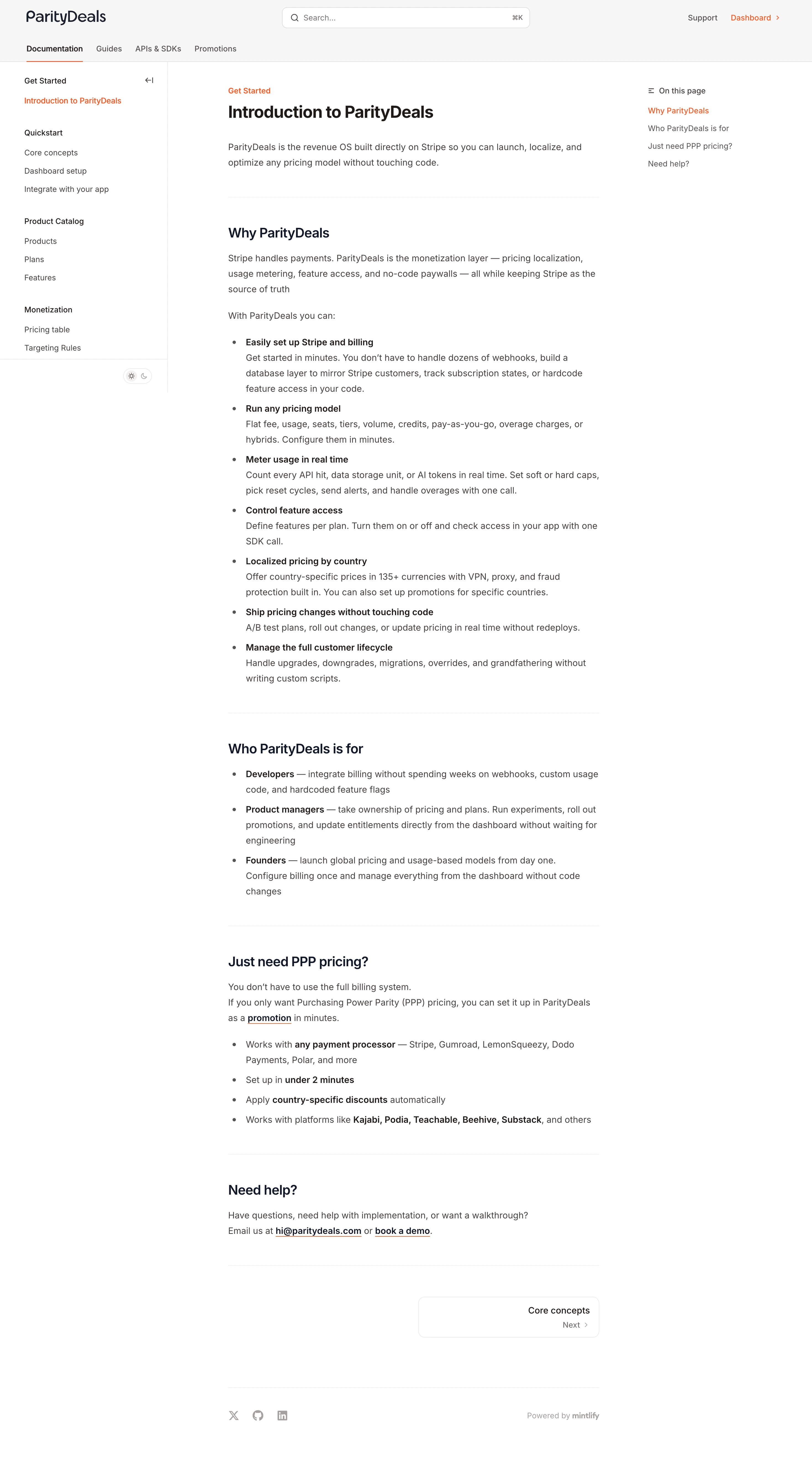
# Design from Reference: ParityDeals Documentation
Create an original, high-fidelity visual design inspired by the reference. Prioritize composition, typography, colors, spacing, and component styling over technical implementation.
## Reference
- **Product:** ParityDeals
- **Category:** Documentation
- **Screenshot:** https://cdn.prod.website-files.com/5e9dc792e1210c5325f7ebbc/6acad3a0c2028efdec71af26_6acad14811963fdadfb4c70b_cms-1b7e7cbbe9316eec16e4d439.webp
Analyze the screenshot first. If inaccessible, request it rather than guessing.
## Content
{{content.instructions}}
{{content.data}}
Preserve essential messaging and factual accuracy. Adapt structure and copy length for visual balance; never invent product claims.
## Visual Design
Use this context to reproduce the reference's visual language: layout, typography, colors, spacing, borders, radii, and distinctive elements. The screenshot takes priority if descriptions conflict.
## Direction
{{preferences.fidelityInstructions}}
## Output
{{output.instructions}}
Deliver a polished, cohesive design with precise alignment, hierarchy, and spacing. Produce the requested visual artifact, not just a description. If unsupported, explain the limitation.
ParityDeals nails the developer documentation look here. The page opens with a clear headline and a one-liner that tells you exactly what the product does. No fluff. The left sidebar keeps navigation tight with logical groupings like Product Catalog, Monetization, and Quickstart. On the right, a sticky "On this page" menu lets you jump between sections fast.
Typography doing the heavy lifting
The type hierarchy is really well handled. Bold section headers in dark charcoal, body text in a readable gray, and inline bold keywords that pull your eye to things like "any payment processor" and "under 2 minutes." It's scannable without feeling like a wall of bullet points. The orange accent color is used sparingly for links and the top nav highlight, which keeps things focused.
What stands out
The content structure is the real star. Each feature gets a bolded label followed by a short explanation. It reads like a pitch doc disguised as documentation. That "Just need PPP pricing?" section near the bottom is a smart move, catching visitors who don't need the full platform.