
Thank you! Your submission has been received!
Oops! Something went wrong while submitting the form.
Get SaaSFrame Pro
Monthly
$18
Quarterly
$48
Yearly
$180
Upgrade to access this feature
Browse all screens & flows
Filter and search screens & flows
Access Figma files
Access mobile versions
Bookmark screens & flows
Join now
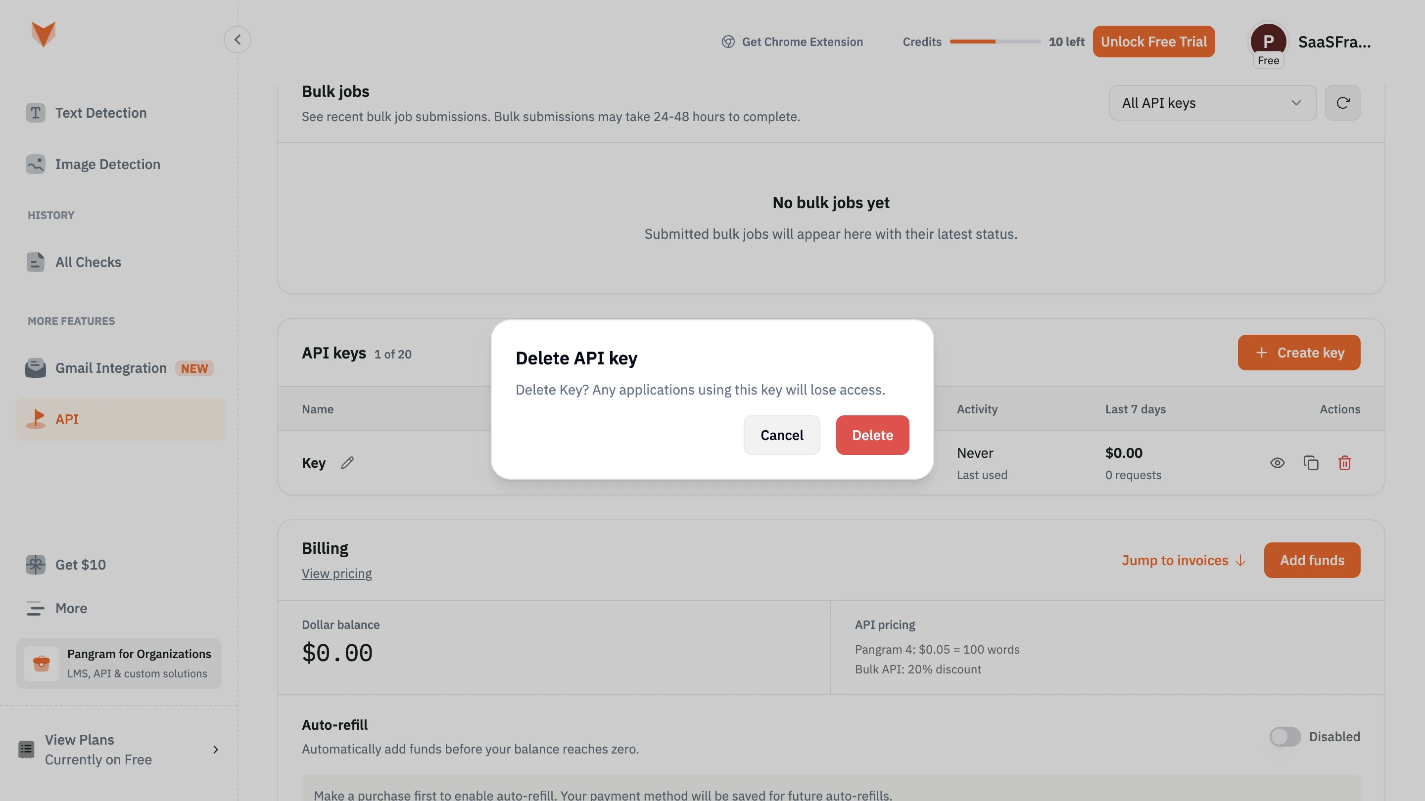
Pangram Delete API key

Pangram
AI detection for text and images.
Designed by
No items found.

Bookmark
Bookmark

Design with AI
Thank you! Your submission has been received!
Oops! Something went wrong while submitting the form.
# Design from Reference: Pangram Delete API key
Create an original, high-fidelity visual design inspired by the reference. Prioritize composition, typography, colors, spacing, and component styling over technical implementation.
## Reference
- **Product:** Pangram
- **Category:** Delete
- **Screenshot:** https://cdn.prod.website-files.com/5e9dc792e1210c5325f7ebbc/6aca2619a3a034e38b3ee667_6aca22ee391fed6b9e14e804_cms-2fdf79790dd8ea99ea966770.webp
Analyze the screenshot first. If inaccessible, request it rather than guessing.
## Content
{{content.instructions}}
{{content.data}}
Preserve essential messaging and factual accuracy. Adapt structure and copy length for visual balance; never invent product claims.
## Visual Design
### Overall aesthetic
- **Style:** Clean, light SaaS dashboard for API management.
- **Visual character:** Compact sans-serif typography, rounded cards, thin borders, generous spacing, and orange product accents.
- **Primary focus:** White deletion-confirmation modal above a dimmed dashboard.
- **Destructive emphasis:** Saturated red confirmation button.
### Page composition
- **Screenshot size:** 2880 × 1620 image px.
- **Navigation rail:** Approximately 480 image px wide.
- **Main content:** Cards extend approximately from x=560 to x=2800 image px, with roughly 80 image px of horizontal clearance.
- **Card order:** Bulk jobs, API keys, then Billing.
- **Modal position:** Centered in the full viewport, approximately x=990–1890 and y=646–971 image px.
- **Modal size:** Approximately 900 × 325 image px; about 450 × 163 CSS px if the screenshot was captured at 2×.
- **Modal padding:** Approximately 48 image px / 24 CSS px at assumed 2×.
- **Modal corner radius:** Approximately 40 image px / 20 CSS px at assumed 2×.
- **Card corner radius:** Approximately 28–32 image px / 14–16 CSS px at assumed 2×.
- **Vertical card spacing:** Approximately 48 image px / 24 CSS px at assumed 2×.
### Information hierarchy
- **First level:** Bold, near-black “Delete API key” title.
- **Second level:** Muted blue-gray warning explaining that applications using the key will lose access.
- **Third level:** Right-aligned Cancel and Delete buttons.
- **Context:** API-key management and billing remain visible behind the overlay.
- **Attention:** The bright modal and red Delete button create the strongest contrast.
### Typography
- **Font style:** Compact, humanist-looking sans serif. Exact font family is unverified.
- **Modal title:** Approximately 36 image px nominal size / 18 CSS px at assumed 2×; estimated weight 700; suggested line-height 24 CSS px; color #020817.
- **Warning text:** Approximately 28 image px nominal size / 14 CSS px at assumed 2×; estimated weight 400; suggested line-height 20 CSS px; color #64758B.
- **Button labels:** Approximately 28 image px / 14 CSS px at assumed 2×; estimated weight 600; suggested line-height 20 CSS px.
- **Card headings:** Approximately 32 image px / 16 CSS px at assumed 2×; estimated weight 600–700.
- **Secondary labels and navigation:** Approximately 24–28 image px / 12–14 CSS px at assumed 2×.
- **Sidebar section labels:** Smaller, bold, uppercase text.
- **Billing balance:** Numerals with a monospaced appearance, approximately 48 image px / 24 CSS px at assumed 2×.
- **Alignment:** Modal title and warning are left-aligned; action group is right-aligned.
- **Precision:** Font sizes, weights, line-heights, and the 2× scale are reconstruction estimates rather than verified source CSS.
### Colors & surfaces
- **Modal background:** #FFFFFF.
- **Title and Cancel text:** #020817.
- **Warning text:** #64758B.
- **Modal outline and Cancel border:** #E2E8F0.
- **Cancel background:** #F2F2F2.
- **Delete background:** #EF4444.
- **Delete text:** Approximately #F8FAFC.
- **Border thickness:** Approximately 2 image px / 1 CSS px at assumed 2×.
- **Modal shadow:** Soft gray shadow, most visible below the dialog; exact blur and opacity are unverified.
- **Dimmed background surface:** Observed as #CCCCCC.
- **Dimmed orange accents:** Observed as #CD4E09.
- **Dimmed active-navigation background:** Observed as #CCC6BD.
- **Overlay guidance:** Black at approximately 20% opacity over white would produce #CCCCCC; this is a reconstruction hypothesis.
- **Color precision:** Hex values are sRGB samples after conversion from the screenshot’s embedded display profile. Background samples include the overlay and should not be used as undimmed brand tokens.
### Components
- **Dialog:** Rounded white rectangle with a subtle border and shadow; no visible close X, illustration, warning icon, or input.
- **Cancel button:** Approximately 155 × 80 image px / 78 × 40 CSS px at assumed 2×; pale gray fill, cool-gray border, dark label.
- **Delete button:** Approximately 148 × 80 image px / 74 × 40 CSS px at assumed 2×; red fill and near-white label.
- **Button radius:** Approximately 16 image px / 8 CSS px at assumed 2×.
- **Button gap:** Approximately 32 image px / 16 CSS px at assumed 2×.
- **Action placement:** Approximately 48 image px / 24 CSS px from the dialog’s right and bottom edges.
- **Sidebar:** Icon-and-label navigation, orange-tinted active API item, badges, and plan promotions.
- **Header:** Extension link, credits meter, trial CTA, and user profile.
- **Dashboard controls:** Dropdown filter, refresh button, orange CTAs, API-key table, outlined view/copy/delete icons, billing summary, and disabled toggle.
### Visual rhythm
- **Text inset:** Approximately 48 image px / 24 CSS px from the modal’s left edge.
- **Title placement:** Visible glyphs begin approximately 56–60 image px below the top edge; glyph bounds differ from line-box bounds.
- **Reading sequence:** Title, warning, then actions.
- **Spacing grid:** A 4/8 CSS-px grid is a suitable reconstruction starting point.
- **Key spacing:** Approximately 24 CSS-px modal padding, 16 CSS-px action gap, and 40 CSS-px button height at assumed 2×.
- **Consistency:** Shared card edges, repeated corner radii, and fine dividers.
- **Density:** Spacious dialog and cards, with denser horizontal structure in the API-key table.
### Responsive
- **Observed version:** Desktop only; mobile behavior is unverified.
- **Suggested modal width:** min(450px, calc(100vw - 32px)), based on the assumed 2× reconstruction.
- **Suggested padding:** Approximately 24 CSS px, reduced to 20 CSS px if needed.
- **Text wrapping:** Allow the warning to wrap naturally while retaining approximately 14px text with 20px line-height.
- **Actions:** Keep touch targets approximately 40–44 CSS px tall; stack buttons if space becomes constrained.
- **Dashboard:** Use collapsible navigation and adapt or horizontally scroll the table.
- **Status:** These are adaptation recommendations, not observed mobile behavior.
### Adaptation guidance
- **Content structure:** Explicit object-specific title, concrete consequence, then Cancel and destructive confirmation.
- **Typography:** Preserve the contrast between a bold title and quieter explanatory copy.
- **Palette:** Reuse the directly sampled modal colors; reserve #EF4444 for destructive actions.
- **Starting dimensions:** Approximately 450 CSS-px maximum width, 24px padding, 20px outer radius, 8px button radius, and 16px action gap under the assumed 2× scale.
- **Content flexibility:** Adjust modal height to the warning length and allow text wrapping.
- **Product accents:** Obtain the original undimmed orange from source styles or an unobscured reference.
- **Fidelity:** Treat dimensions and typography as reconstruction estimates; do not claim an exact font identity or source implementation.
Use this context to reproduce the reference's visual language: layout, typography, colors, spacing, borders, radii, and distinctive elements. The screenshot takes priority if descriptions conflict.
## Direction
{{preferences.fidelityInstructions}}
## Output
{{output.instructions}}
Deliver a polished, cohesive design with precise alignment, hierarchy, and spacing. Produce the requested visual artifact, not just a description. If unsupported, explain the limitation.


Category
Tech Stack
No items found.
Added on
October 9, 2026
Similar screens







Upgrade to SaaSFrame Pro now to see similar examples.
Monthly
$18 /month
Billed $18 monthly
Browse all screens & flows
Filter and search screens & flows
Search text in screenshots
Access Figma files
Access mobile versions
Join now
Quarterly
$16 /month
Billed $48 quarterly
Browse all screens & flows
Filter and search screens & flows
Search text in screenshots
Access Figma files
Access mobile versions
Join now
Yearly
$15 /month
Billed $180 yearly
Browse all screens & flows
Filter and search screens & flows
Search text in screenshots
Access Figma files
Access mobile versions
Join now