Design with AI
Generate a new design based on this screen using your own content.
# Design from Reference: Superlist Delete Account Confirmation
Create an original, high-fidelity visual design inspired by the reference. Prioritize composition, typography, colors, spacing, and component styling over technical implementation.
## Reference
- **Product:** Superlist
- **Category:** Delete
- **Screenshot:** https://cdn.prod.website-files.com/5e9dc792e1210c5325f7ebbc/6acad51b5a5fdf4c30310dae_6acad43f3003494aa6949550_cms-35e54c4d2c2e39cc27db1064.webp
Analyze the screenshot first. If inaccessible, request it rather than guessing.
## Content
{{content.instructions}}
{{content.data}}
Preserve essential messaging and factual accuracy. Adapt structure and copy length for visual balance; never invent product claims.
## Visual Design
### Overall aesthetic
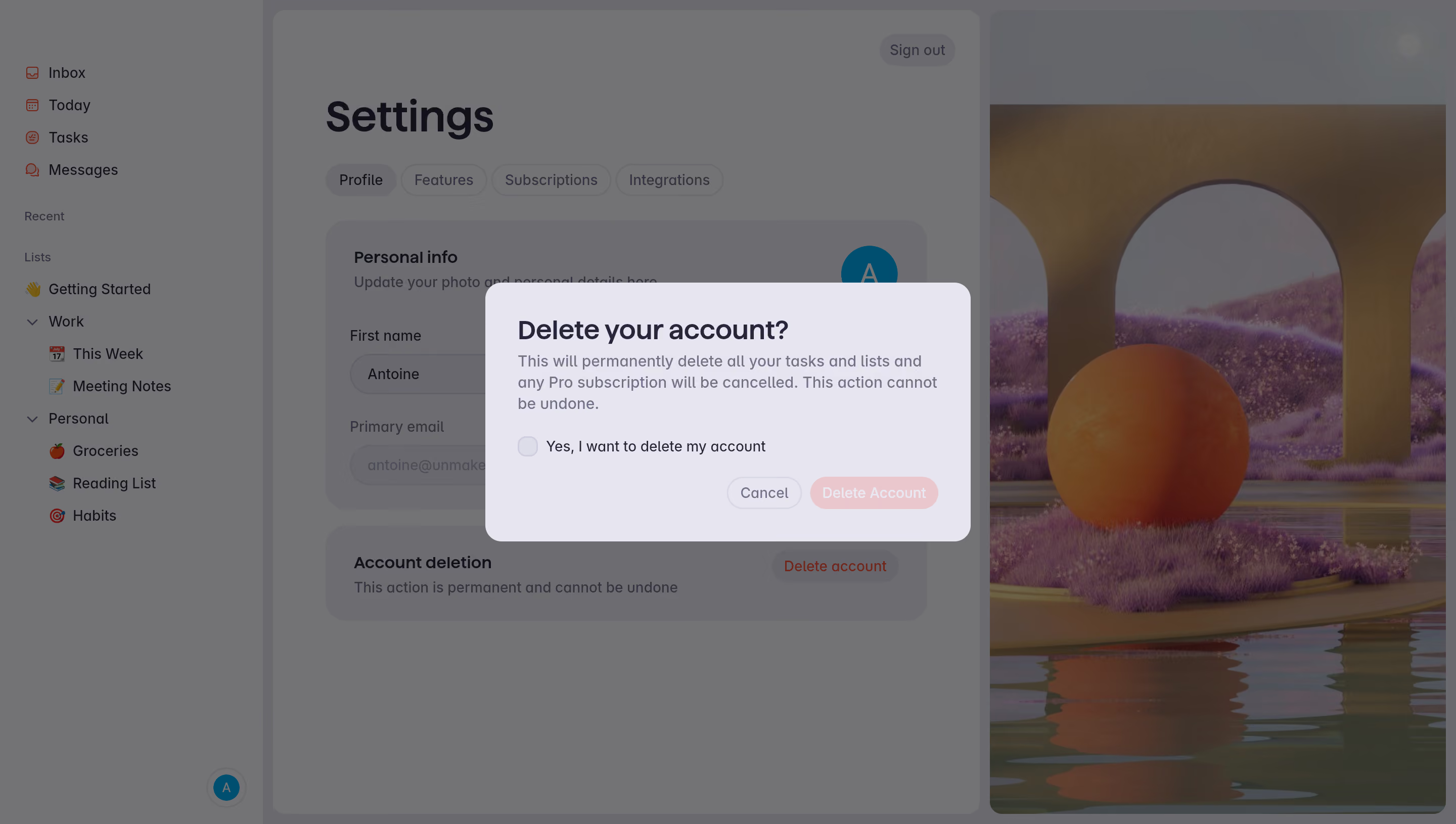
- **Character:** A pale lavender confirmation dialog overlays a dimmed task-management settings page with a colorful decorative scene at the right.
- **Tone:** Rounded panels, soft pill controls and muted violet-gray text create a gentle interface, while the warning copy and pink action identify a destructive confirmation state.
### Page composition
- **Capture scale:** The source measures 2880 × 1630 image pixels. CSS estimates below assume a 2× capture; device-pixel ratio is unverified.
- **Background shell:** A left list/navigation sidebar sits beside a central settings panel and a tall decorative artwork panel.
- **Settings context:** A large heading, four tabs, personal-information card and account-deletion card remain visible beneath the overlay.
- **Dialog:** A roughly 480 × 255 px CSS rounded rectangle is centered horizontally, with title, warning paragraph, unchecked acknowledgement and right-aligned actions.
### Information hierarchy
- **Confirmation title:** A bold question is the strongest modal text.
- **Warning:** A three-line paragraph explains the displayed consequences, using muted text but close proximity to the title.
- **Acknowledgement:** An unchecked box precedes a clear statement of intent.
- **Actions:** Cancel is outlined; Delete Account has a pale pink fill. Its subdued appearance is visible, but functional disabled behavior is unverified.
### Typography
- **Family:** A rounded-looking sans serif is visible; exact identity is unverified.
- **Dialog title:** Approximately 26 px CSS, semibold, with 32 px leading.
- **Body:** Approximately 16 px with 22 px line height.
- **Checkbox/actions:** Approximately 14 px, with medium weight for controls.
- **Background:** The Settings heading is much larger and bold, while tabs and field labels use compact body sizes.
### Colors & surfaces
- **Measured modal:** ICC-aware sRGB sampling yields pale lavender #E7E6F1.
- **Measured overlay:** Dimmed gray #737374 dominates the background, with related #6D6D70/#6A6A6E.
- **Measured text:** Dark #11111C appears in prominent interface text.
- **Action palette:** Pale pink marks the destructive control; lavender-gray outlines support checkbox and Cancel.
- **Artwork:** Muted orange, purple and blue-gray remain visible in the dimmed arch/sphere landscape.
### Components
- **Dialog shell:** A softly rounded panel has approximately 16 px CSS corners and generous 32 px padding.
- **Acknowledgement:** A small rounded-square checkbox aligns beside one line of text.
- **Action pills:** Two compact rounded controls align at the lower right with a narrow gap.
- **Background tabs:** Four pill-like tabs sit beneath the settings title, with Profile visibly selected.
- **Decorative panel:** A tall rounded artwork area shows an orange sphere, large arches, purple terrain and reflective water.
### Visual rhythm
- **Compact modal flow:** Title and warning are tightly grouped; a larger pause separates them from acknowledgement and actions.
- **Alignment:** Modal title, paragraph and checkbox share a stable left edge.
- **Layer focus:** The bright lavender dialog contrasts with the uniformly dimmed application.
- **Background balance:** The central form and right artwork provide different visual densities beneath the overlay.
### Responsive
- **Evidence boundary:** Only a desktop state is shown; responsive behaviors are recommendations.
- **Dialog width:** Use a fluid max-width confirmation with safe mobile gutters.
- **Copy wrapping:** Allow warning and acknowledgement text to wrap without squeezing the checkbox.
- **Action access:** Keep cancellation and confirmation clearly separated and comfortably tappable.
### Adaptation guidance
- **Confirmation pattern:** Reuse explicit consequences, an acknowledgement control and distinct cancellation/confirmation actions.
- **Accessible modal:** Manage focus and associate the checkbox with its full label.
- **State boundaries:** The capture shows an unchecked pre-confirmation state; no account deletion was performed or verified.
- **Data handling:** Keep personal profile details as replaceable application data.
- **Scale calibration:** Validate the assumed 2× scale before implementing dimensions.
Use this context to reproduce the reference's visual language: layout, typography, colors, spacing, borders, radii, and distinctive elements. The screenshot takes priority if descriptions conflict.
## Direction
{{preferences.fidelityInstructions}}
## Output
{{output.instructions}}
Deliver a polished, cohesive design with precise alignment, hierarchy, and spacing. Produce the requested visual artifact, not just a description. If unsupported, explain the limitation.