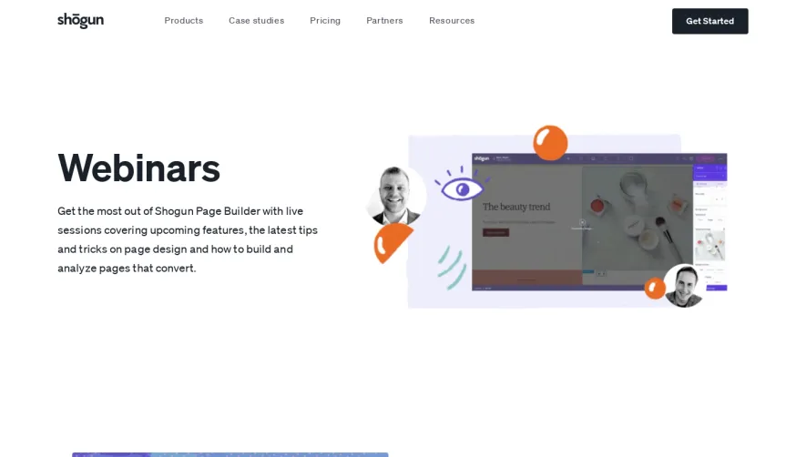
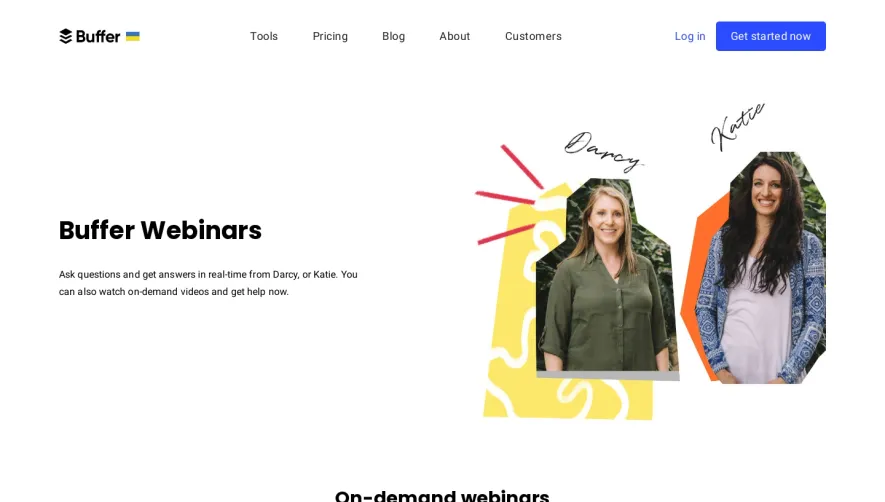
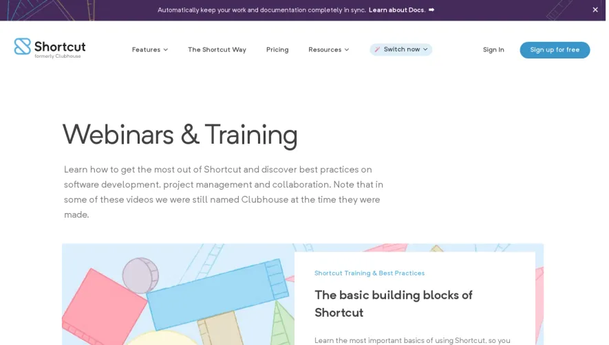
Generate a new design based on this screen using your own content.
Thank you! Your submission has been received!
Oops! Something went wrong while submitting the form.
# Design from Reference: Paddle Webinars Page
Create an original, high-fidelity visual design inspired by the reference. Prioritize composition, typography, colors, spacing, and component styling over technical implementation.
## Reference
- **Product:** Paddle
- **Category:** Webinars Page
- **Screenshot:** https://cdn.prod.website-files.com/5e9dc792e1210c5325f7ebbc/6acad3b5c2028efdec71b15a_6acad172c5142fbf8922d7af_cms-0e43d439ee52ad392a1aa7dc.webp
Analyze the screenshot first. If inaccessible, request it rather than guessing.
## Content
{{content.instructions}}
{{content.data}}
Preserve essential messaging and factual accuracy. Adapt structure and copy length for visual balance; never invent product claims.
## Visual Design
Use this context to reproduce the reference's visual language: layout, typography, colors, spacing, borders, radii, and distinctive elements. The screenshot takes priority if descriptions conflict.
## Direction
{{preferences.fidelityInstructions}}
## Output
{{output.instructions}}
Deliver a polished, cohesive design with precise alignment, hierarchy, and spacing. Produce the requested visual artifact, not just a description. If unsupported, explain the limitation.
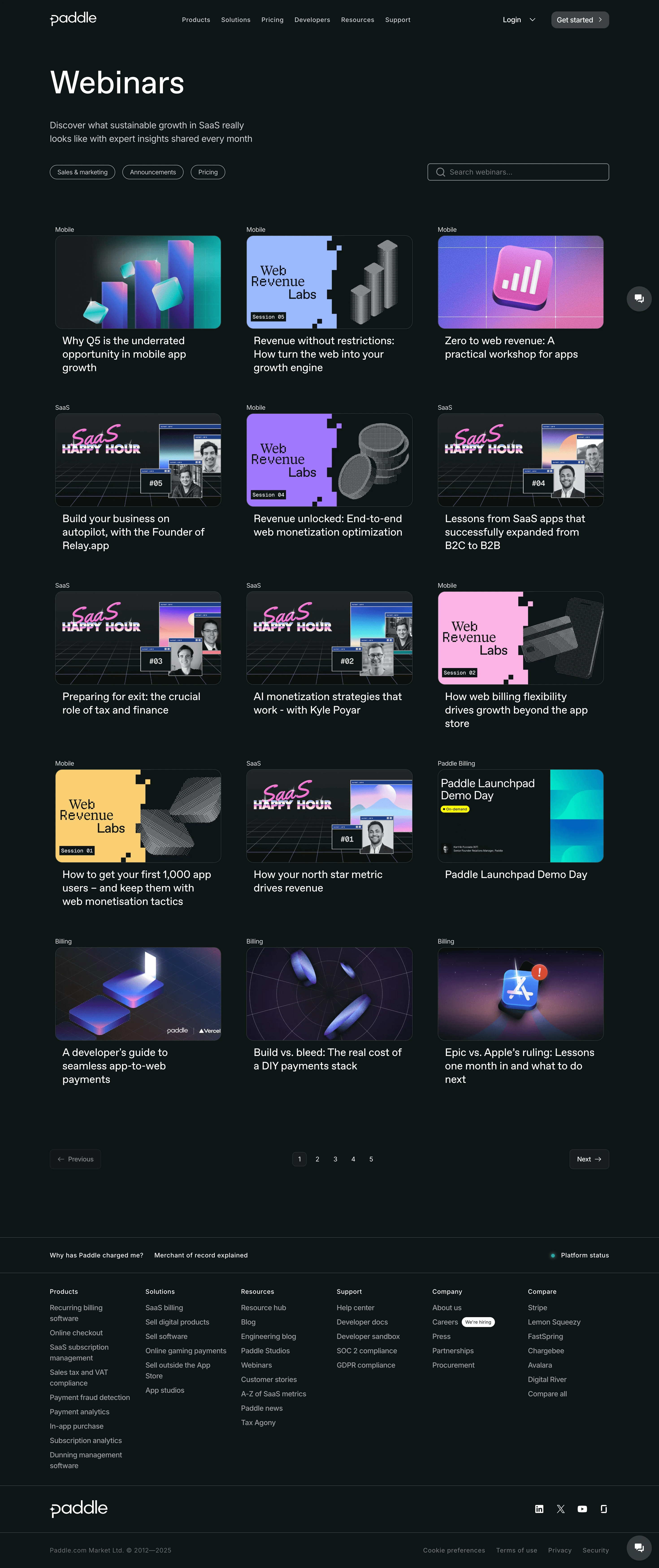
Paddle's webinar hub is a masterclass in organizing a content library without making it feel like a boring archive. The dark background makes every thumbnail pop, and those thumbnails are doing serious work. Each one has its own branded visual identity with bold purples, pinks, and geometric patterns that feel cohesive but never repetitive.
Grid That Breathes
Three-column card layout, consistent spacing, zero clutter. Every card follows the same structure: category tag up top, thumbnail, then title. Simple but effective. The category pills like "Mobile," "SaaS," and "Billing" in subtle text above each card help you scan fast without overwhelming the page. Filter buttons at the top (Sales & marketing, Announcements, Pricing) plus a search bar give you two ways in.
What Makes It Stand Out
The "SaaS Happy Hour" series branding is a fun touch. Those recurring visual motifs across episodes create recognition and make you want to binge. Pagination at the bottom tells you there's depth here. Five pages of content, clearly organized. The footer is dense but well-structured with logical groupings. Overall, it respects the user's time while looking genuinely sharp.