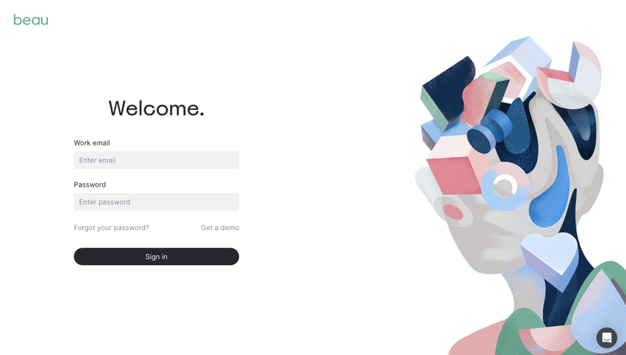
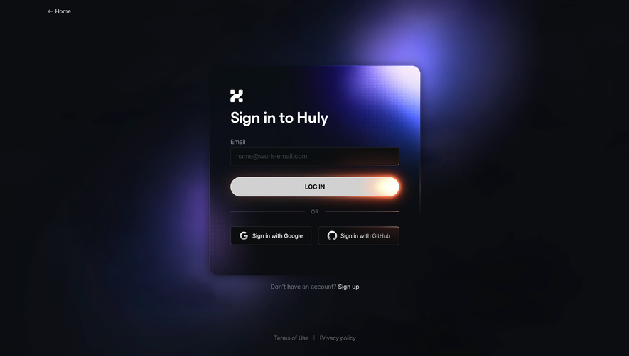
Generate a new design based on this screen using your own content.
Thank you! Your submission has been received!
Oops! Something went wrong while submitting the form.
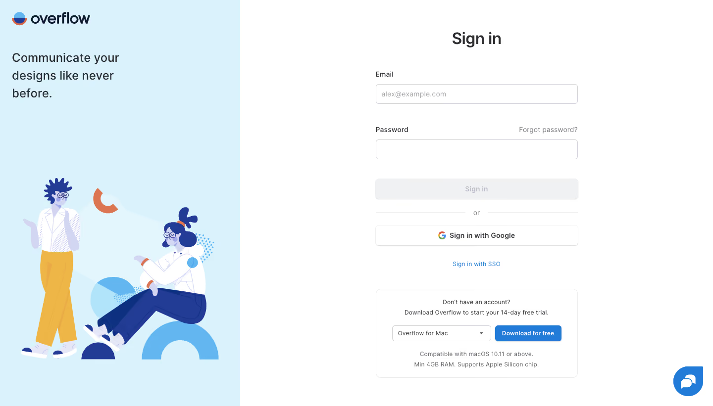
# Design from Reference: Overflow Login
Create an original, high-fidelity visual design inspired by the reference. Prioritize composition, typography, colors, spacing, and component styling over technical implementation.
## Reference
- **Product:** Overflow
- **Category:** Login
- **Screenshot:** https://cdn.prod.website-files.com/5e9dc792e1210c5325f7ebbc/6acb7270b10d21a746c47d09_6acb6f162c985439fc0f7f0b_cms-fe8384af97e4a749b0ce2f3f.webp
Analyze the screenshot first. If inaccessible, request it rather than guessing.
## Content
{{content.instructions}}
{{content.data}}
Preserve essential messaging and factual accuracy. Adapt structure and copy length for visual balance; never invent product claims.
## Visual Design
Use this context to reproduce the reference's visual language: layout, typography, colors, spacing, borders, radii, and distinctive elements. The screenshot takes priority if descriptions conflict.
## Direction
{{preferences.fidelityInstructions}}
## Output
{{output.instructions}}
Deliver a polished, cohesive design with precise alignment, hierarchy, and spacing. Produce the requested visual artifact, not just a description. If unsupported, explain the limitation.
``` Overflow.io’s sign-in page embodies a crisp, modern minimalism that radiates professionalism without feeling cold. The interface is free from clutter, relying on a spacious design with generous white space and meticulously balanced elements. This understated approach creates a welcoming, focused environment for users to carry out essential actions. ```html
Layout and Structure
``` The page zeroes in on functionality, dedicating the entire viewport to the sign-in panel, which is perfectly centered both vertically and horizontally. Unlike many SaaS pages, it eschews traditional sections like “features” or “testimonials,” channeling the user’s attention exclusively toward the login process. The lack of distractions ensures a frictionless, single-purpose experience. ```html
Visual Elements
``` Overflow leverages subtle visual cues—an abstract, brand-themed illustrated header that injects personality and a touch of playfulness. Clean iconography enhances usability for the input fields, while the overall lack of photography or video keeps the focus sharp. ```html
Color Palette and Typography
``` The palette revolves around calming shades of white and gray, punctuated by the brand’s signature vibrant purple for calls-to-action and highlights. Typography is both legible and distinct, featuring bold, geometric sans-serif fonts for headings and lighter weights for supporting text, creating a clear information hierarchy. ```html
User Experience Patterns & Notable Design Choices
``` Simplified navigation (logo only, no menus or secondary links) guides users straight to the task. The form is concise, with smart labeling and “Show password” toggles enhancing usability. Distinctive is the balanced fusion of aesthetic polish and user-centric design—subtle gradients, smooth microinteractions, and an uplifting, trustworthy tone that encourages seamless engagement.