Design with AI
Generate a new design based on this screen using your own content.
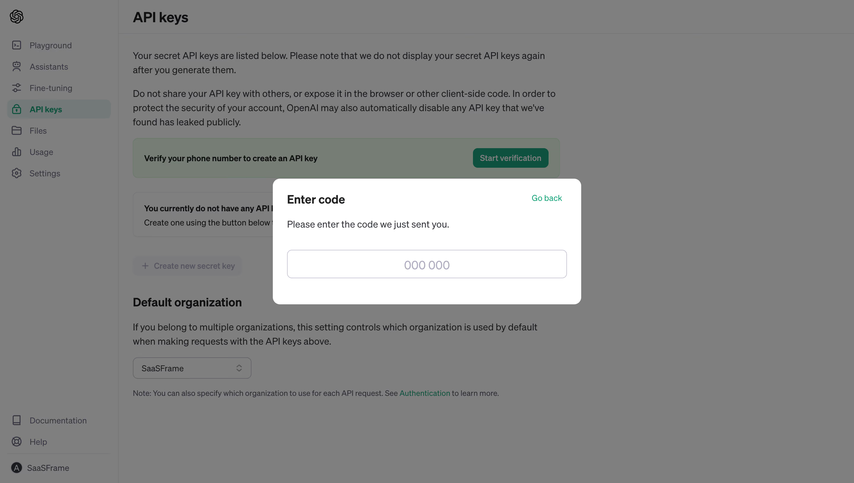
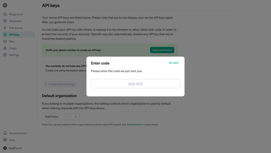
# Design from Reference: OpenAI Enter Code
Create an original, high-fidelity visual design inspired by the reference. Prioritize composition, typography, colors, spacing, and component styling over technical implementation.
## Reference
- **Product:** OpenAI
- **Category:** Verification
- **Screenshot:** https://cdn.prod.website-files.com/5e9dc792e1210c5325f7ebbc/6acad57e86f1bee9c3650909_6acad4f5886583e9d96b9b18_cms-8e5c2dc7be95120bd2e597b8.webp
Analyze the screenshot first. If inaccessible, request it rather than guessing.
## Content
{{content.instructions}}
{{content.data}}
Preserve essential messaging and factual accuracy. Adapt structure and copy length for visual balance; never invent product claims.
## Visual Design
### Overall aesthetic
- **Style:** Compact verification dialog with a white surface, green secondary navigation and a uniformly dimmed API-settings background.
- **Scale:** Source 2880 × 1630px; sizes estimate a 1440px-wide CSS viewport at 2× capture scale.
### Page composition
- **Backdrop:** API keys settings, left navigation and a phone-verification notice remain visible under a gray scrim.
- **Dialog:** Approximately 520 × 212px white panel centered in the viewport.
- **Content:** Enter code title and Go back link share the top row, followed by a short instruction and one wide code field.
### Information hierarchy
- **Task:** The heading and instruction ask for the recently sent code.
- **Input:** A single field displays a six-digit grouped placeholder.
- **Alternative:** Go back is the only other visible dialog action; no submit, resend or error is shown.
### Typography
- **Family:** Neutral sans-serif; exact font identity is unverified.
- **Roles:** Estimated title 20px bold, instruction 16px, code placeholder 20px and back link 14px.
- **Alignment:** Text aligns left; code placeholder is centered.
### Colors & surfaces
- **Sampled palette:** ICC-aware sRGB samples include scrim gray #7F7F7F, white #FFFFFF, dimmed #737D74, dark #1A1B1F and #7B7B7C.
- **Accent:** Green identifies Go back and background verification controls.
- **Boundaries:** Input has a pale lavender-gray outline; dialog has soft corners.
### Components
- **Dialog:** Approximately 12px corners and 24px padding, with no header divider.
- **Code field:** Approximately 472 × 48px, 6px corners and thin border.
- **Backdrop controls:** API navigation and disabled-looking creation action provide context but are not part of the modal form.
### Visual rhythm
- **Spacing:** Compact title/instruction grouping contrasts with a larger gap before the code field.
- **Focus:** The bright dialog isolates one task from a text-heavy background.
### Responsive
- **Recommended adaptation:** Only desktop is observed. Use viewport width minus 32px and a suitable numeric-code keyboard.
- **Access:** Keep Go back accessible and code text readable without assuming auto-submit behavior.
### Adaptation guidance
- **Preserve:** Keep a clear code-entry task and an obvious route back.
- **Adapt:** Use actual verification behavior and validation; do not infer unseen resend or completion states.
Use this context to reproduce the reference's visual language: layout, typography, colors, spacing, borders, radii, and distinctive elements. The screenshot takes priority if descriptions conflict.
## Direction
{{preferences.fidelityInstructions}}
## Output
{{output.instructions}}
Deliver a polished, cohesive design with precise alignment, hierarchy, and spacing. Produce the requested visual artifact, not just a description. If unsupported, explain the limitation.