Design with AI
Generate a new design based on this screen using your own content.
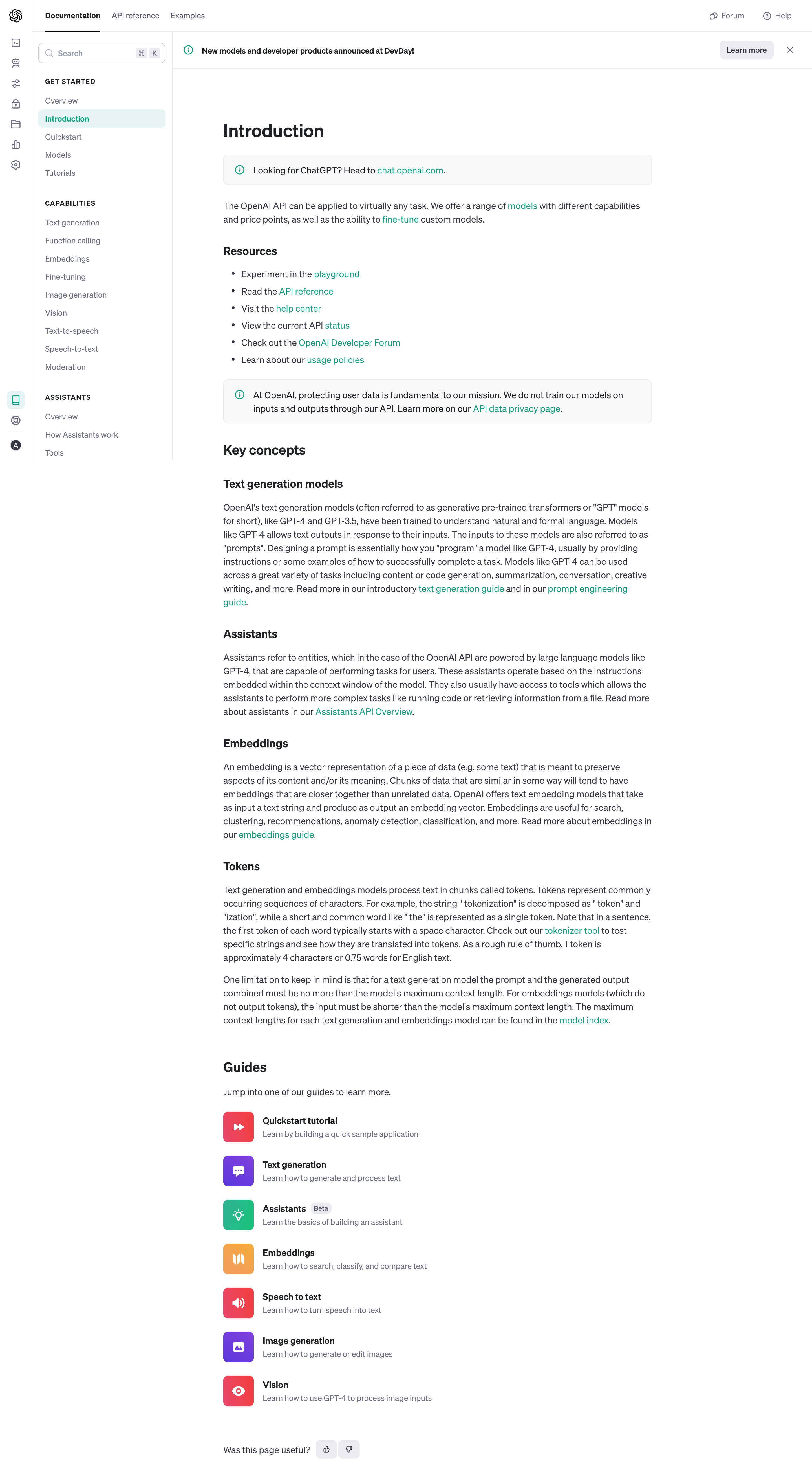
# Design from Reference: OpenAI Documentation
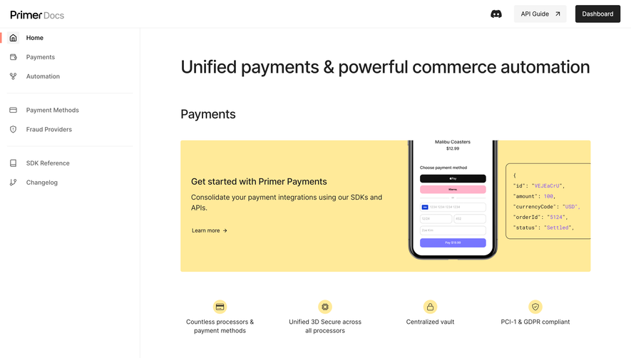
Create an original, high-fidelity visual design inspired by the reference. Prioritize composition, typography, colors, spacing, and component styling over technical implementation.
## Reference
- **Product:** OpenAI
- **Category:** Documentation
- **Screenshot:** https://cdn.prod.website-files.com/5e9dc792e1210c5325f7ebbc/6acad58086f1bee9c3650938_6acad4f8fef6904ce008abe5_cms-6260add5a848084db69fc0f7.webp
Analyze the screenshot first. If inaccessible, request it rather than guessing.
## Content
{{content.instructions}}
{{content.data}}
Preserve essential messaging and factual accuracy. Adapt structure and copy length for visual balance; never invent product claims.
## Visual Design
### Overall aesthetic
- **Character:** Restrained developer documentation, dominated by readable text, stable navigation and small colored guide icons.
### Page composition
- **Canvas:** 2880 × 5250 screenshot px; estimated CSS sizes assume 2× capture.
- **Structure:** Narrow icon rail, wider documentation sidebar, top tabs and announcement strip. Main reading column contains introduction, resource links, information callouts, concepts, guide links and feedback.
- **Layout:** Estimated CSS icon rail 56 px, sidebar 250 px and article approximately 760 px wide with generous surrounding whitespace.
### Information hierarchy
- **Priority:** Active Introduction navigation item and page heading anchor orientation; bold subheads divide dense conceptual text.
- **Secondary routes:** Resource bullets and linked guide rows provide onward navigation without large promotional cards.
### Typography
- **Family:** Neutral interface sans serif; exact identity unverified.
- **Scale:** Estimated CSS page heading 32 px, section heading 24 px, subsection 20 px, body 16 px and navigation 14 px; body line height approximately 24 px.
### Colors & surfaces
- **Sampled palette:** White #FFFFFF; callout fill #F7F7F8; body #343740; headings #202123; rules #ECECF1; active navigation #E5F3F3; secondary text #6E6E80.
- **Accent:** Teal links and information icons; guide icon tiles add red, violet, green and orange.
### Components
- **Navigation:** Upper tabs with active underline, search with keyboard hint, grouped sidebar links and pale-teal active row.
- **Callouts:** Thin outlined pale-gray rounded rectangles with a leading teal information icon.
- **Guides:** Vertical rows with approximately 54 CSS px colored square icons, bold labels and short muted summaries. Small thumbs feedback controls close the article.
### Visual rhythm
- **Spacing:** Approximately 24–40 CSS px between sections, tighter paragraph spacing and consistent indented bullets. Guide rows repeat a stable icon/text alignment.
### Responsive
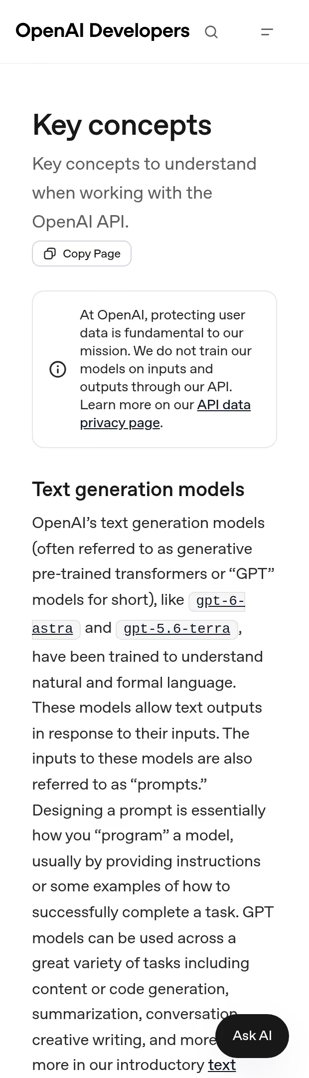
- **Observed:** Desktop only.
- **Adaptation:** Collapse both navigation rails into a menu, keep article gutters approximately 20 px and preserve readable line length and callout padding.
### Adaptation guidance
- **Preserve:** Documentation hierarchy, unobtrusive borders, teal navigation cues and dense but readable prose.
- **Replace:** Use supplied documentation structure and current product terminology; treat screenshot text as visual reference rather than factual documentation.
Use this context to reproduce the reference's visual language: layout, typography, colors, spacing, borders, radii, and distinctive elements. The screenshot takes priority if descriptions conflict.
## Direction
{{preferences.fidelityInstructions}}
## Output
{{output.instructions}}
Deliver a polished, cohesive design with precise alignment, hierarchy, and spacing. Produce the requested visual artifact, not just a description. If unsupported, explain the limitation.