
Thank you! Your submission has been received!
Oops! Something went wrong while submitting the form.
Get SaaSFrame Pro
Monthly
$18
Quarterly
$48
Yearly
$180
Upgrade to access this feature
Browse all screens & flows
Filter and search screens & flows
Access Figma files
Access mobile versions
Bookmark screens & flows
Join now
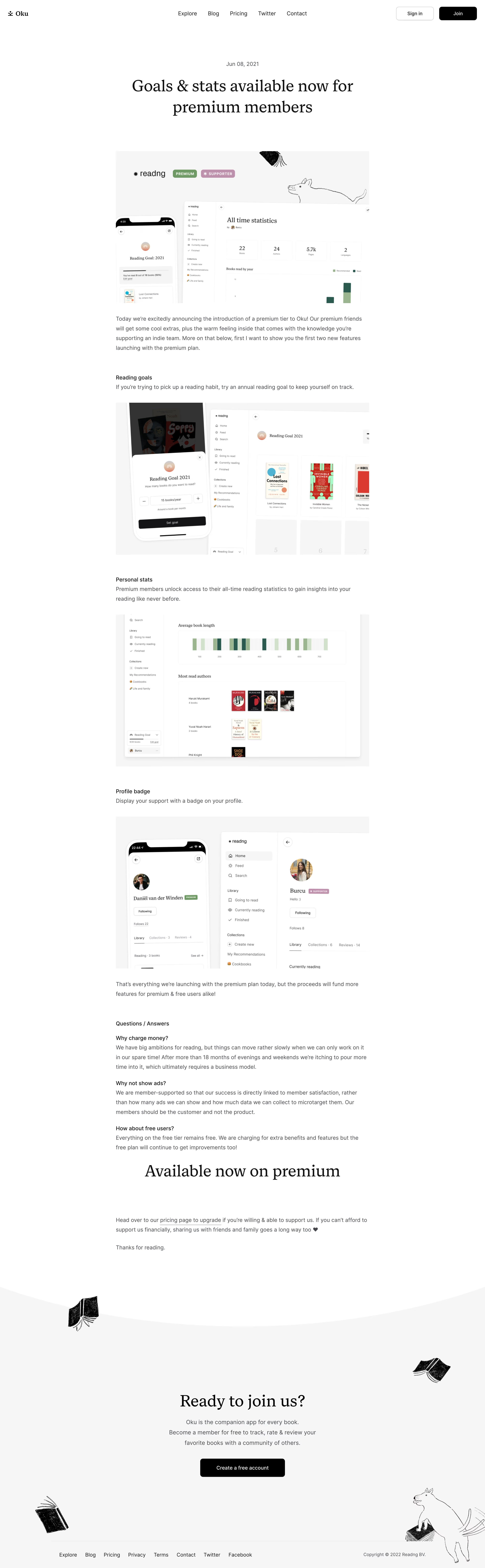

Oku Blog Post

Oku
The companion app for every book.
Designed by
No items found.

Bookmark
Bookmark

Design with AI
Thank you! Your submission has been received!
Oops! Something went wrong while submitting the form.
# Design from Reference: Oku Blog Post
Create an original, high-fidelity visual design inspired by the reference. Prioritize composition, typography, colors, spacing, and component styling over technical implementation.
## Reference
- **Product:** Oku
- **Category:** Blog Post
- **Screenshot:** https://cdn.prod.website-files.com/5e9dc792e1210c5325f7ebbc/6acb61aec08cd859ff851a66_6acad5ac5c79bb17f21ff8b4_cms-8710d9386a56bc85d702c8cd.webp
Analyze the screenshot first. If inaccessible, request it rather than guessing.
## Content
{{content.instructions}}
{{content.data}}
Preserve essential messaging and factual accuracy. Adapt structure and copy length for visual balance; never invent product claims.
## Visual Design
### Overall aesthetic
- **Character:** A quiet editorial product article, pairing large traditional serif display text with readable sans-serif prose and monochrome hand-drawn book illustrations.
- **Evidence scale:** Original 2880 × 9306 pixels, inspected across all four readable crops. CSS dimensions below assume an unverified 2× capture scale.
### Page composition
- **Header:** Full-width white navigation with small Oku wordmark at left, centered product/editorial links and outlined Sign in plus black Join buttons at right.
- **Article opening:** Centered date and a two-line serif headline sit above a large product montage. The article body is a centered approximately 752 px column.
- **Feature sequence:** Introductory prose leads into reading-goal copy and a phone/desktop montage, personal-statistics copy and a chart screenshot, then profile-badge copy and another phone/desktop montage.
- **Closing article:** A plain-text question-and-answer section has three questions with paragraphs, followed by a large centered serif availability statement, supporting copy and a short sign-off.
- **Conversion/footer:** A broad pale-gray section begins with a curved white boundary, floating book sketches and a centered membership invitation. A black account button precedes a thin divider and a horizontal footer with links and copyright.
### Information hierarchy
- **Title:** The article headline is the principal opening landmark; the date is small and muted.
- **Body:** Short medium-weight sans-serif subheadings introduce each feature; large screenshots carry much of the product explanation.
- **Questions:** Dark question lines sit directly above softer paragraphs, with clear gaps between topics and no accordion controls visible.
- **Final action:** The pale closing section isolates a second large serif heading, three-line supporting copy and one strong black button.
### Typography
- **Display:** Unverified serif, approximately 48 px regular with 60 px line height and modestly tight tracking for the main title and closing display headings.
- **Body:** Unverified sans-serif around 16 px regular, 28–29 px line height, producing a relaxed reading rhythm.
- **Subheadings:** Around 16 px medium, visually differentiated from body primarily by darker color and weight.
- **Navigation/actions:** Approximately 16 px links and 14 px medium button labels; footer text around 14–16 px.
- **Embedded UI:** The product screenshots contain their own serif headings, small sans-serif navigation, book covers, statistics tiles and compact badges; these are image content, not page controls.
### Colors & surfaces
- **Base:** Measured white #FFFFFF forms most of the article.
- **Closing section and images:** Very light neutral #F6F6F6 supports the footer conversion area and screenshot backdrops.
- **Text:** Black #000000 and near-black #131314 anchor display text; measured #46474E supplies body copy.
- **Image accents:** Muted green chart bars and premium badges, dusty pink supporter badges and colorful book covers appear inside the product montages.
### Components
- **Header buttons:** Approximately 112 × 40 px, 8 px radii; Sign in is white with a thin gray border, Join is solid black.
- **Article images:** Approximately 752 px wide rectangular montages, with no heavy outer border; embedded phone mockups overlap desktop interfaces.
- **Statistics image:** A sidebar and large chart/content area show a horizontal distribution graphic and rows of book covers.
- **Text links:** Underlined inline pricing link and simple footer links use restrained monochrome styling.
- **Closing CTA:** Approximately 252 × 54 px black rounded rectangle with white text, centered below the membership message.
- **Decorative layer:** Small black book sketches and a larger line-drawn animal sit around the pale conversion/footer area without covering its text.
### Visual rhythm
- **Reading width:** Body text and feature images share a consistent narrow column, while display headings are centered and can span wider.
- **Spacing:** Approximately 64–72 px separates major feature sections; body lines use generous leading, and images follow related copy with around 32 px separation.
- **Opening:** Large blank intervals separate navigation, date/title and hero montage, creating a slow editorial entrance.
- **Footer transition:** The curved boundary and distributed illustrations soften the shift from article to membership conversion.
### Responsive
- **Observed limit:** A long desktop page only; embedded phone mockups are illustrations and do not prove the website's mobile behavior.
- **Recommendation:** Keep prose near 60–75 characters per line, scale images proportionally and reduce display headings on small screens.
- **Navigation/footer:** Wrap or collapse navigation and footer links, preserving clear account actions and comfortable tap spacing.
- **Decoration:** Reposition book and animal sketches outside text flow at narrow widths.
### Adaptation guidance
- **Retain:** Alternate concise feature explanations with large concrete product images, then answer objections before the final invitation.
- **Implement:** Use a serif/sans pairing, neutral surfaces, generous line height and a single black primary-action style.
- **Verify:** Confirm fonts, true CSS scale and responsive rules separately; historical product text and embedded screenshots are visual evidence, not current feature claims.
Use this context to reproduce the reference's visual language: layout, typography, colors, spacing, borders, radii, and distinctive elements. The screenshot takes priority if descriptions conflict.
## Direction
{{preferences.fidelityInstructions}}
## Output
{{output.instructions}}
Deliver a polished, cohesive design with precise alignment, hierarchy, and spacing. Produce the requested visual artifact, not just a description. If unsupported, explain the limitation.


Category
Patterns
No items found.
Tech Stack

Added on
November 14, 2023
Similar screens





Upgrade to SaaSFrame Pro now to see similar examples.
Monthly
$18 /month
Billed $18 monthly
Browse all screens & flows
Filter and search screens & flows
Search text in screenshots
Access Figma files
Access mobile versions
Join now
Quarterly
$16 /month
Billed $48 quarterly
Browse all screens & flows
Filter and search screens & flows
Search text in screenshots
Access Figma files
Access mobile versions
Join now
Yearly
$15 /month
Billed $180 yearly
Browse all screens & flows
Filter and search screens & flows
Search text in screenshots
Access Figma files
Access mobile versions
Join now