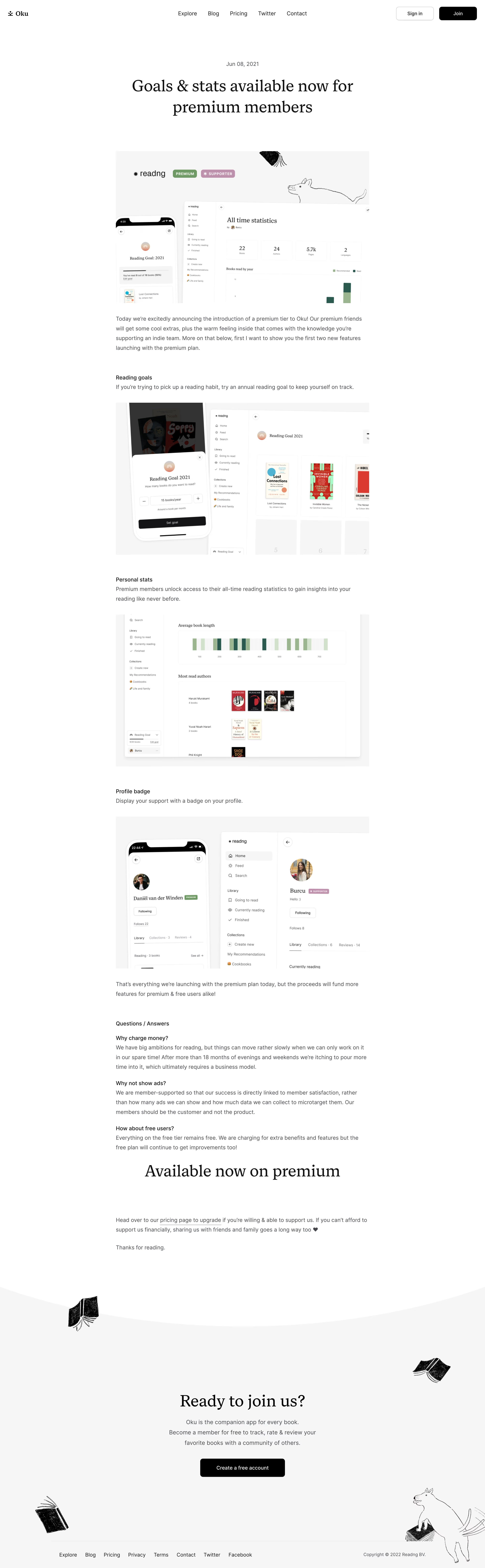

OKU’s Premium Membership launch page radiates a sleek, modern minimalism tailored for the SaaS sector. The uncluttered layout, generous white space, and subtle graphic motifs produce a calm, professional atmosphere—elevating substance while projecting a sense of trusted innovation.
Layout and Structure
The page opens with a clear hero section: crisp headline, brief subtext, and prominent CTA button immediately orient visitors. Scrolling reveals logically segmented content blocks—features, benefits, premium-specific distinctions—each separated by subtle visual dividers that maintain focus and flow. The absence of superfluous elements reinforces clarity and directs attention toward key information.
Visual Elements
Custom illustrations—soft-edged, on-brand, and friendly—enliven the experience without overwhelming it. Discrete icons and badges punctuate benefits, providing quick visual cues. There’s a gentle embrace of animation (e.g., hovering CTAs) to guide interaction and give the page a polished dynamism.
Color Palette and Typography
Dominated by neutrals—white backgrounds, charcoal grays—the palette leverages a single vibrant accent (OKU’s signature orange) to highlight actions and core messages. Modern sans-serif fonts deliver both approachability and professionalism, with a clear typographic scale: bold headings, regular body, and subtle metadata.
User Experience Patterns
Persistent top navigation ensures users never feel lost, while in-page anchors and a sticky CTA maintain engagement. The scroll is smooth, revealing content in digestible increments. Deliberate CTAs (“Get Premium”) use color contrast and placement for maximum conversion potential, always remaining actionable but never intrusive.
Unique or Notable Design Choices
OKU’s balance of editorial focus (blog format) within a polished SaaS environment stands out—combining trust-building longform storytelling with crisp micro-interactions. The blended approach bridges product announcement and brand narrative, fostering both excitement and credibility.
# Design from Reference: Oku Blog Post
Create an original, high-fidelity visual design inspired by the reference. Prioritize composition, typography, colors, spacing, and component styling over technical implementation.
## Reference
- **Product:** Oku
- **Category:** Blog Post
- **Screenshot:** https://cdn.prod.website-files.com/5e9dc792e1210c5325f7ebbc/6acb61aec08cd859ff851a66_6acad5ac5c79bb17f21ff8b4_cms-8710d9386a56bc85d702c8cd.webp
Analyze the screenshot first. If inaccessible, request it rather than guessing.
## Content
{{content.instructions}}
{{content.data}}
Preserve essential messaging and factual accuracy. Adapt structure and copy length for visual balance; never invent product claims.
## Visual Design
Use this context to reproduce the reference's visual language: layout, typography, colors, spacing, borders, radii, and distinctive elements. The screenshot takes priority if descriptions conflict.
## Direction
{{preferences.fidelityInstructions}}
## Output
{{output.instructions}}
Deliver a polished, cohesive design with precise alignment, hierarchy, and spacing. Produce the requested visual artifact, not just a description. If unsupported, explain the limitation.