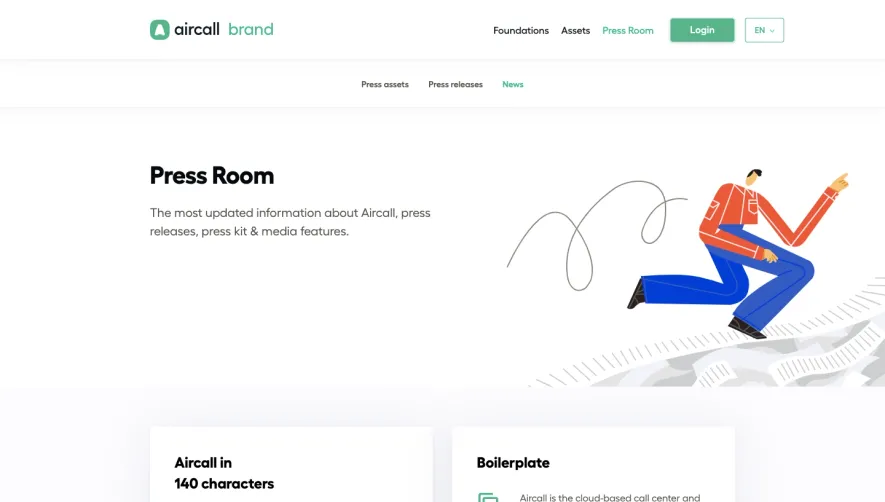
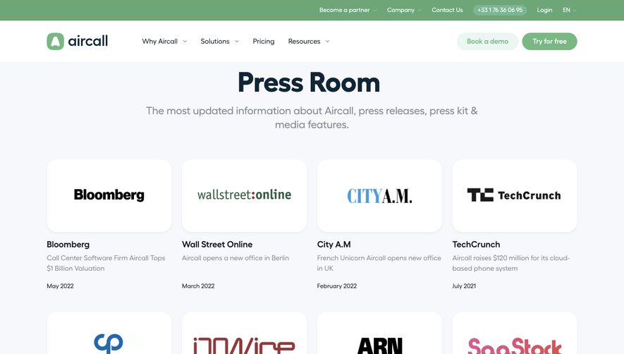
Overall Style and Aesthetic
The NordVPN Press Area exemplifies a sleek, minimalist, and highly professional aesthetic. White space dominates, creating a clean, uncluttered feel. The overall visual language is modern and unfussy, prioritizing clear communication and easy access to information over decorative flourishes. This imparts a sense of trust and authority, making it ideal inspiration for SaaS teams aiming for credibility and polish. Layout and Structure
The structure is concise and functional. A prominent hero section greets visitors with the NordVPN logo, a big, bold headline, and a focused subheadline. This is immediately followed by logically grouped content blocks: downloadable assets, press releases, and contact information, each crisply separated for scannability. The page ends with a compact, information-rich footer—traditional in structure but tailored to its audience. Visual Elements
Sharp, branded icons and carefully curated images—such as product screenshots and team photography—support content with visual clarity. File types and download buttons are clearly iconized, aiding instant recognition. Subtle animations on hover add a layer of refinement without distraction, while consistent iconography reinforces brand identity. Color Palette and Typography
A cool blue palette dominates, accented with dark gray and crisp white backgrounds. Strategic blue highlights cue interactivity and brand cohesion. Typography is modern and readable, using bold san-serifs for headlines and lighter weights for secondary details, combined with decisive hierarchy and spacing that guides the eye naturally. User Experience Patterns & Unique Choices
Simple top-level navigation and clear CTAs (“Download”, “Contact Us”) keep interactions straightforward. The page eschews excessive scroll with succinct, tabbed content and sticky navigation elements—a thoughtful nod to the busy audience it serves. What stands out is the dedicated media kit section with immediate downloads—a rare, frictionless touch that directly addresses press needs. Tone and Feel
The design exudes dependability and innovation, striking a careful balance between approachability and professionalism—offering plenty of inspiration for SaaS teams seeking to build trust through clarity and purposeful visual design.