Overall Style and Aesthetic
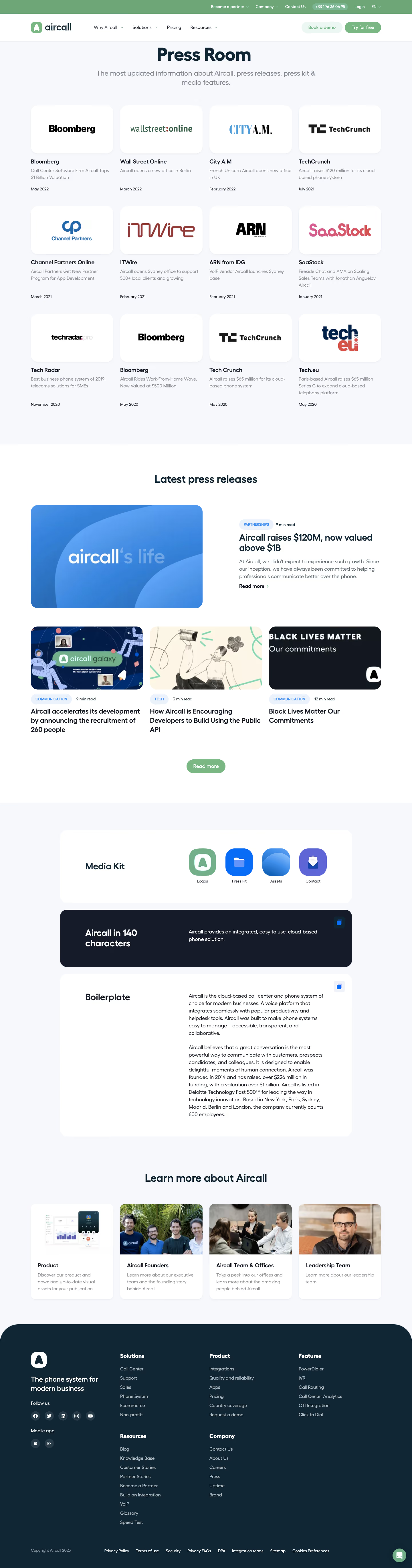
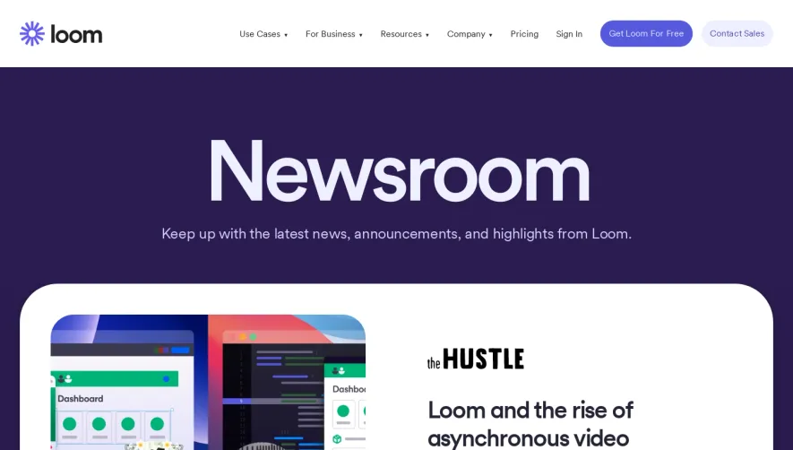
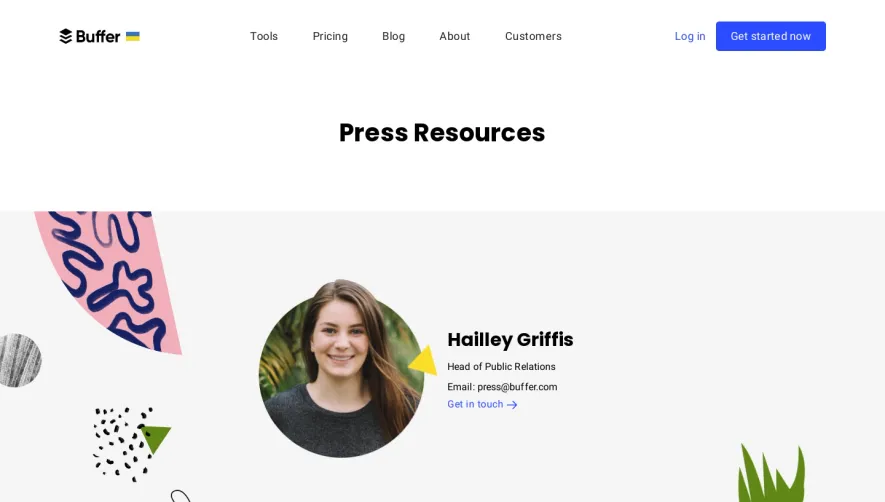
Aircall’s Press Room exemplifies a polished, modern minimalist aesthetic. Crisp white spaces dominate, accented by balanced splashes of Aircall’s signature mint green and bold navy. The page exudes confidence and clarity, projecting professionalism while still feeling fresh and welcoming—ideal for a SaaS audience seeking trust and innovation. Layout and Structure
The layout is clean and thoughtfully segmented. The hero section immediately captures attention with a subtle background pattern and prominent headline, clearly stating the page's purpose. Key sections follow: a straightforward “Media Kit” button, a curated list of press releases, a media contact area, and a robust “In the news” press mention carousel. There’s no clutter; each section serves a clear function, separated by generous padding for easy scanning. Visual Elements
Visual restraint is paired with subtle sophistication. Branded icons highlight action buttons, while logos and media thumbnails in the press carousel provide visual variety. The selective use of company photography humanizes the brand, avoiding stock-photo clichés. Hover effects provide tactile cues, enhancing engagement without distracting animations. Color Palette and Typography
A calming palette of white, mint green, navy, and gray creates a harmonious hierarchy. Large, sans-serif headlines command attention, while supportive body copy remains legible and inviting. A clear typographic scale simplifies navigation, seamlessly guiding visitors between sections. User Experience Patterns & Notable Choices
Navigation is streamlined: sticky header, well-marked CTAs, and succinct forms for press inquiries. Interactive elements—like the lateral scroll of press coverage—add dynamism. Overall, the restrained palette, selective imagery, and purposeful sections reinforce Aircall’s trustworthy, innovative presence while delivering a flawless user experience for SaaS design inspiration.