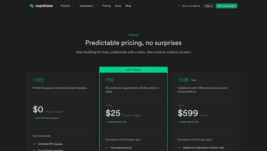
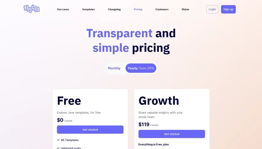
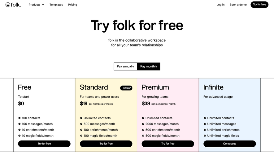
Generate a new design based on this screen using your own content.
Thank you! Your submission has been received!
Oops! Something went wrong while submitting the form.
# Design from Reference: NewsCatcher Pricing Page
Create an original, high-fidelity visual design inspired by the reference. Prioritize composition, typography, colors, spacing, and component styling over technical implementation.
## Reference
- **Product:** NewsCatcher
- **Category:** Pricing Page
- **Screenshot:** https://cdn.prod.website-files.com/5e9dc792e1210c5325f7ebbc/6acad0e35af75170c4bbe2cb_6acad07a053419932ab48e07_cms-88f2f4619c5d505353695c6c.webp
Analyze the screenshot first. If inaccessible, request it rather than guessing.
## Content
{{content.instructions}}
{{content.data}}
Preserve essential messaging and factual accuracy. Adapt structure and copy length for visual balance; never invent product claims.
## Visual Design
Use this context to reproduce the reference's visual language: layout, typography, colors, spacing, borders, radii, and distinctive elements. The screenshot takes priority if descriptions conflict.
## Direction
{{preferences.fidelityInstructions}}
## Output
{{output.instructions}}
Deliver a polished, cohesive design with precise alignment, hierarchy, and spacing. Produce the requested visual artifact, not just a description. If unsupported, explain the limitation.
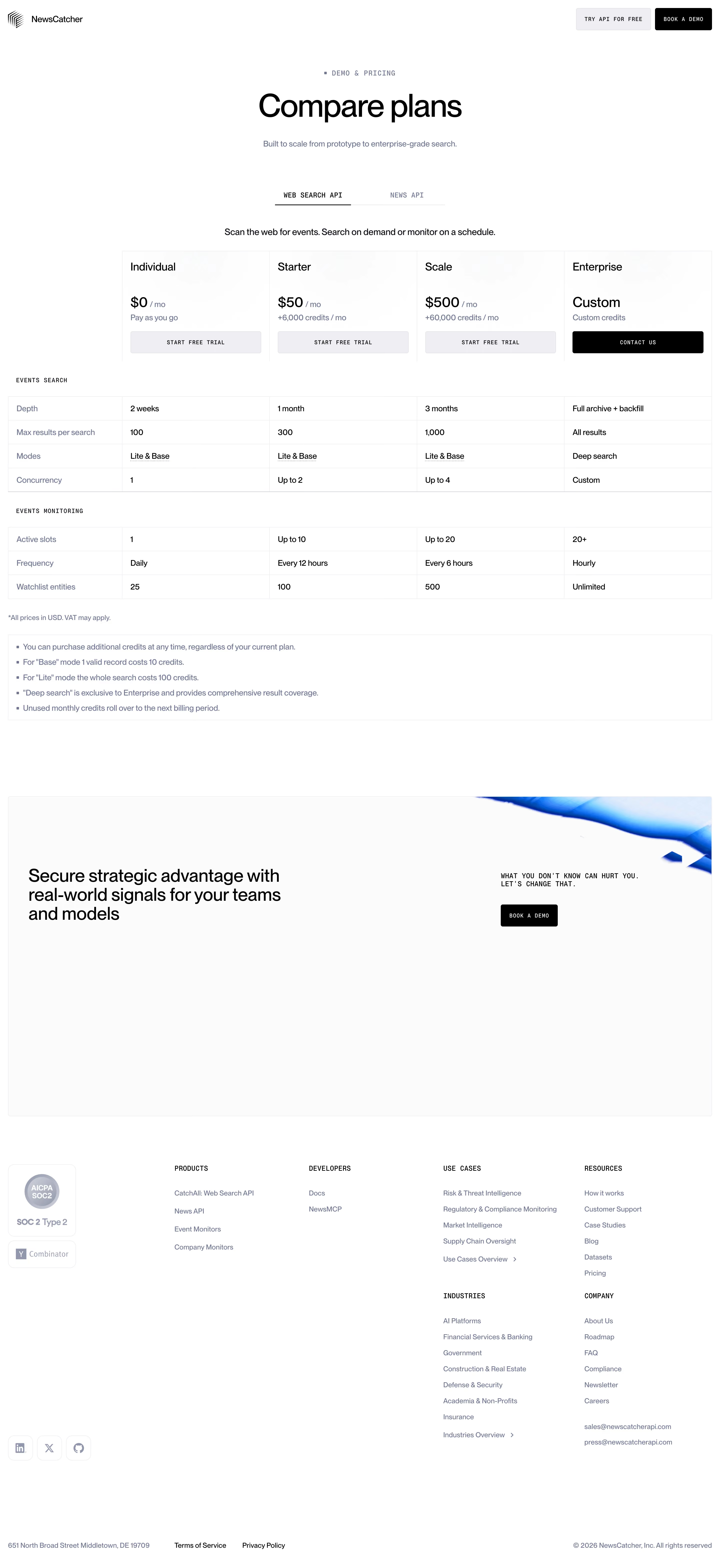
NewsCatcher's pricing page is a masterclass in restraint. Four-column plan comparison with a near-monochrome palette. Black, white, and the tiniest hint of soft blue-gray borders. The Enterprise column gets a solid dark "Contact Us" button that immediately pulls your eye to the highest tier. Smart move.
Typography That Stays Out of the Way
The type system mixes a bold serif for the hero headline "Compare plans" with monospaced caps for section labels like "EVENTS SEARCH" and "EVENTS MONITORING." That contrast between editorial and technical feels intentional and gives the page a data-forward personality. Prices are big and bold. Everything else is small and functional.
Structure That Sells
The sticky detail here is how they break the comparison into distinct grouped sections rather than one massive table. Each chunk is scannable on its own. The footnotes at the bottom handle edge cases without cluttering the grid. And that dark CTA banner with "Secure strategic advantage" adds weight before the footer. It works hard without shouting.