
Thank you! Your submission has been received!
Oops! Something went wrong while submitting the form.
Get SaaSFrame Pro
Monthly
$18
Quarterly
$48
Yearly
$180
Upgrade to access this feature
Browse all screens & flows
Filter and search screens & flows
Access Figma files
Access mobile versions
Bookmark screens & flows
Join now
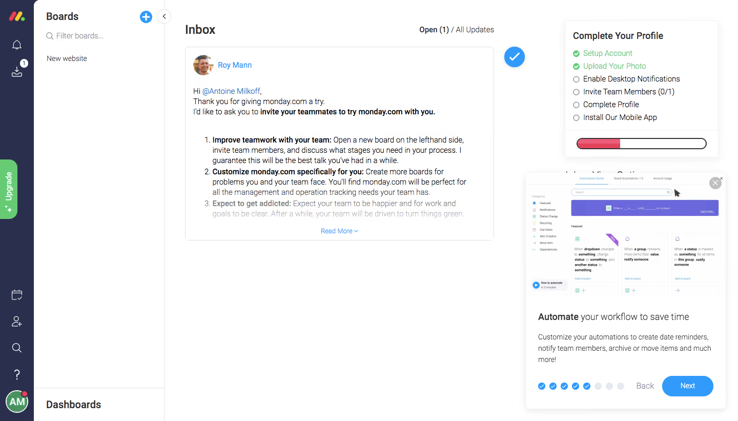
Monday User Onboarding
Monday
The Work OS that powers remote teamwork
Designed by
No items found.

Bookmark
Bookmark

Design with AI
Thank you! Your submission has been received!
Oops! Something went wrong while submitting the form.
# Design from Reference: Monday User Onboarding
Create an original, high-fidelity visual design inspired by the reference. Prioritize composition, typography, colors, spacing, and component styling over technical implementation.
## Reference
- **Product:** Monday
- **Category:** User Onboarding
- **Screenshot:** https://cdn.prod.website-files.com/5e9dc792e1210c5325f7ebbc/6acbc137b7ca13cf70095a78_6acbc02ca4008ddb7477eac1_cms-a0994914b9d44b4f419ed129.webp
Analyze the screenshot first. If inaccessible, request it rather than guessing.
## Content
{{content.instructions}}
{{content.data}}
Preserve essential messaging and factual accuracy. Adapt structure and copy length for visual balance; never invent product claims.
## Visual Design
### Overall aesthetic
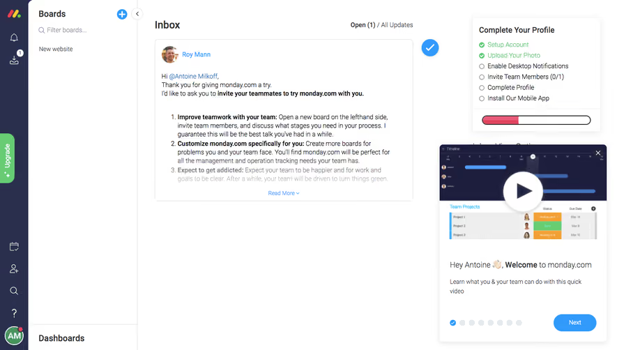
- **Style:** Functional onboarding inside a busy work-management inbox, with a floating educational tour card.
- **Visual character:** White workspace, navy icon rail, bright blue actions, and green checklist completion.
- **Surface treatment:** Central update card, right profile-checklist card, and a shadowed lower-right tour popover organize the screen.
### Page composition
- **Screenshot size:** 1440 × 821 image px. Capture-to-CSS scale unverified; dimensions below refer to screenshot pixels.
- **Navigation:** Narrow navy icon rail and adjacent Boards column; Dashboards entry is separated at the bottom.
- **Main inbox:** Heading and Open/All Updates filter above a large welcome update card.
- **Profile panel:** Upper-right Complete Your Profile checklist with six tasks and a colored horizontal progress bar.
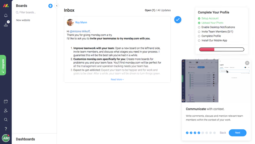
- **Tour panel:** Lower-right floating card with automation screenshot, title, explanatory paragraph, progress dots, Back, Next, and close.
- **Overlay relationship:** Tour card overlaps the right-side content without dimming the full workspace.
### Information hierarchy
- **Primary workspace:** Inbox heading and welcome update remain visible while the tour explains automation.
- **Onboarding checklist:** Two completed tasks are green; remaining tasks have empty circles.
- **Tour hierarchy:** Screenshot leads to Automate your workflow to save time, supporting instructions, then progression controls.
- **Action hierarchy:** Blue Next dominates; Back is subdued and close sits over the image.
- **Progress hierarchy:** Multiple blue completed dots lead to pale remaining dots, separate from the profile completion bar.
### Typography
- **Family:** Narrow humanist sans serif appearance; exact family unverified.
- **Page heading:** Approximately 24 screenshot px, weight 600.
- **Panel headings:** Approximately 18 px bold; tour title combines bold first phrase with regular continuation.
- **Body/update copy:** Approximately 14 px with 20 px leading.
- **Tour helper:** Approximately 14 px, muted dark gray, 21 px leading.
- **Navigation:** Approximately 14–16 px.
- **Precision:** Values are visual estimates rather than extracted CSS.
### Colors & surfaces
- **Main surfaces:** Sampled sRGB #FFFFFF with nearby near-whites #FFFEFF/#FEFEFE.
- **Navy rail:** Sampled #292F4C.
- **Primary blue:** Sampled #319AFB.
- **Product-preview violet:** Sampled #6A68DC.
- **Dark text:** Sampled #333333.
- **Local state colors:** Green completed checks and Upgrade tab; pink/red progress fill in the profile panel.
- **Muted elements:** Pale gray borders and uncompleted progress dots stay subordinate.
### Components
- **Update card:** Thin gray border, small radius, sender portrait/link, numbered guidance, and Read More affordance.
- **Checklist card:** Approximately 300 px wide with thin border, subtle shadow, compact task rows, and outlined progress bar.
- **Tour shell:** Approximately 390 × 460 screenshot px, 10 px corners, white fill, and soft shadow.
- **Tour image:** Full-width product screenshot with a circular gray close control near upper right.
- **Tour footer:** About eight progress markers, subdued Back, and blue pill Next approximately 100 × 40 px.
- **Rail controls:** Small white line icons, notification badge, and bottom circular user avatar.
- **Observed state:** Mid-tour automation explanation; subsequent slides and task completion behavior are unverified.
### Visual rhythm
- **Workspace columns:** Clear vertical boundaries separate icon rail, board list, update, and onboarding assistance.
- **Card pacing:** Dense welcome text contrasts with large unused white space below it.
- **Tour rhythm:** Image takes roughly half the card; title, paragraph, and controls fill the lower half.
- **Control alignment:** Dots remain left while Back/Next sit to the right on one baseline.
- **Progress separation:** Profile checklist and educational tour are visually distinct onboarding mechanisms.
### Responsive
- **Observed version:** Desktop only.
- **Tour recommendation:** Present as a viewport-safe sheet on small screens.
- **Navigation recommendation:** Collapse board navigation and show inbox as the primary view.
- **Checklist recommendation:** Move profile tasks into a separate accessible panel rather than placing them behind the tour.
- **Controls recommendation:** Keep Next, Back, and close reachable without covering important content.
### Adaptation guidance
- **Preserve:** Contextual product education, image-first tour card, distinct task checklist, and strong Next hierarchy.
- **Content fidelity:** Use actual automation capabilities, setup tasks, and completed-step state.
- **Starting dimensions:** Approximately 18 px tour title, 14 px body, 40 px action height, and 10 px shell radius.
- **Layout adaptation:** Keep educational content attached to the workspace but avoid obstructing essential controls.
- **Interaction fidelity:** Derive slide order, dismissal, and completion tracking from the implemented onboarding flow.
Use this context to reproduce the reference's visual language: layout, typography, colors, spacing, borders, radii, and distinctive elements. The screenshot takes priority if descriptions conflict.
## Direction
{{preferences.fidelityInstructions}}
## Output
{{output.instructions}}
Deliver a polished, cohesive design with precise alignment, hierarchy, and spacing. Produce the requested visual artifact, not just a description. If unsupported, explain the limitation.


Category
Patterns
No items found.
Tech Stack





Added on
February 4, 2023
Found in 1 flow

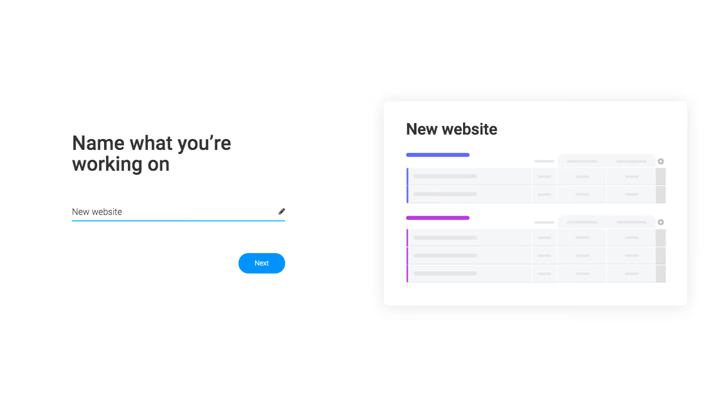
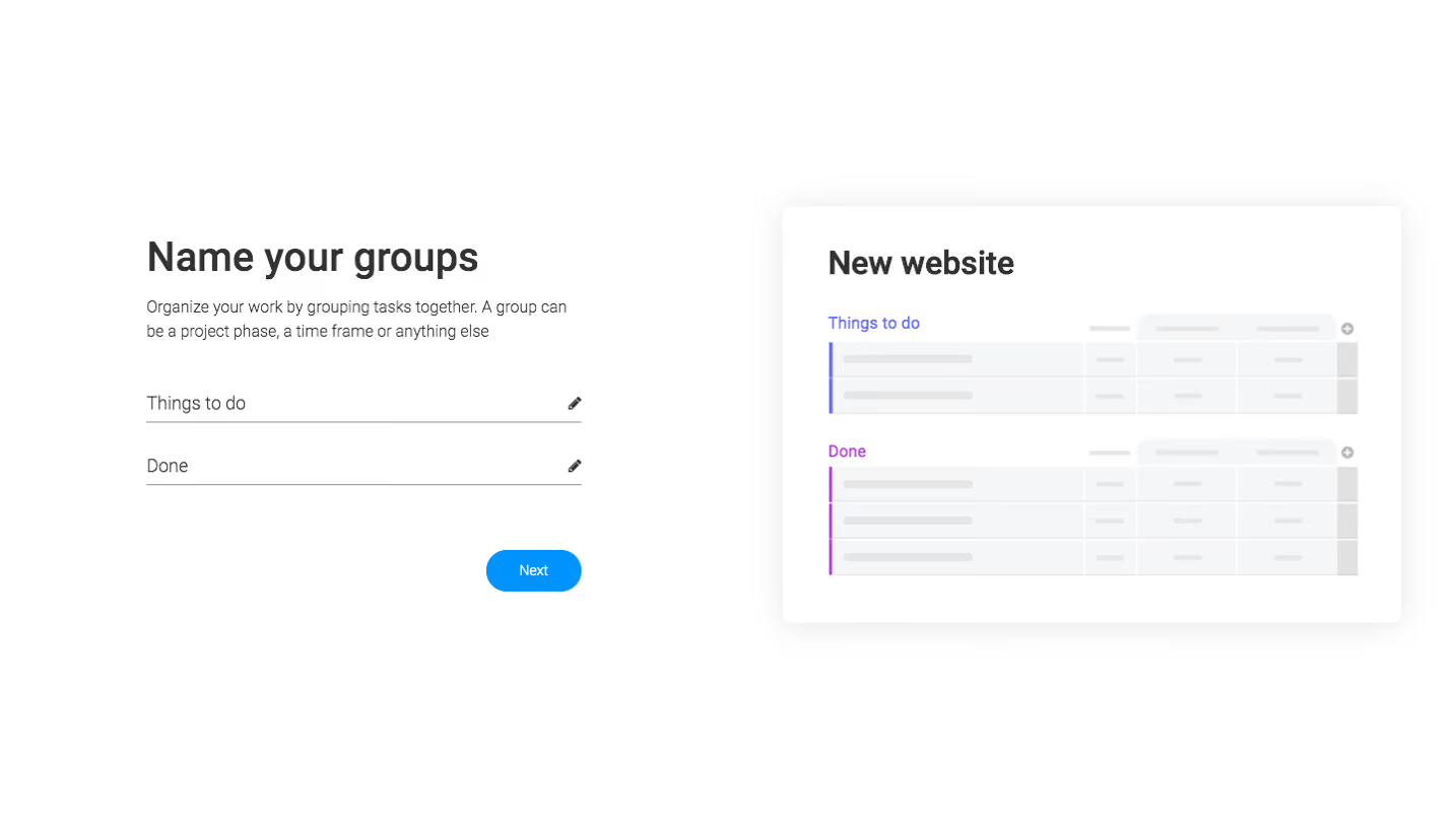



Similar screens



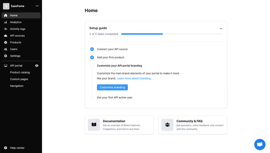

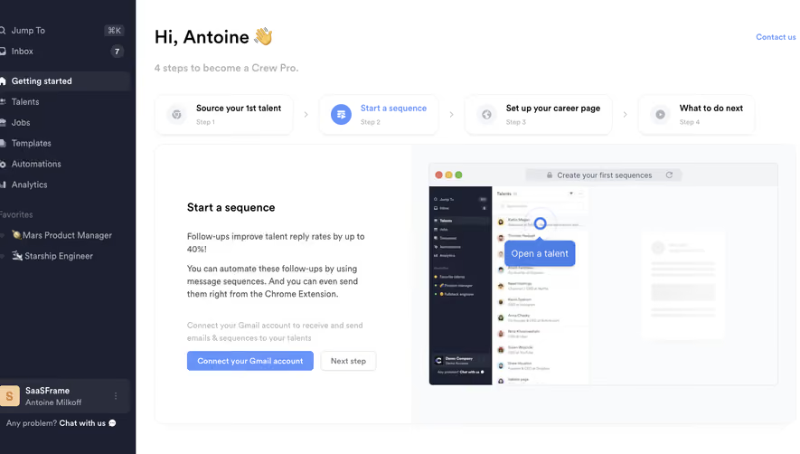

Upgrade to SaaSFrame Pro now to see similar examples.
Monthly
$18 /month
Billed $18 monthly
Browse all screens & flows
Filter and search screens & flows
Search text in screenshots
Access Figma files
Access mobile versions
Join now
Quarterly
$16 /month
Billed $48 quarterly
Browse all screens & flows
Filter and search screens & flows
Search text in screenshots
Access Figma files
Access mobile versions
Join now
Yearly
$15 /month
Billed $180 yearly
Browse all screens & flows
Filter and search screens & flows
Search text in screenshots
Access Figma files
Access mobile versions
Join now