
Thank you! Your submission has been received!
Oops! Something went wrong while submitting the form.
Get SaaSFrame Pro
Monthly
$18
Quarterly
$48
Yearly
$180
Upgrade to access this feature
Browse all screens & flows
Filter and search screens & flows
Access Figma files
Access mobile versions
Bookmark screens & flows
Join now
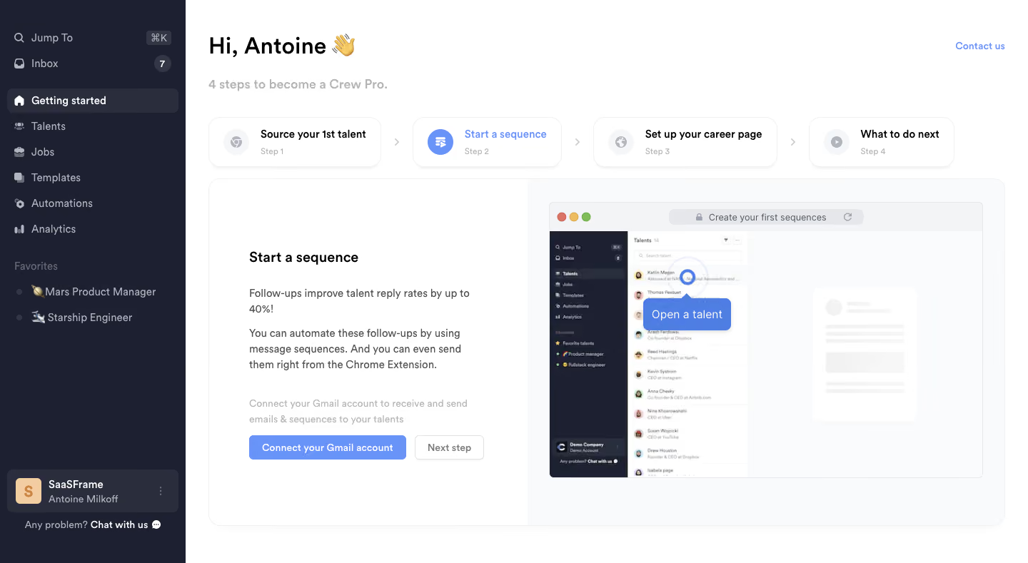
Crew User Onboarding

Crew
Recruiting CRM built for collaboration
Designed by
No items found.

Bookmark
Bookmark

Design with AI
Thank you! Your submission has been received!
Oops! Something went wrong while submitting the form.
# Design from Reference: Crew User Onboarding
Create an original, high-fidelity visual design inspired by the reference. Prioritize composition, typography, colors, spacing, and component styling over technical implementation.
## Reference
- **Product:** Crew
- **Category:** User Onboarding
- **Screenshot:** https://cdn.prod.website-files.com/5e9dc792e1210c5325f7ebbc/6acbbdacd6be908889c4e776_6acbbce17aa5c17bd9378d5f_cms-91884558e0add7e35051dd19.webp
Analyze the screenshot first. If inaccessible, request it rather than guessing.
## Content
{{content.instructions}}
{{content.data}}
Preserve essential messaging and factual accuracy. Adapt structure and copy length for visual balance; never invent product claims.
## Visual Design
### Overall aesthetic
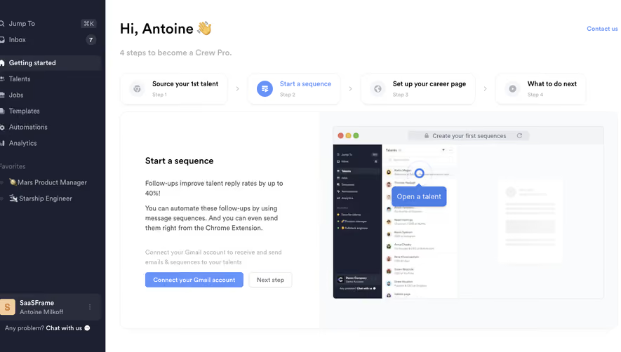
- **Character:** A recruiting-app onboarding dashboard pairs a dark sidebar with a bright guided setup area and blue active-state accents.
- **Capture evidence:** The screenshot measures 1440 × 789 pixels. Approximate dimensions are image pixels; a near-1× CSS scale is plausible but unverified.
- **Tone:** A personalized greeting, four-step sequence and large illustrated instruction panel create a practical guided introduction.
### Page composition
- **Sidebar:** A roughly 260px-wide dark rail contains quick navigation, selected Getting started, recruiting destinations, favorites and a lower workspace/account block.
- **Header:** A large greeting with waving emoji sits above a muted four-step introduction; Contact us aligns upper right.
- **Step trail:** Four rounded cards span the main width, separated by chevrons.
- **Instruction panel:** A large rounded two-column region contains explanatory copy and actions left, with a browser-style product demonstration right.
- **Lower sidebar:** A compact support sentence sits beneath the workspace block.
### Information hierarchy
- **Current step:** Start a sequence is blue in the four-step trail, with a blue circular icon.
- **Instruction heading:** The left panel repeats the current task in bold.
- **Explanation:** Short paragraphs describe follow-up sequences and their role; a lighter line introduces account connection.
- **Primary action:** Connect your Gmail account is blue; Next step is outlined and quieter.
- **Product demonstration:** A large mock browser screenshot includes a prominent blue Open a talent callout.
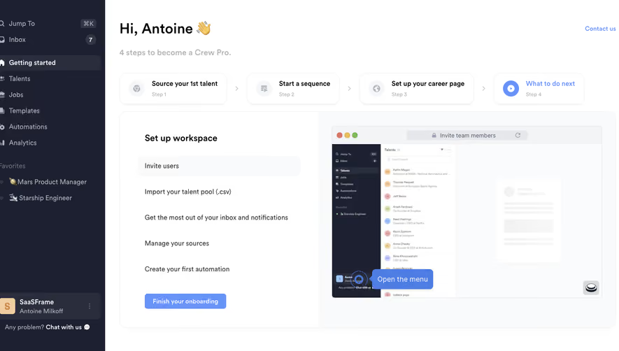
- **Visible sequence:** The other cards represent sourcing a first talent, setting up a career page and next guidance.
### Typography
- **Family:** A neutral sans-serif is visible; exact identity is unverified.
- **Greeting:** Approximately 32px bold with 40px line-height.
- **Subtitle:** Approximately 18px semibold, pale gray.
- **Step labels:** Approximately 14px bold, with 12px muted step numbers.
- **Panel title:** Approximately 20px semibold.
- **Body:** Approximately 14px with 21–22px line-height.
- **Sidebar:** Approximately 14px, with a stronger selected label.
### Colors & surfaces
- **Main canvas:** Sampled #FFFFFF supplies the workspace.
- **Sidebar:** Sampled #1D2030 supplies the dark navy rail.
- **Selected/sidebar panels:** Sampled #2A2D3C supplies lighter dark blocks.
- **Instruction surfaces:** Sampled #F9FAFB and #F9FBFC supply pale demonstration and panel areas.
- **Rules:** Sampled #F3F4F6 supplies fine neutral boundaries.
- **Blue accent:** Sampled #6893F9 supplies active-step and action styling.
- **Secondary text:** Pale gray reduces emphasis on instructions not currently actionable.
### Components
- **Step cards:** Four white bordered rectangles around 210–260px wide and 70px high use rounded corners around 16px and subtle shadows.
- **Step icons:** Small pale circular backings hold icons; the current step uses a saturated blue circle.
- **Instruction container:** A broad approximately 1115 × 485px rounded panel has a thin border and a white/pale split.
- **Browser illustration:** A framed screenshot with top traffic-light dots and an address-like bar occupies most of the right column.
- **Actions:** The Gmail connection button is approximately 220 × 34px with white bold text; Next step is around 96px wide with a pale outline.
- **Sidebar selection:** A rounded lighter-dark row highlights Getting started with a white home icon.
- **Workspace block:** A rounded dark panel combines an initials tile, workspace/account labels and a small overflow menu.
### Visual rhythm
- **Main padding:** Approximately 32px separates the sidebar from the content.
- **Step spacing:** Small chevrons and consistent gaps connect the four setup cards.
- **Panel balance:** The left copy is vertically centered, while the larger demonstration fills the right half.
- **Text cadence:** Short paragraph groups and a larger break before account-connection guidance organize the instructions.
- **Sidebar density:** Compact navigation contrasts with broad white space in the onboarding area.
### Responsive
- **Evidence limit:** Only a desktop setup state is visible; account connection, tour actions and responsive behavior are unverified.
- **Step recommendation:** Convert the four-card trail into a compact current-step indicator or horizontally scrollable sequence.
- **Panel recommendation:** Stack copy and demonstration on narrow screens.
- **Navigation recommendation:** Collapse the sidebar while preserving the selected onboarding destination.
- **Action recommendation:** Allow connection and next-step controls to wrap with comfortable touch targets.
### Adaptation guidance
- **Guided setup:** Keep one clearly active step and a matching instruction panel.
- **State consistency:** Reuse blue for active setup and primary actions, with quieter treatments for secondary paths.
- **Illustration:** Use a static demonstration asset unless a functional interactive preview is explicitly required.
- **Privacy:** Use representative candidate and account data in mockups.
- **Accessibility:** Expose step progress semantically, label account-connection actions and provide visible keyboard focus.
Use this context to reproduce the reference's visual language: layout, typography, colors, spacing, borders, radii, and distinctive elements. The screenshot takes priority if descriptions conflict.
## Direction
{{preferences.fidelityInstructions}}
## Output
{{output.instructions}}
Deliver a polished, cohesive design with precise alignment, hierarchy, and spacing. Produce the requested visual artifact, not just a description. If unsupported, explain the limitation.


Category


Added on
February 14, 2023
Found in 1 flow


Similar screens
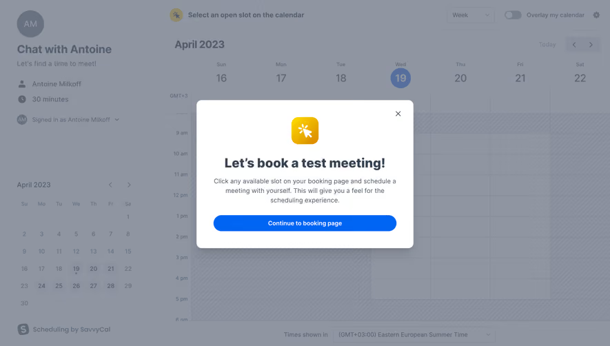


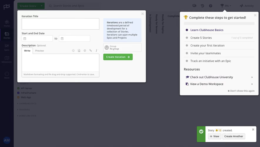



Upgrade to SaaSFrame Pro now to see similar examples.
Monthly
$18 /month
Billed $18 monthly
Browse all screens & flows
Filter and search screens & flows
Search text in screenshots
Access Figma files
Access mobile versions
Join now
Quarterly
$16 /month
Billed $48 quarterly
Browse all screens & flows
Filter and search screens & flows
Search text in screenshots
Access Figma files
Access mobile versions
Join now
Yearly
$15 /month
Billed $180 yearly
Browse all screens & flows
Filter and search screens & flows
Search text in screenshots
Access Figma files
Access mobile versions
Join now