
Thank you! Your submission has been received!
Oops! Something went wrong while submitting the form.
Get SaaSFrame Pro
Monthly
$18
Quarterly
$48
Yearly
$180
Upgrade to access this feature
Browse all screens & flows
Filter and search screens & flows
Access Figma files
Access mobile versions
Bookmark screens & flows
Join now
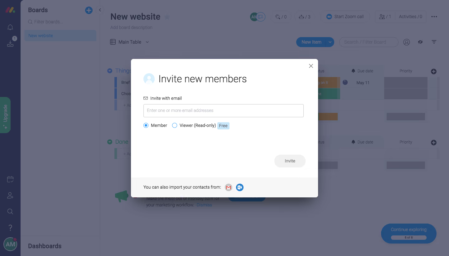
Monday Invite Team Members

Monday
The Work OS that powers remote teamwork
Designed by
No items found.

Bookmark
Bookmark

Design with AI
Thank you! Your submission has been received!
Oops! Something went wrong while submitting the form.
# Design from Reference: Monday Invite Team Members
Create an original, high-fidelity visual design inspired by the reference. Prioritize composition, typography, colors, spacing, and component styling over technical implementation.
## Reference
- **Product:** Monday
- **Category:** Invite Team Members
- **Screenshot:** https://cdn.prod.website-files.com/5e9dc792e1210c5325f7ebbc/6acbcebc75891049b18402e5_6acbcd0f79661806cce89ce1_cms-7bf569d4c29db84f604e4aa2.webp
Analyze the screenshot first. If inaccessible, request it rather than guessing.
## Content
{{content.instructions}}
{{content.data}}
Preserve essential messaging and factual accuracy. Adapt structure and copy length for visual balance; never invent product claims.
## Visual Design
### Overall aesthetic
- **Character:** A white invitation modal floats above a dimmed project-board workspace. The modal uses a large lightweight title, simple email input, blue role selectors, and a pale footer for contact-import options.
- **Focus treatment:** A blue-gray overlay mutes the dense application behind the dialog, making the invitation task the clear priority.
- **Observed scale:** The source measures 1440 × 821 pixels. Sizes below describe approximate image pixels; CSS estimates assume an unverified 1× capture.
### Page composition
- **Background application:** A narrow dark icon rail, Boards sidebar, and broad project table fill the screen. Board groups, status cells, due dates, priorities, and top actions remain visible through the overlay.
- **Modal placement:** A centered dialog approximately 600 × 445 pixels begins near x=420 and y=189, with small rounded corners and a strong soft shadow.
- **Dialog header:** A pale circular person icon precedes Invite new members. A small close symbol sits at the upper-right.
- **Form:** An email label and full-width input are followed by a horizontal role-choice row.
- **Action placement:** A small Invite pill sits toward the lower-right of the white body, with substantial empty space above it.
- **Footer:** A pale gray strip at the bottom contains contact-import text and two mail-provider icons.
### Information hierarchy
- **Primary task:** The large title establishes the invitation purpose.
- **Entry instruction:** The email label and placeholder indicate that one or more addresses can be entered.
- **Permission choice:** Member is selected; Viewer (Read-only) is unselected and accompanied by a small Free badge.
- **Action state:** The Invite control is pale gray with muted text while the input is empty. This appears inactive, but exact enabling rules are unverified.
- **Alternative method:** Contact import is separated into the footer as a secondary path.
- **Background scope:** The board is contextual and dimmed. Its controls are not part of the invitation task, and no invitation has been sent in the captured state.
### Typography
- **Typeface appearance:** A neutral sans-serif is used. Exact font family is unverified.
- **Modal title:** Approximately 32 pixels, light/regular weight, with line-height near 40 pixels.
- **Labels and roles:** Around 14 pixels, regular weight, with compact line-height.
- **Placeholder:** Approximately 14 pixels, in pale gray-blue.
- **Action/footer:** Invite and contact-import text are around 14 pixels. The Free badge is compact and slightly emphasized.
- **Background type:** Board title is larger/bolder than table labels, but all background typography is subdued by the overlay.
### Colors & surfaces
- **Measured modal:** #FFFFFF forms the dialog body; #F7F7F7 supplies the pale footer/control family.
- **Measured dimmed canvas:** #696C81 dominates the overlaid workspace. Nearby #666A7F and #575A6F appear in darker background regions.
- **Measured rail:** #292F4C contributes to the dark left application rail as captured through the overlay.
- **Accent:** Bright blue marks selected radio controls and mail-provider detail; pale blue supports the person icon and Free badge.
- **Neutral controls:** The input uses a thin gray border, while the inactive-looking Invite control uses a pale gray fill.
- **Depth:** The modal’s shadow and uniform scrim establish a clear layer above the application.
### Components
- **Person icon:** A pale blue circle contains a white user silhouette beside the title.
- **Close control:** A gray x-shaped symbol sits inside the modal’s top-right padding.
- **Email field:** A rectangular input roughly 515 × 42 pixels has a thin border and slight corner rounding. No address chips or entered value are visible.
- **Role group:** Two small blue-outlined radio controls sit on one line. Member has a filled center; Viewer is empty.
- **Free badge:** A small pale blue rounded label follows the viewer description.
- **Invite button:** Approximately 100 × 42 pixels, fully rounded, with muted centered text.
- **Contact import:** Gmail and Outlook-style circular symbols follow the footer sentence. Authentication or import behavior is not shown.
- **Background board:** The dimmed workspace includes a board name, view selector, New Item action, search/filter field, grouped rows, colored status cells, and a lower-right guided-exploration pill.
- **Unshown states:** Email validation, selected viewer mode, active invitation button, contact-import popup, sending, and confirmation are not visible.
### Visual rhythm
- **Compact upper form:** Title, label, input, and role row form a tight sequence in the dialog’s upper half.
- **Large action gap:** Empty vertical space separates role selection from the lower-right Invite button.
- **Footer separation:** A full-width fill change creates a clear boundary for the alternative import method.
- **Consistent inset:** Header icon, form label, input, and footer copy align near the same left content margin.
- **Layer contrast:** Dense background columns contrast with the simpler modal, reinforcing task focus.
### Responsive
- **Evidence limit:** Only a desktop modal is shown. Mobile behavior and focus management are unverified.
- **Recommended dialog:** Use fluid width with safe viewport margins and a maximum height with internal scrolling.
- **Recommended roles:** Allow the role row and badge to wrap without separating labels from their radio controls.
- **Recommended action:** Keep the invitation action reachable on short screens and provide a clear enabled/disabled distinction.
- **Recommended accessibility:** Trap focus appropriately, label the dialog, support Escape/close behavior, and restore focus to the trigger.
- **Recommended import:** Give provider icons explicit accessible names and usable hit areas.
### Adaptation guidance
- **Preserve the task structure:** Ask for addresses, clarify permission level, provide invitation action, and offer contact import as an alternative.
- **Define actual permission rules:** Member, viewer, and free-plan implications require current product specifications; the screenshot only establishes their labels and layout.
- **Validate addresses clearly:** Support multiple recipients with readable errors and a deliberate sending/success state.
- **Keep background inert:** Use a real modal layer so dimmed board controls cannot receive accidental interaction.
- **Use safe board data:** Replace captured project/account details with approved examples.
- **Standardize modal tokens:** White body, pale footer, small radius, soft shadow, blue selection controls, and clear focus states form the reusable system.
Use this context to reproduce the reference's visual language: layout, typography, colors, spacing, borders, radii, and distinctive elements. The screenshot takes priority if descriptions conflict.
## Direction
{{preferences.fidelityInstructions}}
## Output
{{output.instructions}}
Deliver a polished, cohesive design with precise alignment, hierarchy, and spacing. Produce the requested visual artifact, not just a description. If unsupported, explain the limitation.


Category
Patterns
Tech Stack





Added on
May 10, 2020
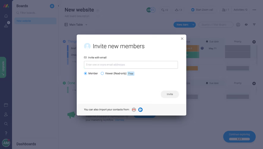

Similar screens
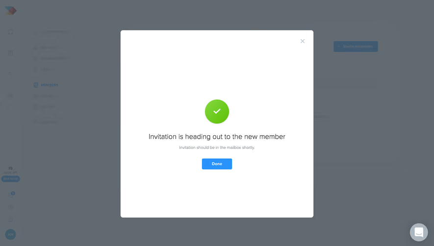


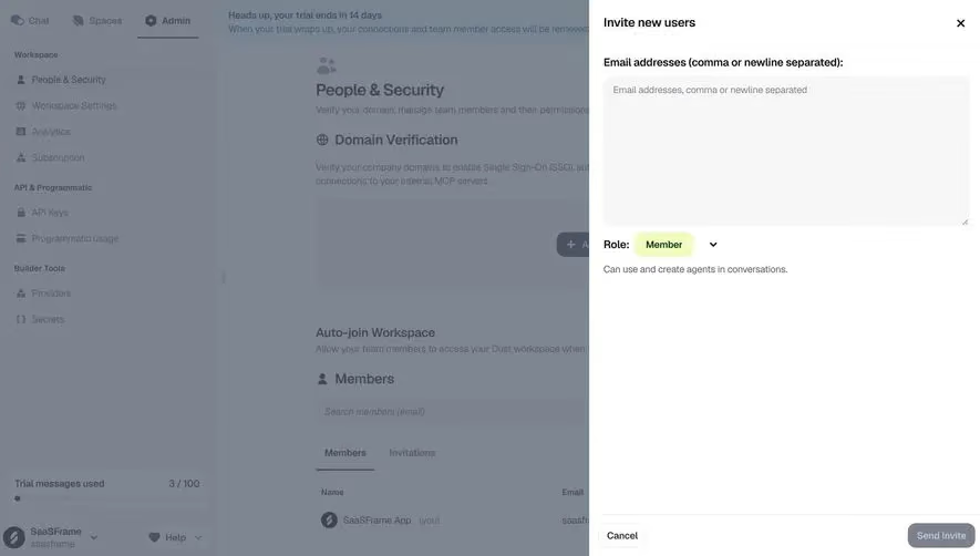



Upgrade to SaaSFrame Pro now to see similar examples.
Monthly
$18 /month
Billed $18 monthly
Browse all screens & flows
Filter and search screens & flows
Search text in screenshots
Access Figma files
Access mobile versions
Join now
Quarterly
$16 /month
Billed $48 quarterly
Browse all screens & flows
Filter and search screens & flows
Search text in screenshots
Access Figma files
Access mobile versions
Join now
Yearly
$15 /month
Billed $180 yearly
Browse all screens & flows
Filter and search screens & flows
Search text in screenshots
Access Figma files
Access mobile versions
Join now