Overall Style and Aesthetic
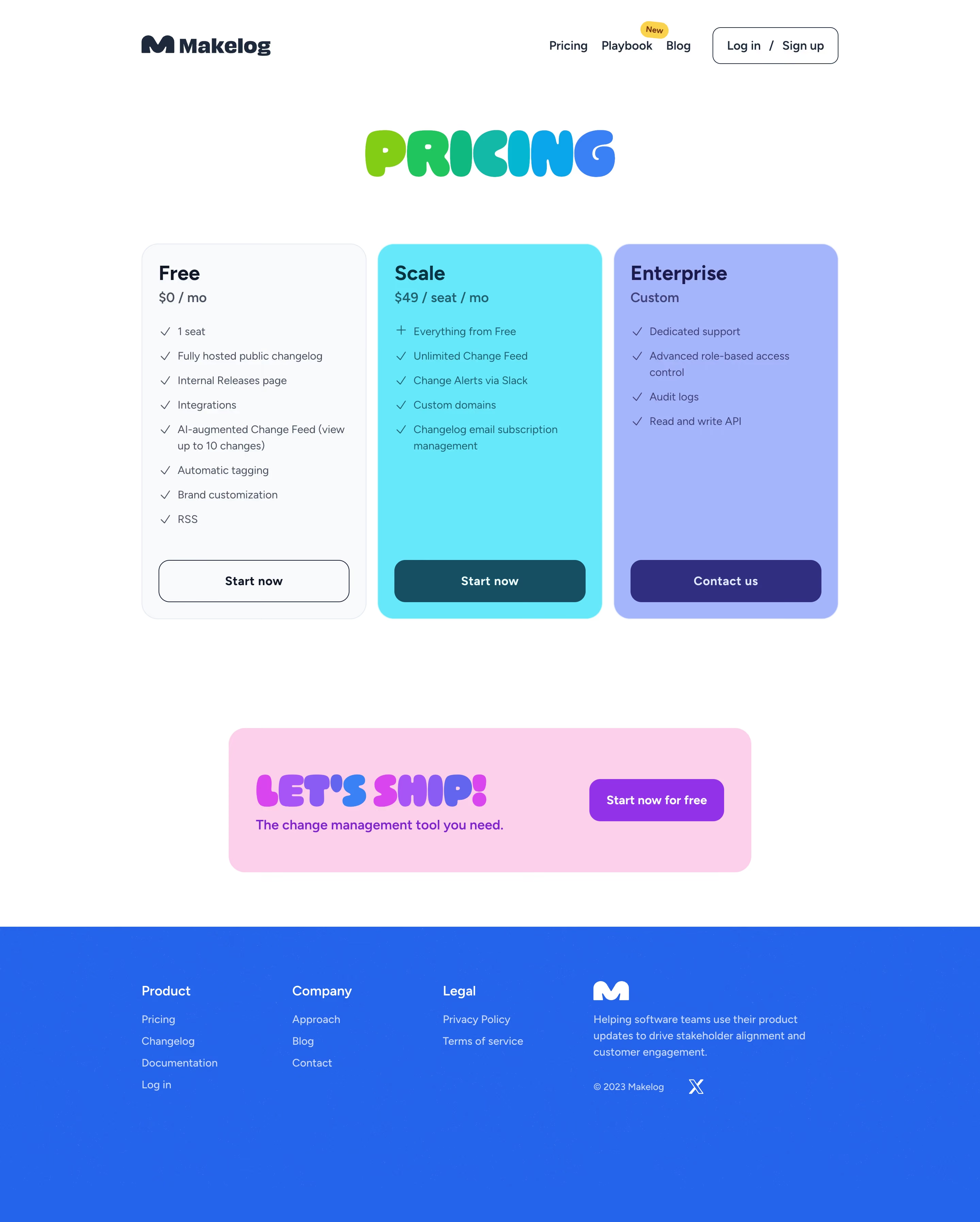
Maklog’s pricing page exemplifies a modern, minimalist approach with a professional yet inviting feel. The design uses ample white space, clear grid alignment, and concise text for an uncluttered look. Subtle microinteractions, friendly iconography, and occasional accent illustrations give the site a tech-forward, approachable vibe without overwhelming the content. Layout and Structure
The structure is highly intuitive: a prominent header with navigation sits atop the page, followed by a focused hero pricing section. Pricing cards are centrally aligned for quick comparison, each box outlining details with clear headings, feature lists, and a standout CTA button. Below, succinct FAQs and a compact footer round out the experience, keeping the core offerings front and center. Visual Elements
Clean line icons accentuate feature lists, while illustrated elements offer personality and energy. Animations and hover states are subtle, reinforcing interactivity without distracting. There is no reliance on heavy photography or video, supporting the focus on function and clarity. Color Palette and Typography
The palette pairs deep navy and charcoal with a lively orange accent—drawing the eye to CTAs and price points—balanced by soft grays and whites. Modern, sans-serif fonts create a sense of clarity and hierarchy: bold headings set sections apart, while lighter body text remains legible and unobtrusive. User Experience Patterns
Sticky top navigation ensures easy access to other parts of the site. Primary CTAs are recurring and easily scannable. Pricing tiers are interactive, with clear “Start Free” and “Contact Sales” actions, reinforcing direction. Scroll is straightforward, with the lift from clutter enhancing speed of understanding for visitors. Unique or Notable Design Choices
Particularly notable is the streamlined, frictionless comparison between plans, accentuated by concise copy and iconographic support. The use of warm accent colors in CTAs and highlights draws attention where it matters, and focus is kept laser-sharp on helping users make quick, confident decisions. The tone remains trustworthy and empowering, positioning Makelog as both innovative and dependable.