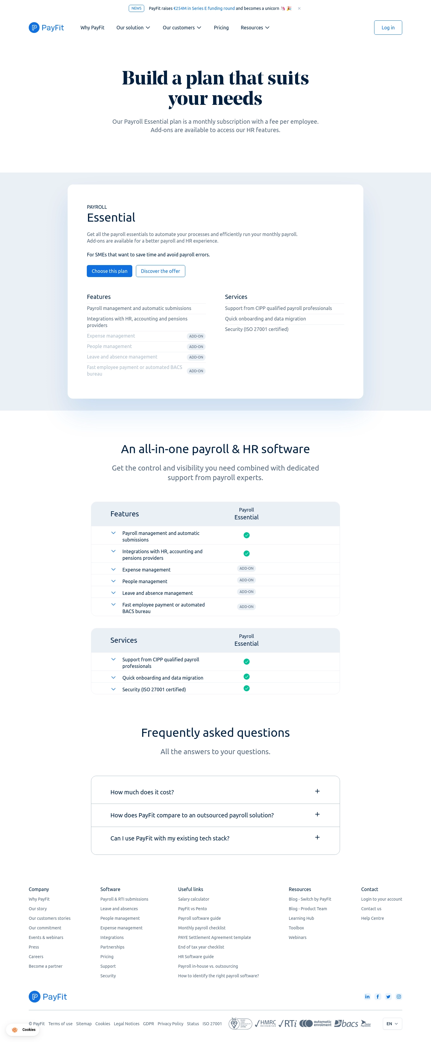
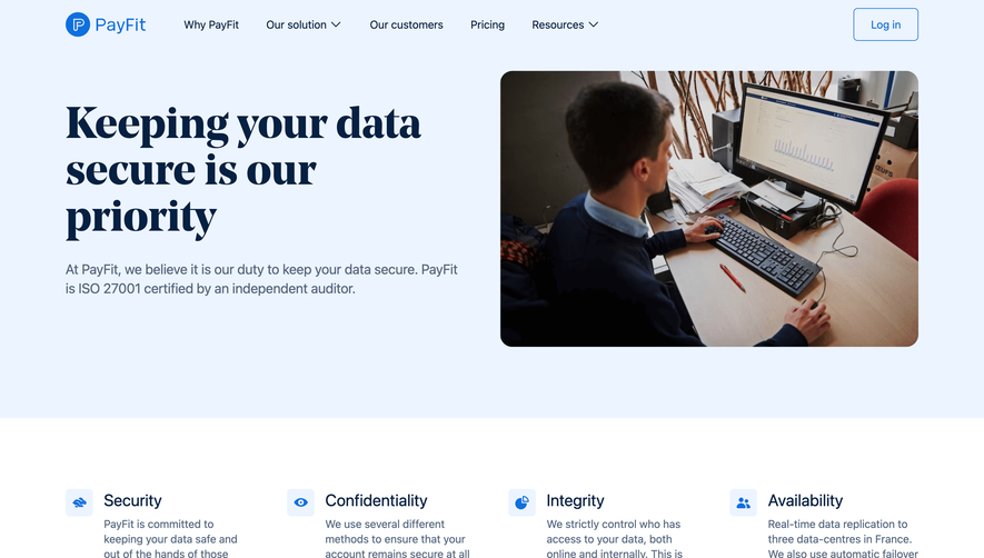
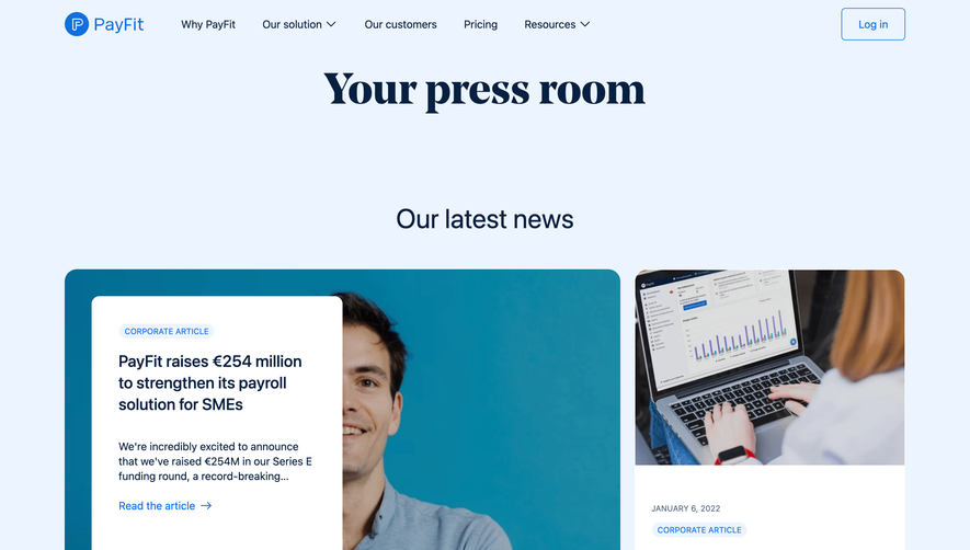
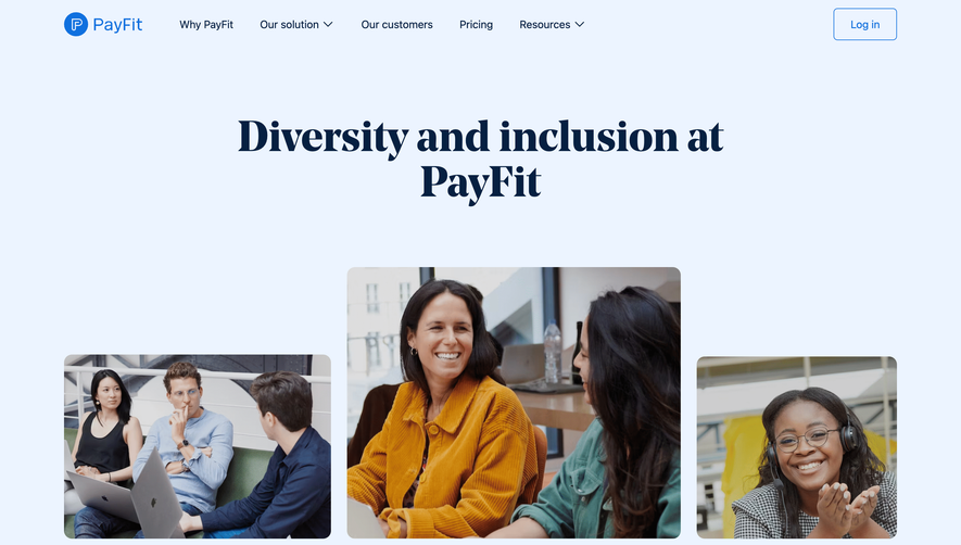
PayFit keeps things super straightforward here. The hero is bold and confident with that chunky serif headline "Build a plan that suits your needs" sitting on a white background. No noise. No gradients. Just clarity.
Structure That Does the Work
The page flows from a single plan card into a detailed feature comparison table, then drops into FAQs. It's a classic SaaS pricing layout but executed with restraint. The "Payroll Essential" card uses subtle shadows and plenty of whitespace to breathe. Green checkmarks and "ADD-ON" tags in soft blue make scanning effortless. You always know what's included versus what costs extra.
What Makes It Stand Out
The typography pairing works well. A strong serif for headlines paired with a clean sans-serif for body copy gives it personality without feeling trendy. The color palette is minimal, almost monochrome with just teal green accents doing all the heavy lifting. Two CTAs on the plan card, "Choose this plan" in solid dark blue and "Discover the offer" as an outline, create a clear hierarchy without competing. The footer is dense but well-organized into logical columns. Honest, functional design.
 SaaSFrame