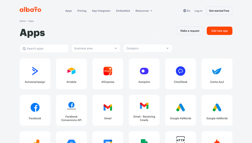
Generate a new design based on this screen using your own content.
Thank you! Your submission has been received!
Oops! Something went wrong while submitting the form.
# Design from Reference: Livestorm Integrations Library
Create an original, high-fidelity visual design inspired by the reference. Prioritize composition, typography, colors, spacing, and component styling over technical implementation.
## Reference
- **Product:** Livestorm
- **Category:** Integrations Library
- **Screenshot:** https://cdn.prod.website-files.com/5e9dc792e1210c5325f7ebbc/6acb646fb206c0d3f8f06765_6acb63e4a2ab34f17294046a_cms-96ee5a4cb287252dcb2274ce.webp
Analyze the screenshot first. If inaccessible, request it rather than guessing.
## Content
{{content.instructions}}
{{content.data}}
Preserve essential messaging and factual accuracy. Adapt structure and copy length for visual balance; never invent product claims.
## Visual Design
Use this context to reproduce the reference's visual language: layout, typography, colors, spacing, borders, radii, and distinctive elements. The screenshot takes priority if descriptions conflict.
## Direction
{{preferences.fidelityInstructions}}
## Output
{{output.instructions}}
Deliver a polished, cohesive design with precise alignment, hierarchy, and spacing. Produce the requested visual artifact, not just a description. If unsupported, explain the limitation.
Livestorm’s Integrations page adopts a clean, modern, and professional style rooted in an understated yet vibrant SaaS aesthetic. Generous whitespace, soft drop-shadows, and subtle gradients create an inviting, uncluttered environment. The tone feels approachable and forward-thinking, balancing friendliness with enterprise credibility.
Layout and Structure
The structure leads with a concise hero section introducing integrations, paired with a search/filter tool for instant exploration—a user-focused move. The grid-style showcase follows, neatly organizing integrations by category. There’s no overwhelming list; each integration is spaced thoughtfully, encouraging discovery. The footer continues the brand’s design approach with helpful links and gentle contrast.
Visual Elements
Simple, consistent iconography gives each integration clear visual identity without overpowering the page. Animated micro-interactions on hover lend a sense of interactivity and polish. Occasional playful illustrations and logos inject visual interest without distracting from function. There’s minimal use of images, keeping attention on content.
Color Palette and Typography
Livestorm’s signature blue accents punctuate a mostly white and light gray backdrop, creating clarity and drawing attention to key interactive areas. Typography is crisply sans-serif, establishing hierarchy with weight and size: bold headers, prominent filters, clean body text. The result is easy scanning and effortless readability.
User Experience Patterns and Notable Design Choices
Seamless navigation—horizontal filtering, persistent search, and clearly-labeled CTAs—makes engaging with the content delightful. Micro-animations enliven the experience, while carefully spaced cards prevent cognitive overload. The mix of function and flair, especially in the playful use of integration logos and animated cards, reflects Livestorm’s innovative, user-centric spirit.