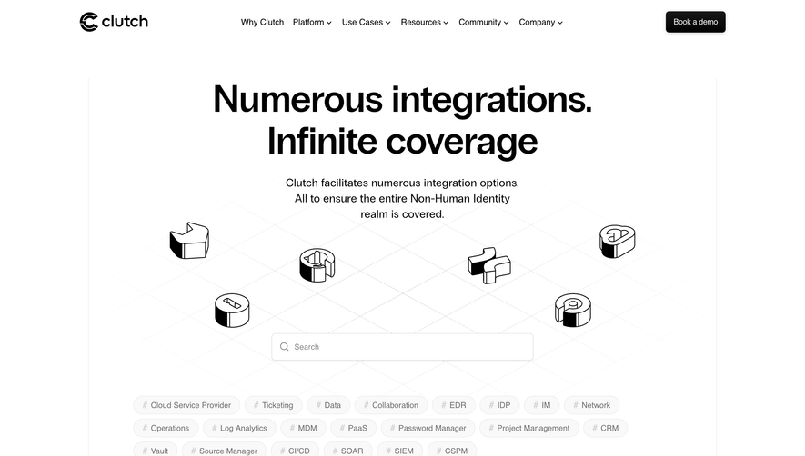
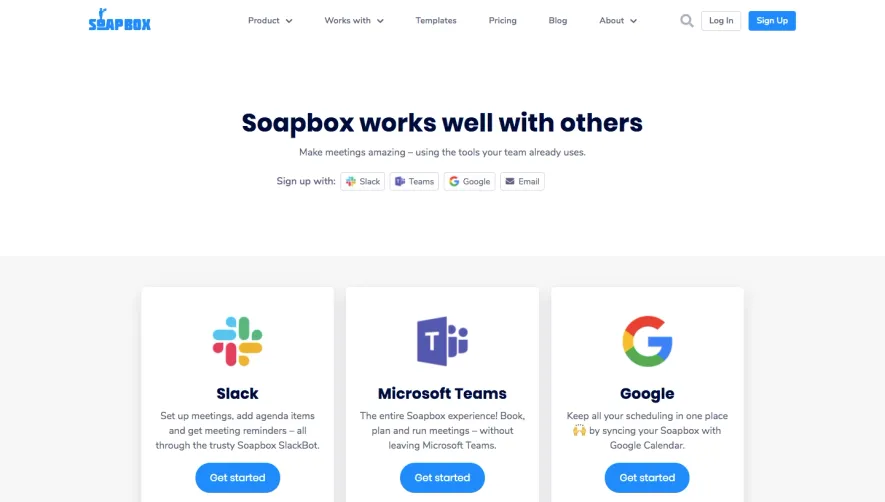
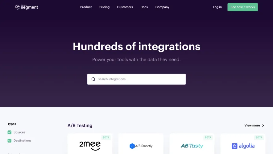
Generate a new design based on this screen using your own content.
Thank you! Your submission has been received!
Oops! Something went wrong while submitting the form.
# Design from Reference: Albato Integrations Library
Create an original, high-fidelity visual design inspired by the reference. Prioritize composition, typography, colors, spacing, and component styling over technical implementation.
## Reference
- **Product:** Albato
- **Category:** Integrations Library
- **Screenshot:** https://cdn.prod.website-files.com/5e9dc792e1210c5325f7ebbc/6acada5ca43009b06fe6f1b8_6acad9f0b3daa04f5427c10f_cms-223ade8350337011fc54ec08.webp
Analyze the screenshot first. If inaccessible, request it rather than guessing.
## Content
{{content.instructions}}
{{content.data}}
Preserve essential messaging and factual accuracy. Adapt structure and copy length for visual balance; never invent product claims.
## Visual Design
Use this context to reproduce the reference's visual language: layout, typography, colors, spacing, borders, radii, and distinctive elements. The screenshot takes priority if descriptions conflict.
## Direction
{{preferences.fidelityInstructions}}
## Output
{{output.instructions}}
Deliver a polished, cohesive design with precise alignment, hierarchy, and spacing. Produce the requested visual artifact, not just a description. If unsupported, explain the limitation.
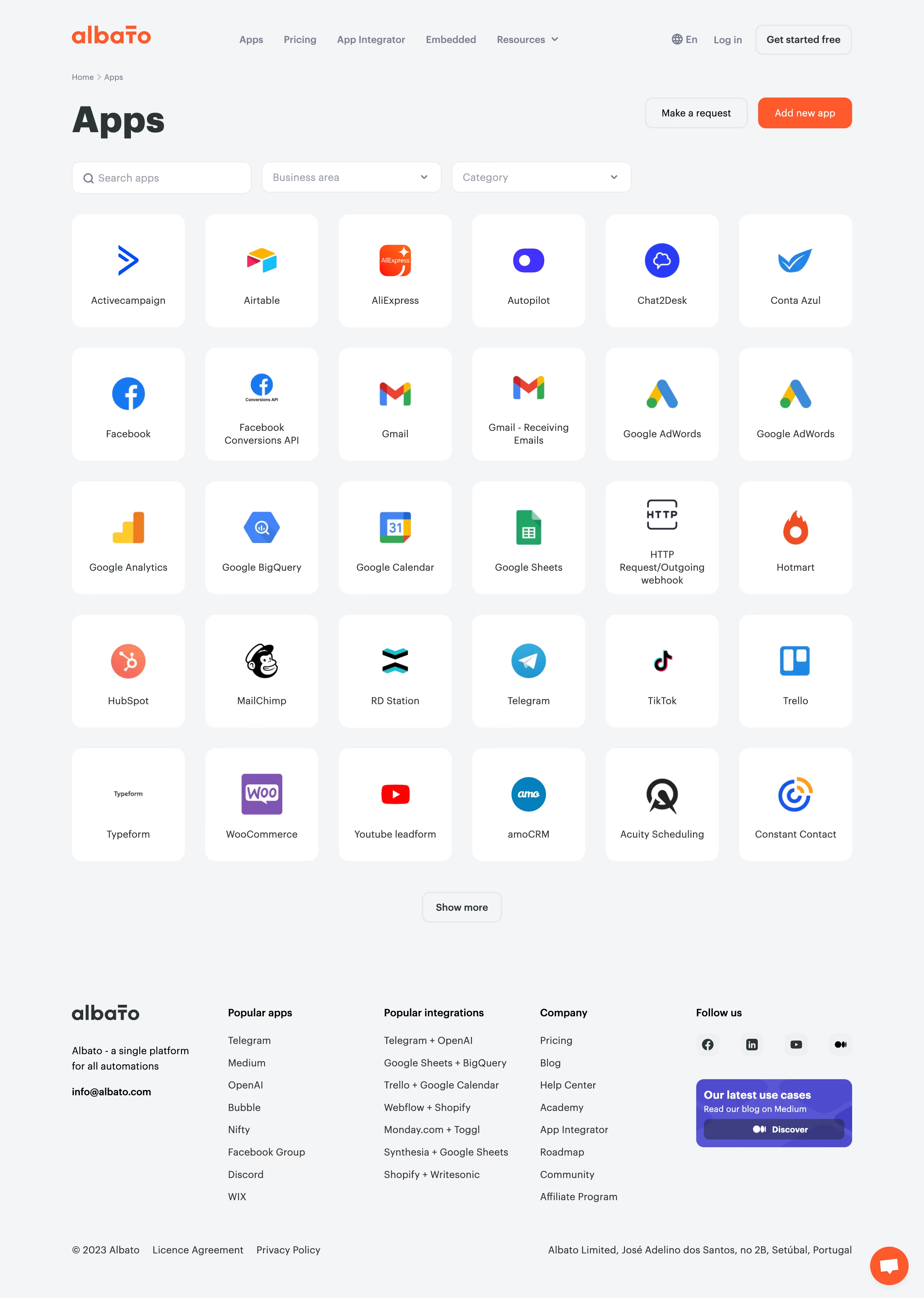
Albato’s Apps page embraces a polished, modern SaaS aesthetic that instantly signals trustworthiness and innovation. The design leans into a minimalist approach, letting colorful accents and intuitive iconography breathe against crisp white space. The vibe is professional yet approachable—inviting both seasoned users and SaaS newcomers.
Layout and Structure
The layout is meticulously structured for effortless scanning: a clear hero section introduces the app integration value proposition, followed by a grid-based gallery of app cards. Each card subtly animates on hover, encouraging exploration. Logical groupings, prominent headings, and sticky navigation ensure visitors can jump seamlessly between app categories or return to the top.
Visual Elements
Eye-catching, custom-designed icons represent each app, contributing playful energy without sacrificing credibility. Subtle micro-interactions—hover shading, animated transitions—add a delightful tactile layer. There’s minimal reliance on stock photos, keeping the visual system harmonious and brand-driven.
Color Palette and Typography
A vibrant medley of pastel accent colors punctuates a foundation of cool blues, lively greens, and warm yellows. Clean, sans-serif typography with distinct weight hierarchies produces clarity and natural reading flow. Text contrast is thoughtfully calibrated for accessibility and visual sharpness.
User Experience Patterns
Navigational elements are persistent and unobtrusive, with sticky filters and search making discovery frictionless. CTAs are bold yet unobtrusive, guiding attention where it’s needed most. Responsive design and rapid loading promote seamless interaction across devices.
Unique or Notable Design Choices
Standout choices include the playful iconography theme, grid zoom-on-hover, and well-executed dark/light color contrasts for accessibility. The result is a lively, credible, and highly usable gallery page—an inspiring template for SaaS designers seeking to balance energy and professionalism.