
Thank you! Your submission has been received!
Oops! Something went wrong while submitting the form.
Get SaaSFrame Pro
Monthly
$18
Quarterly
$48
Yearly
$180
Upgrade to access this feature
Browse all screens & flows
Filter and search screens & flows
Access Figma files
Access mobile versions
Bookmark screens & flows
Join now
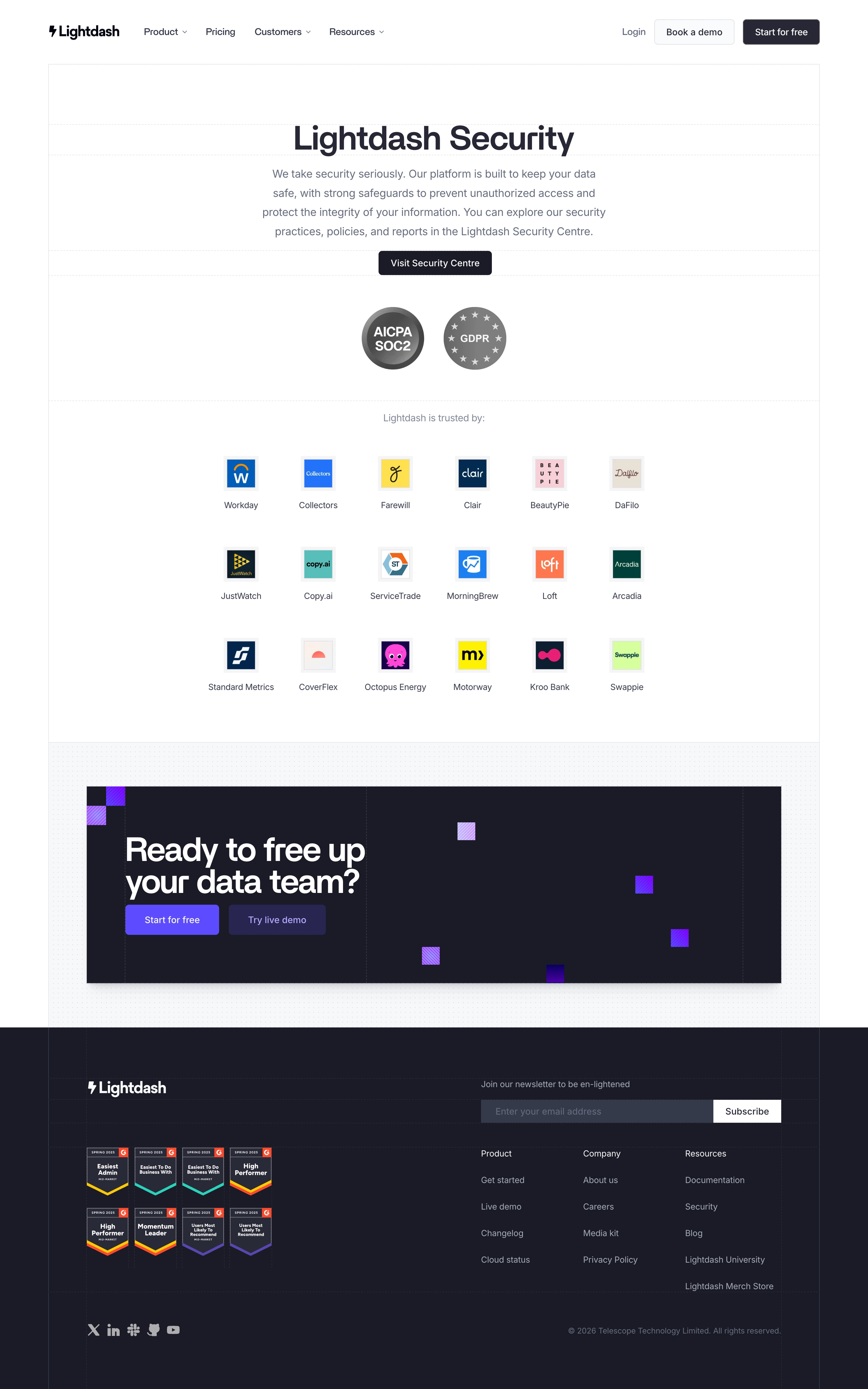

Lightdash Security Page

Lightdash
The open-source AI native BI platform
Designed by


Bookmark
Bookmark

Design with AI
Thank you! Your submission has been received!
Oops! Something went wrong while submitting the form.
# Design from Reference: Lightdash Security Page
Create an original, high-fidelity visual design inspired by the reference. Prioritize composition, typography, colors, spacing, and component styling over technical implementation.
## Reference
- **Product:** Lightdash
- **Category:** Security Page
- **Screenshot:** https://cdn.prod.website-files.com/5e9dc792e1210c5325f7ebbc/6acad336d5603a17eba5b5a2_6acad0be3003494aa6937aa6_cms-9fdf9aae4740d0eefbfa8b13.webp
Analyze the screenshot first. If inaccessible, request it rather than guessing.
## Content
{{content.instructions}}
{{content.data}}
Preserve essential messaging and factual accuracy. Adapt structure and copy length for visual balance; never invent product claims.
## Visual Design
### Overall aesthetic
- **Style:** Restrained security marketing page with white editorial sections, dark navy typography and a contrasting near-black conversion block/footer. Fine grid rules and small purple patterned squares add a technical character.
- **Scale:** The source is 2880 × 4606px. Dimensions below estimate a 1440px-wide CSS layout at 2× capture scale.
### Page composition
- **Header:** A centered approximately 1280px container holds the Lightdash logo and four navigation groups at left; Login, an outlined demo button and a dark free-start button align right.
- **Hero:** A bordered white main container begins beneath the header. Centered security title, four-line explanatory copy and a dark Security Centre button lead to two grayscale compliance badges.
- **Trust grid:** Eighteen customer marks form six columns and three rows, each a small square logo above a company label. Generous vertical space separates the rows.
- **Conversion and footer:** A dotted pale section frames a wide dark CTA panel. Beneath it, a full-width dark footer contains the logo, eight review badges, newsletter form, three link columns, social icons and copyright.
### Information hierarchy
- **Trust sequence:** The page moves from the security commitment to the external security destination, compliance marks, customer proof and a free-start invitation.
- **CTA hierarchy:** The lower panel uses a large two-line heading with adjacent Start for free and Try live demo buttons; decorative squares occupy the empty right half.
- **Footer grouping:** Newsletter signup sits over Product, Company and Resources links, while the brand and review badges occupy the left half.
### Typography
- **Family:** Compact modern sans-serif, with exact font identity unverified.
- **Hero:** Estimated title 54–58px bold with tight tracking; centered body about 18px/32px and a maximum width near 590px. Button labels are approximately 16px.
- **Secondary roles:** Customer labels around 14px; lower CTA heading 52–56px bold with tightly stacked lines. Footer headings/body are around 14px, with subdued secondary text.
### Colors & surfaces
- **Sampled palette:** ICC-aware sRGB samples include white #FFFFFF, dark navy #1A1B25, pale surface #F7F8FA and secondary dark tones #292A38, #36394A and #272835.
- **Accents:** Vivid violet and lavender visually distinguish the lower CTA buttons and striped decorative squares; customer logos retain their own brand colors.
- **Surface detail:** Very light horizontal dotted rules organize hero bands. The CTA wrapper uses a tiny repeated dot pattern and the dark footer retains faint grid lines.
### Components
- **Compliance and logos:** Two approximately 104px circular grayscale badges are centered together. Customer logos are roughly 56px square including pale frames, with labels beneath.
- **Buttons:** Header actions are around 42px tall with 5–6px corners. The hero button is about 188 × 40px; lower conversion buttons are roughly 156–160 × 50px.
- **Conversion panel:** Approximately 1152 × 326px dark rectangle with a subtle shadow and about 64px internal left padding; colored square motifs range around 28–32px.
- **Newsletter:** A long dark gray email input and contrasting white Subscribe button share one horizontal row. No focused, submitted or dropdown states are shown.
### Visual rhythm
- **Spacing:** Broad blank bands isolate the hero, badge row and customer grid. Logo rows repeat on roughly 150px centers; the CTA wrapper adds around 72px of top/bottom breathing room.
- **Alignment:** The header/main boundary, lower CTA and footer columns follow common vertical guides, while the hero and trust content remain centered.
### Responsive
- **Recommended adaptation:** Only desktop is observed. Collapse navigation, reduce the logo grid to two or three columns and stack the footer groups and newsletter control as needed.
- **CTA:** Keep the heading and actions ahead of the decorative squares, reducing title size and panel padding on narrow screens.
### Adaptation guidance
- **Preserve:** Retain the evidence-first sequence, quiet compliance presentation, structured customer grid and high-contrast lower conversion band.
- **Use truthful proof:** Replace customer marks and certifications only with verified equivalents. Adapt button destinations and copy to real product actions without adding unsupported security claims.
Use this context to reproduce the reference's visual language: layout, typography, colors, spacing, borders, radii, and distinctive elements. The screenshot takes priority if descriptions conflict.
## Direction
{{preferences.fidelityInstructions}}
## Output
{{output.instructions}}
Deliver a polished, cohesive design with precise alignment, hierarchy, and spacing. Produce the requested visual artifact, not just a description. If unsupported, explain the limitation.


Category
Patterns
No items found.
Tech Stack

Added on
July 15, 2026
Similar screens



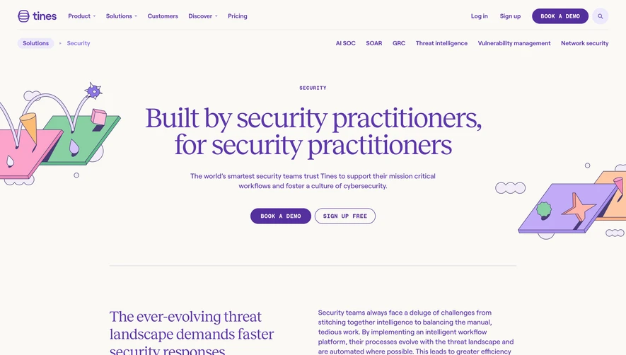

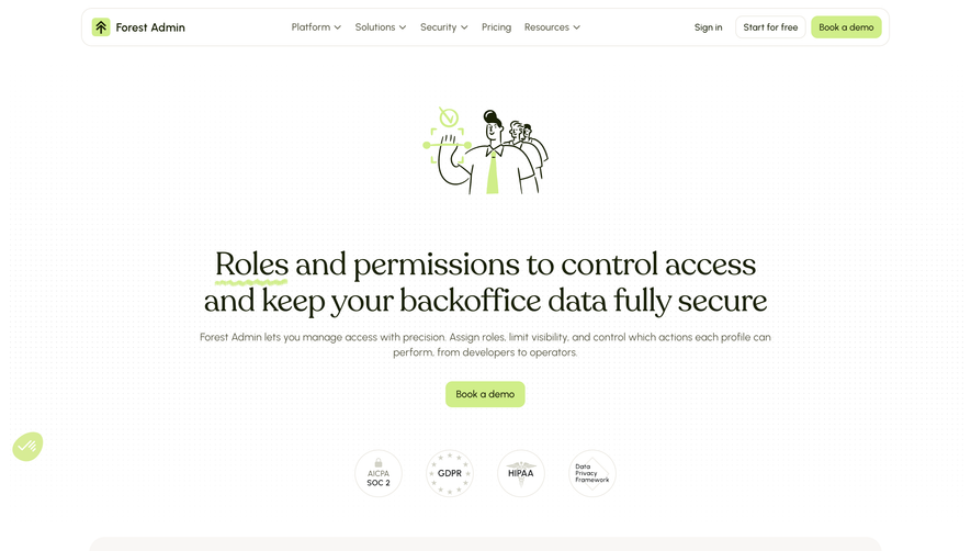

Upgrade to SaaSFrame Pro now to see similar examples.
Monthly
$18 /month
Billed $18 monthly
Browse all screens & flows
Filter and search screens & flows
Search text in screenshots
Access Figma files
Access mobile versions
Join now
Quarterly
$16 /month
Billed $48 quarterly
Browse all screens & flows
Filter and search screens & flows
Search text in screenshots
Access Figma files
Access mobile versions
Join now
Yearly
$15 /month
Billed $180 yearly
Browse all screens & flows
Filter and search screens & flows
Search text in screenshots
Access Figma files
Access mobile versions
Join now