Design with AI
Generate a new design based on this screen using your own content.
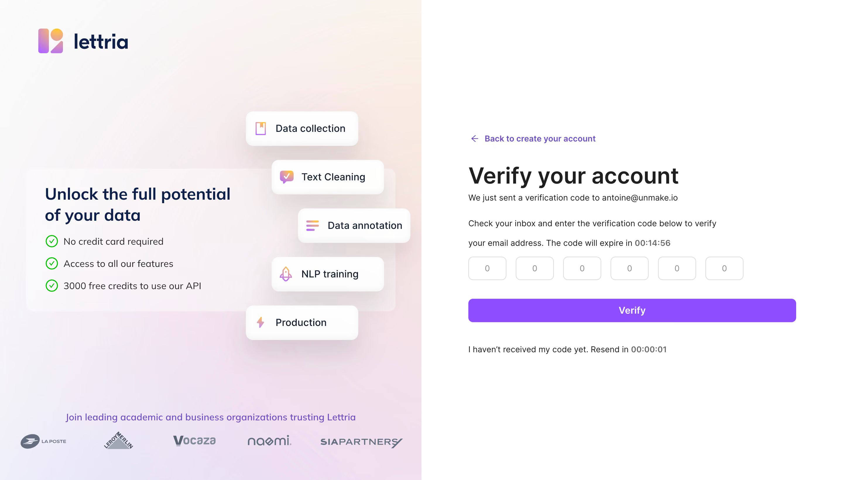
# Design from Reference: Lettria Verification
Create an original, high-fidelity visual design inspired by the reference. Prioritize composition, typography, colors, spacing, and component styling over technical implementation.
## Reference
- **Product:** Lettria
- **Category:** Verification
- **Screenshot:** https://cdn.prod.website-files.com/5e9dc792e1210c5325f7ebbc/6acb6e952837b9f3168fb34f_6acb6c9f994832179b5743e0_cms-945bdd608947df3d52354afb.webp
Analyze the screenshot first. If inaccessible, request it rather than guessing.
## Content
{{content.instructions}}
{{content.data}}
Preserve essential messaging and factual accuracy. Adapt structure and copy length for visual balance; never invent product claims.
## Visual Design
### Overall aesthetic
- **Character:** Split verification screen with a soft pastel promotional panel and a crisp white code-entry form.
### Page composition
- **Canvas:** 2880 × 1642 screenshot px; CSS estimates assume 2× capture.
- **Structure:** Equal-width halves. Left contains logo, translucent benefit card, five floating feature labels and customer logos; right contains back link, heading, instructions, six code boxes, Verify button and resend status.
### Information hierarchy
- **Priority:** Verify your account heading and six-digit input row anchor the task; left-side feature pills add supporting brand context.
### Typography
- **Family:** Neutral sans serif, exact family unverified.
- **Scale:** Estimated CSS heading 36–38 px, promotional heading 28 px, body 14–16 px and action 16 px bold.
### Colors & surfaces
- **Sampled palette:** White #FFFFFF and saturated purple #8E4DFF.
- **Surfaces:** Left blends pale pink, peach and lavender; floating white labels have broad soft shadows. Dark navy brand text contrasts with green outlined benefit checks.
### Components
- **Code entry:** Six equal outlined rounded boxes with generous spacing; full-width purple Verify button below.
- **Promotional labels:** Small gradient icons, white rounded rectangles and staggered alignment beside a translucent benefit panel.
- **Feedback:** Expiry and resend countdowns use bold gray numerals within instructional copy.
### Visual rhythm
- **Spacing:** Approximately 32–40 CSS px between heading/instructions/input/action groups; centered vertical form position leaves large white margins.
### Responsive
- **Observed:** Desktop only.
- **Adaptation:** Prioritize the code form on mobile and move promotional content below or reduce it. Keep all six code inputs reachable and readable.
### Adaptation guidance
- **Preserve:** Clear verification hierarchy, pastel depth and wide purple action.
- **Replace:** Use actual delivery destination, expiry behavior and permitted product claims; do not reuse reference addresses or timers.
Use this context to reproduce the reference's visual language: layout, typography, colors, spacing, borders, radii, and distinctive elements. The screenshot takes priority if descriptions conflict.
## Direction
{{preferences.fidelityInstructions}}
## Output
{{output.instructions}}
Deliver a polished, cohesive design with precise alignment, hierarchy, and spacing. Produce the requested visual artifact, not just a description. If unsupported, explain the limitation.