
Thank you! Your submission has been received!
Oops! Something went wrong while submitting the form.
Get SaaSFrame Pro
Monthly
$18
Quarterly
$48
Yearly
$180
Upgrade to access this feature
Browse all screens & flows
Filter and search screens & flows
Access Figma files
Access mobile versions
Bookmark screens & flows
Join now

Lattice Thank You Page

Lattice
People success platform
Designed by
No items found.

Bookmark
Bookmark

Design with AI
Thank you! Your submission has been received!
Oops! Something went wrong while submitting the form.
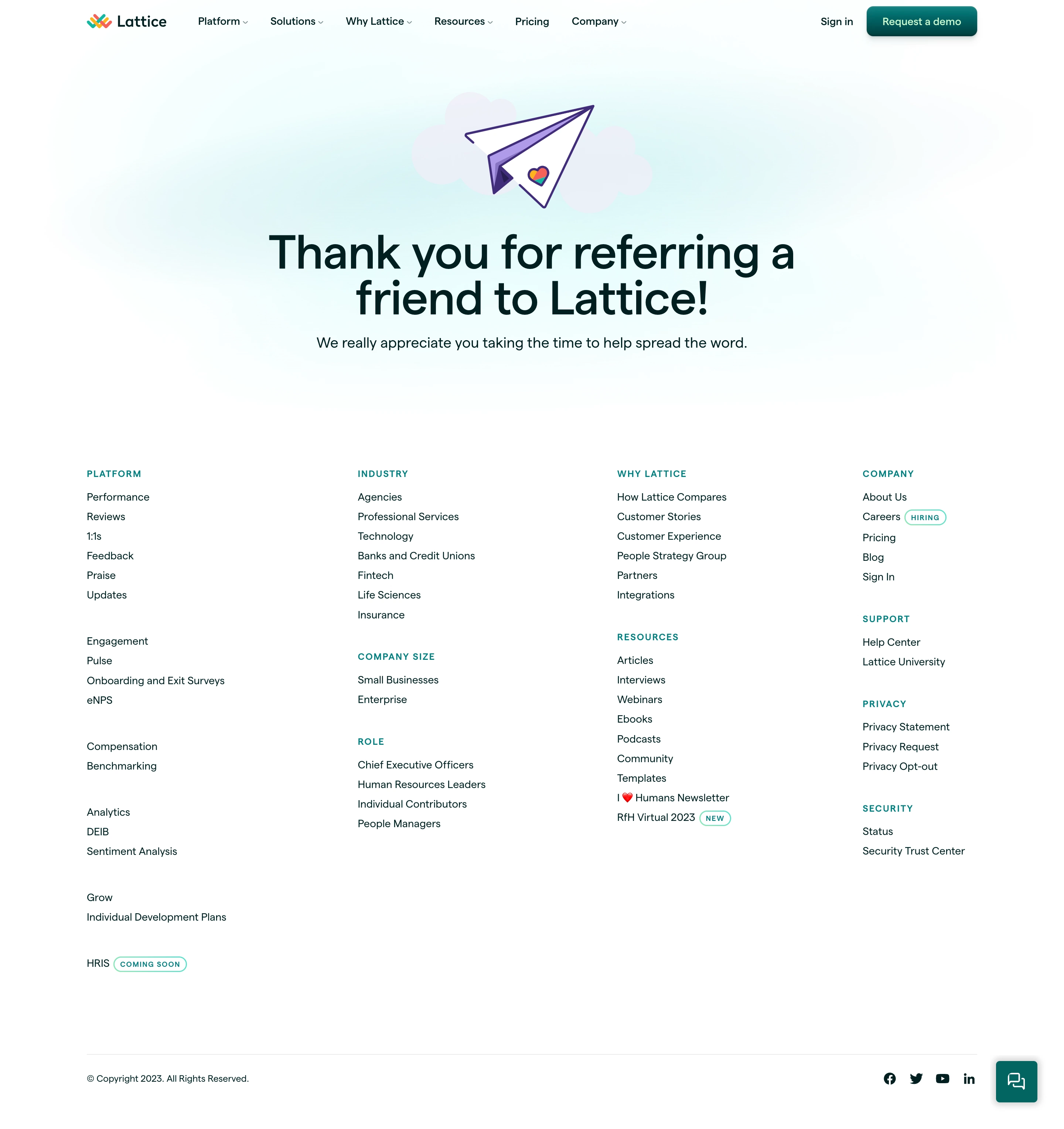
# Design from Reference: Lattice Thank You Page
Create an original, high-fidelity visual design inspired by the reference. Prioritize composition, typography, colors, spacing, and component styling over technical implementation.
## Reference
- **Product:** Lattice
- **Category:** Thank You Page
- **Screenshot:** https://cdn.prod.website-files.com/5e9dc792e1210c5325f7ebbc/6acad849b3daa04f54276321_6acad7ce5a5fdf4c30319820_cms-0fac066c0eb4fb11002a868b.webp
Analyze the screenshot first. If inaccessible, request it rather than guessing.
## Content
{{content.instructions}}
{{content.data}}
Preserve essential messaging and factual accuracy. Adapt structure and copy length for visual balance; never invent product claims.
## Visual Design
### Overall aesthetic
- **Style:** Friendly referral-confirmation page with a centered thank-you message, light mint atmosphere and an extensive white navigation footer.
- **Character:** Dark green-black typography, teal actions and small colorful brand details. A playful paper-plane illustration gives the confirmation a human tone.
- **Surface treatment:** Flat white sections with a diffuse mint glow behind the hero. Cards and heavy borders are largely absent.
### Page composition
- **Capture scale:** 2880 × 3056 image px. CSS estimates assume an unverified 2× capture, approximately 1440 × 1528 CSS px.
- **Header:** A centered container roughly 1200 px wide holds the multicolor Lattice logo left, six navigation groups across the middle and sign-in/demo controls right.
- **Confirmation hero:** A paper plane and pale cloud shapes are centered above a two-line headline. A single supporting sentence sits beneath.
- **Hero background:** A broad, soft mint/cyan glow fades into white around the illustration and message without a hard section edge.
- **Footer transition:** Substantial blank space separates the confirmation sentence from four widely spaced navigation columns.
- **Footer columns:** Platform occupies the first column; Industry, Company Size and Role stack in the second; Why Lattice and Resources stack in the third; Company, Support, Privacy and Security stack in the fourth.
- **Bottom row:** A fine horizontal divider precedes copyright at left and four compact social links at right.
- **Support control:** A teal square chat launcher floats near the lower-right corner, separate from the social icons.
### Information hierarchy
- **Primary message:** The large thank-you headline confirms the referral action; the supporting sentence expresses appreciation without another main task.
- **Illustration role:** Paper plane and small heart motif reinforce the message but remain secondary to the text.
- **Header action:** Request a demo is the strongest visible button; sign-in is a plain text route.
- **Footer hierarchy:** Small uppercase teal headings separate link groups, while larger vertical gaps distinguish subcategories.
- **Badges:** Small outlined pills mark hiring, new content and coming-soon status in the footer.
- **Captured state:** No referral form, submission details, reward status or next-step workflow is visible.
### Typography
- **Family:** Clean modern sans serif with gently rounded forms. Exact identity is unverified.
- **Hero headline:** Approximately 60–64 CSS px, semibold around 600, with 62–66 px leading and tight tracking, centered across two lines.
- **Supporting sentence:** Approximately 20 px with 28 px leading, regular weight.
- **Header:** Approximately 14 px, medium weight, with compact dropdown chevrons beside applicable links.
- **Footer labels:** Approximately 12–13 px, uppercase, medium/semibold and modestly tracked.
- **Footer links:** Approximately 14 px with about 27 px row spacing.
- **Badges/legal:** Approximately 10–12 px. All values are visual CSS estimates under the assumed 2× scale.
### Colors & surfaces
- **Canvas:** Sampled sRGB #FFFFFF dominates the page.
- **Primary ink:** Sampled #00201F supplies the dark green-black reference for prominent text.
- **Hero atmosphere:** Very pale cyan/white sampled tones include #F4FEFE and #F3FEFE; these belong to the diffuse hero glow rather than a strongly filled panel.
- **Actions and labels:** Teal appears in the demo button, footer group headings, outlined badges and chat launcher. Its exact saturated value is not established by the dominant-color sample.
- **Illustration:** Purple outlines and folded-paper shading contrast with pale lavender cloud shapes; a small multicolor heart ties into the brand mark.
- **Rules:** Extremely light gray lines separate the bottom legal row without enclosing the footer columns.
### Components
- **Paper-plane illustration:** Approximately 180–200 CSS px wide, centered above the heading, with thick purple linework and a folded triangular form.
- **Demo button:** Compact teal rounded rectangle approximately 150 × 40 px, white label, modest radius and subtle shadow.
- **Navigation groups:** Text labels and tiny downward chevrons, aligned on one horizontal baseline.
- **Footer link groups:** Text-only columns, no cards or vertical dividers, with consistent left alignment.
- **Status pills:** Small teal outlined capsules placed inline beside applicable link text.
- **Social icons:** Compact dark symbols aligned horizontally near the bottom right.
- **Chat launcher:** Approximately 54 px square, teal, small-radius corners, white conversation symbol and soft surrounding shadow.
### Visual rhythm
- **Hero symmetry:** Illustration, headline and supporting sentence share a central axis.
- **Density shift:** The sparse confirmation area transitions into a dense but orderly footer.
- **Column rhythm:** Four broad footer columns maintain consistent alignment while variable group lengths create a natural lower silhouette.
- **Whitespace:** Large vertical separation keeps the referral confirmation from being visually absorbed into the navigation catalogue.
### Responsive
- **Evidence limit:** Only desktop is visible; the following are recommendations.
- **Hero recommendation:** Reduce headline toward 34–42 px and allow natural wrapping with 20–24 px side padding.
- **Navigation recommendation:** Collapse header groups while retaining an accessible account/demo route.
- **Footer recommendation:** Progressively reduce to two columns and then one, or use accessible collapsible groups.
- **Utility recommendation:** Keep chat and social controls clear of legal content and safe-area insets.
- **Touch recommendation:** Increase effective targets for small footer badges and links without shrinking text.
### Adaptation guidance
- **Preserve confirmation clarity:** State the completed action plainly and add only a concise supporting sentence.
- **Use accurate context:** Replace referral language with the actual target action; do not imply rewards or follow-up steps absent from the workflow.
- **Retain warmth:** Use a small coherent illustration and soft background light rather than a dense promotional hero.
- **Adapt navigation volume:** Include only genuine target-site destinations and status badges.
- **Accessibility recommendation:** Announce confirmation meaningfully, provide descriptive links and label support controls. These behaviors cannot be verified from the static screenshot.
Use this context to reproduce the reference's visual language: layout, typography, colors, spacing, borders, radii, and distinctive elements. The screenshot takes priority if descriptions conflict.
## Direction
{{preferences.fidelityInstructions}}
## Output
{{output.instructions}}
Deliver a polished, cohesive design with precise alignment, hierarchy, and spacing. Produce the requested visual artifact, not just a description. If unsupported, explain the limitation.


Category
Patterns
No items found.
Tech Stack




Added on
October 25, 2023
Similar screens






Upgrade to SaaSFrame Pro now to see similar examples.
Monthly
$18 /month
Billed $18 monthly
Browse all screens & flows
Filter and search screens & flows
Search text in screenshots
Access Figma files
Access mobile versions
Join now
Quarterly
$16 /month
Billed $48 quarterly
Browse all screens & flows
Filter and search screens & flows
Search text in screenshots
Access Figma files
Access mobile versions
Join now
Yearly
$15 /month
Billed $180 yearly
Browse all screens & flows
Filter and search screens & flows
Search text in screenshots
Access Figma files
Access mobile versions
Join now