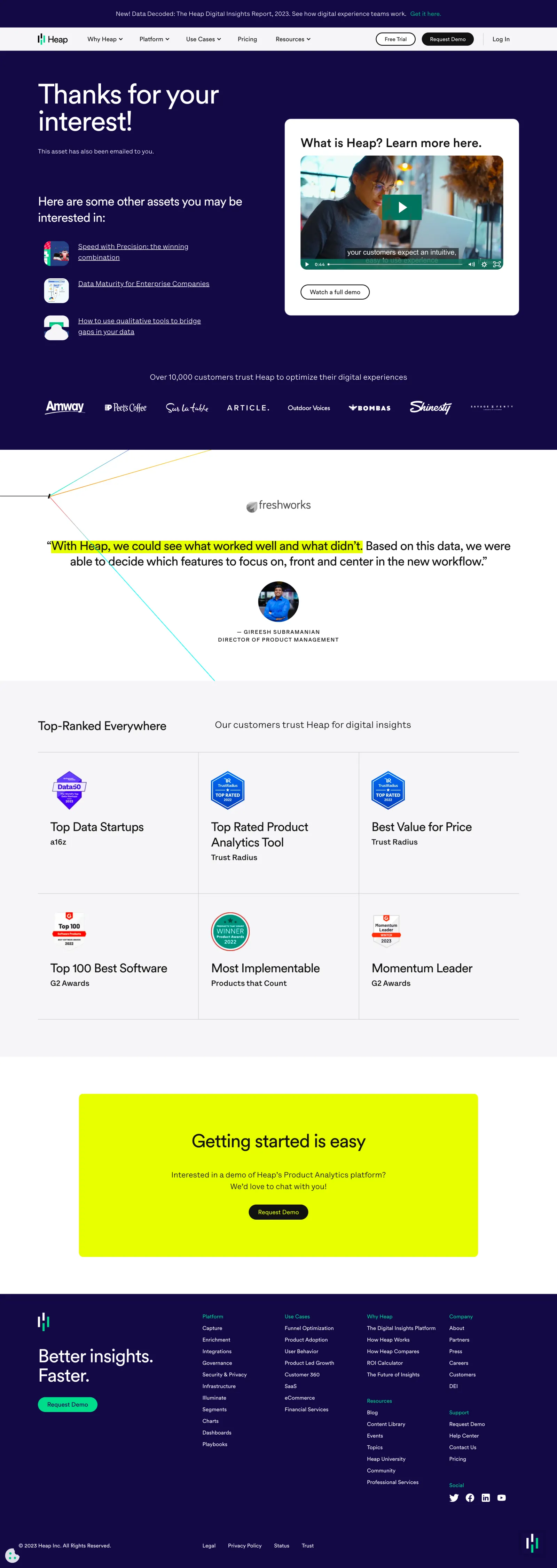
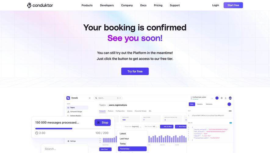
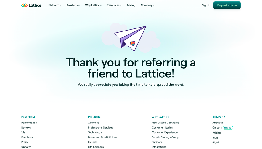
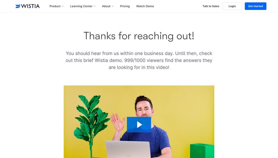
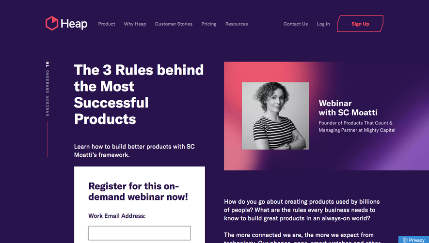
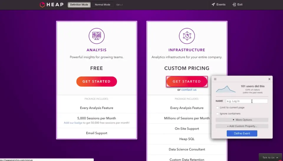
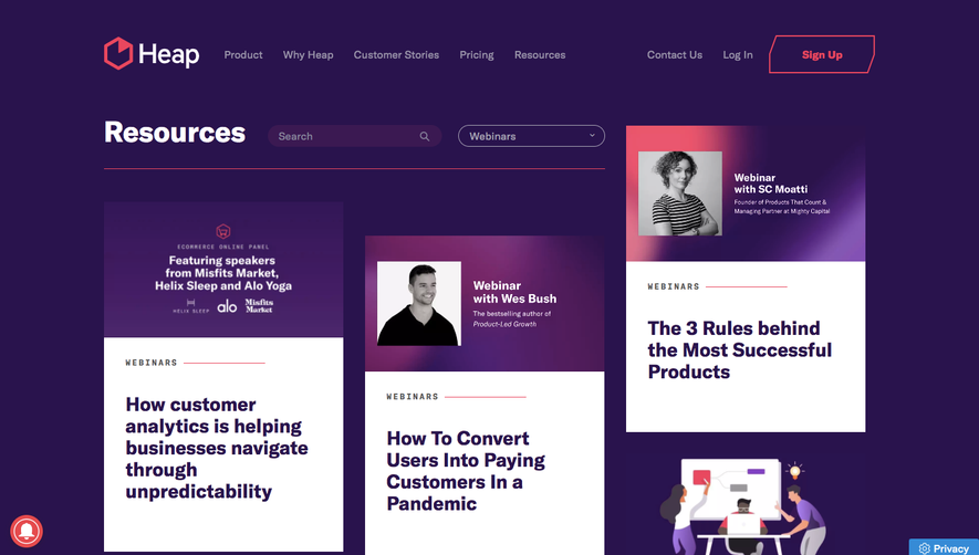
``` Heap’s resource thank-you page embraces a crisp, ultra-modern aesthetic that radiates professionalism. Its minimalist design ensures focus remains on the core message, with ample whitespace supporting a seamless, clutter-free experience. Nothing distracts from the user’s journey, creating a sense of trust and polish. ```html
Layout and Structure
``` The layout is intentionally concise, beginning with a succinct hero section that confirms a successful action. Supportive copy and a bold main headline reinforce value, while a prominent secondary call-to-action (“See Heap in Action”) draws attention below. A well-structured footer sits neatly at the bottom, rounding out the user journey without extraneous sections. ```html
Visual Elements
``` Visual storytelling is subtle yet effective. A custom illustration or digital graphic acts as the visual anchor, adding character without dominating the screen. Icons are thoughtfully restrained, used only where they clarify intent. The absence of heavy photography or animations maintains a lightweight feel, accelerating load time and interaction. ```html
Color Palette and Typography
``` Vibrant yet tasteful, the color palette blends deep blue and purple gradients with energizing accents of magenta and white. Typography is smartly chosen: modern sans-serifs create a clear hierarchy, with large, impactful headings and highly readable body text, guiding the eye intuitively. ```html
User Experience Patterns
``` UX is frictionless—navigation is limited, focusing attention on conversion. CTAs are visually distinct and action-oriented, while the thank-you message offers reassurance. Interactive elements, like buttons, have satisfying hover states. The slim form and logical flow underscore a user-friendly ethos. ```html
Unique and Notable Design Choices
``` The decision to keep this page focused, visually restrained, and streamlined is a masterclass in SaaS thank-you page design. The inviting color gradients and signature graphics signal brand consistency, while concise messaging keeps users engaged and confident in their next step. The overall tone is clear: innovative yet approachable, with trust built through clarity and restraint.
 SaaSFrame