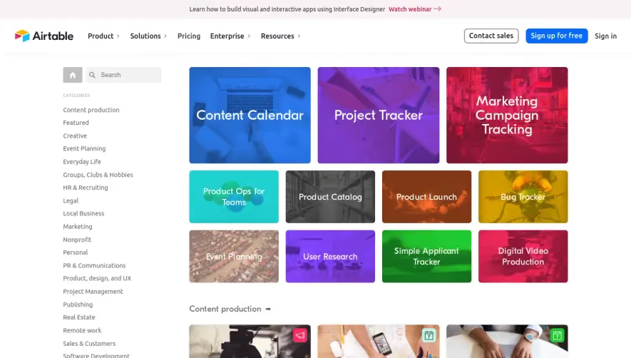
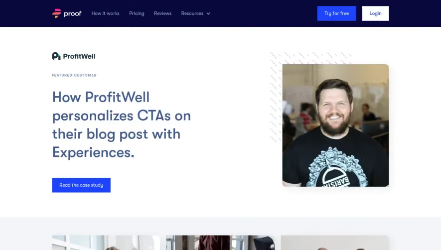
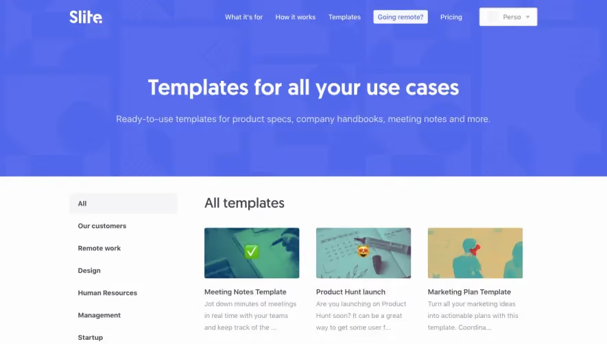
Generate a new design based on this screen using your own content.
Thank you! Your submission has been received!
Oops! Something went wrong while submitting the form.
# Design from Reference: Lattice Templates Library
Create an original, high-fidelity visual design inspired by the reference. Prioritize composition, typography, colors, spacing, and component styling over technical implementation.
## Reference
- **Product:** Lattice
- **Category:** Templates Library
- **Screenshot:** https://cdn.prod.website-files.com/5e9dc792e1210c5325f7ebbc/6acb6c145391d62536b671e9_6acb6a9dd8a653ae3d589911_cms-cec1ae4315710612369f9190.webp
Analyze the screenshot first. If inaccessible, request it rather than guessing.
## Content
{{content.instructions}}
{{content.data}}
Preserve essential messaging and factual accuracy. Adapt structure and copy length for visual balance; never invent product claims.
## Visual Design
Use this context to reproduce the reference's visual language: layout, typography, colors, spacing, borders, radii, and distinctive elements. The screenshot takes priority if descriptions conflict.
## Direction
{{preferences.fidelityInstructions}}
## Output
{{output.instructions}}
Deliver a polished, cohesive design with precise alignment, hierarchy, and spacing. Produce the requested visual artifact, not just a description. If unsupported, explain the limitation.
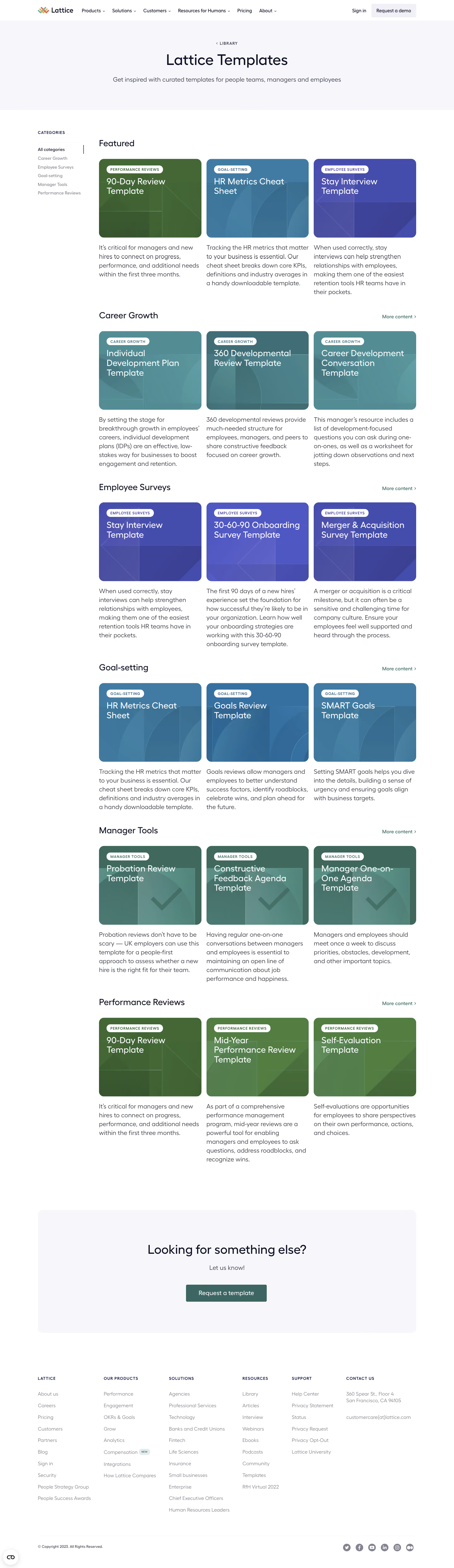
Lattice’s Templates page embodies a clean, modern, and professional aesthetic. The interface is minimalist yet vibrant, creating a sense of clarity and efficiency. Generous white space combined with pops of color provides a balanced, inviting atmosphere that feels trustworthy and conducive to productivity.
Layout and Structure
The page opens with a bold hero section featuring a short explanatory headline, concise description, and a primary call-to-action that directs users to browse templates. Below, a grid-based layout organizes template categories and individual templates for quick scanning. Absent are overpowering distractions; the focus remains on showcasing offerings. The footer anchors the experience with essential navigation links and brand consistency.
Visual Elements
Vector illustrations and subtle iconography add visual interest without overwhelming users. This visual language is both friendly and professional, paired with soft drop shadows and gently rounded corners that echo the site’s approachable tone. Thumbnail imagery previews template contents for at-a-glance comparison.
Color Palette and Typography
A restrained palette of cool blues, gentle grays, and strategic highlights delivers energy without chaos. Primary actions use a distinctive color for high visibility. Clean sans-serif fonts support easy reading and a harmonious hierarchy, using weight and size to distinguish headings, descriptions, and CTAs.
User Experience Patterns
Navigation is frictionless—a sticky header keeps menus accessible, and CTAs are prominent yet never intrusive. Filtering and search tools help users localize content swiftly. Scroll interactions feel seamless, with smooth transitions and load states.
Unique or Notable Design Choices
Unique touches include subtle micro-animations on hover, clear template previews, and a layout that adjusts elegantly to any device size. The site exudes confidence and warmth—a blend of expert-driven utility and approachable design ripe for SaaS inspiration.