Overall Style and Aesthetic
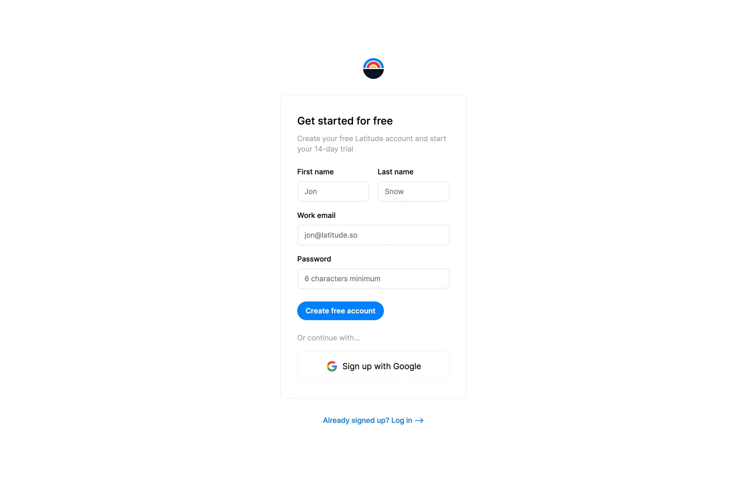
Latitude’s sign-up page embodies a crisp, minimalist aesthetic that exudes modernity and professionalism. The spacious composition, subtle shadows, and generous white space lend the interface a sense of calm clarity—ideal for fostering user trust and focus during the onboarding moment. Everything is pared down to essentials, creating an environment that feels approachable and straightforward, with no visual clutter to distract from the primary action. Layout and Structure
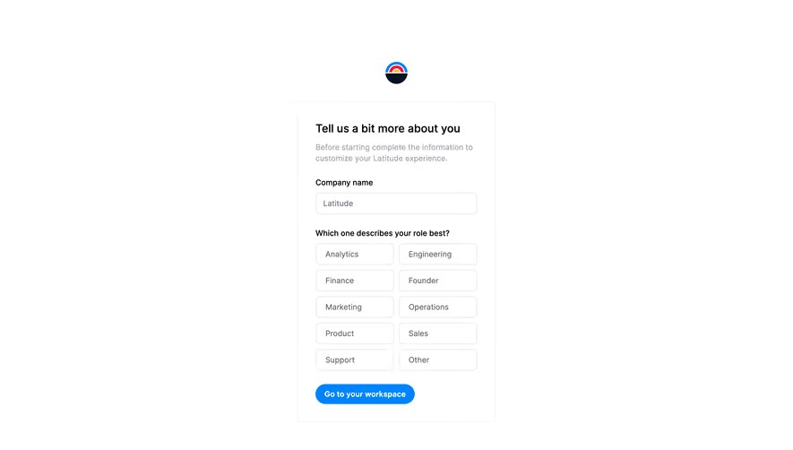
The structure centers around a vertically-aligned form, showcased as the focal point on the page. There are no extraneous hero images, marketing content, or feature banners—just a concise, user-friendly registration panel. Core input fields for name, email, and password are prioritized for efficiency. Supplementary options, such as a social sign-up button and a call to log in for existing users, are presented as supportive alternatives rather than distractions. Visual Elements
Visuals are subtle but purposeful. Clean borders, gentle shadowing on UI cards, and a soft logo mark the only accents, guiding attention without crowding the interface. There are no illustrations, animations, or photography, further underlining the commitment to a distraction-free experience. Color Palette and Typography
A restrained color palette—pure whites, neutral grays, and strategic highlights in blues—frames the content while underscoring interactable elements (such as CTAs and active fields). Typography is modern and sans-serif, ensuring maximum readability, with a clear hierarchy: headings stand out confidently above understated field labels and supportive body text. User Experience Patterns
Navigation is reduced to essentials, streamlining the journey directly into the SaaS platform. The call-to-action button is visually prominent, augmented by clear labels and unobtrusive error states. The concise structure enables quick scanning and rapid completion—active design choices for an effortless sign-up. Unique or Notable Design Choices
Latitude’s sign-up page stands out by practicing restraint—a testament to the idea that sometimes less is more. The commitment to minimalism, combined with purposeful spacing and clear affordances, establishes an experience that feels both innovative and thoughtfully considered. The tone communicates trustworthiness and modernity, perfectly aligning with contemporary SaaS expectations.