Generate a new design based on this screen using your own content.
Thank you! Your submission has been received!
Oops! Something went wrong while submitting the form.
# Design from Reference: Koyeb Integrations Page
Create an original, high-fidelity visual design inspired by the reference. Prioritize composition, typography, colors, spacing, and component styling over technical implementation.
## Reference
- **Product:** Koyeb
- **Category:** Integrations Page
- **Screenshot:** https://cdn.prod.website-files.com/5e9dc792e1210c5325f7ebbc/6acad12cb2165b6c7fffacf9_6acad0b75a5fdf4c302f6df8_cms-9977eff65fac581ffa859039.webp
Analyze the screenshot first. If inaccessible, request it rather than guessing.
## Content
{{content.instructions}}
{{content.data}}
Preserve essential messaging and factual accuracy. Adapt structure and copy length for visual balance; never invent product claims.
## Visual Design
Use this context to reproduce the reference's visual language: layout, typography, colors, spacing, borders, radii, and distinctive elements. The screenshot takes priority if descriptions conflict.
## Direction
{{preferences.fidelityInstructions}}
## Output
{{output.instructions}}
Deliver a polished, cohesive design with precise alignment, hierarchy, and spacing. Produce the requested visual artifact, not just a description. If unsupported, explain the limitation.
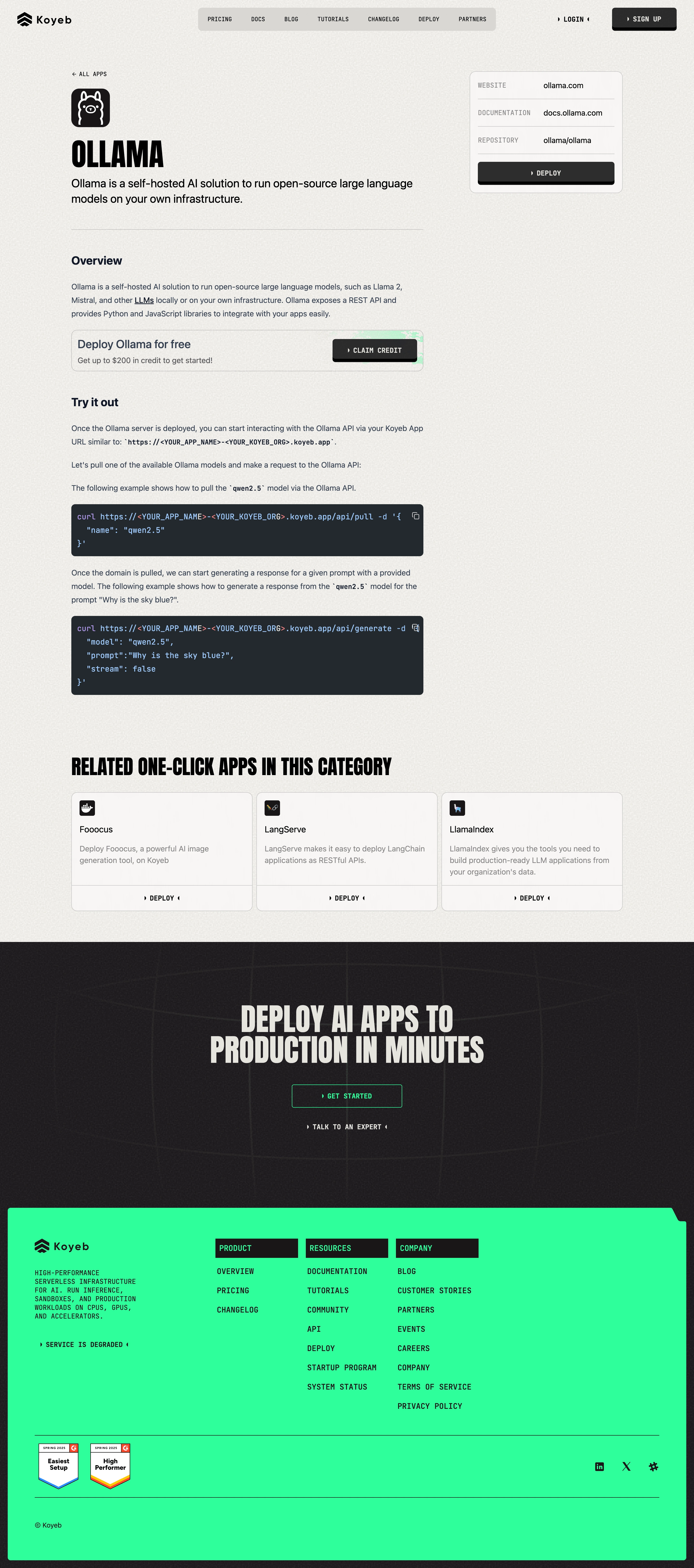
The typography here is doing all the heavy lifting. Koyeb goes full monospace across the entire page, from the navigation to the headings to the body copy. It gives the whole thing a developer-tool feel that's completely on brand for a serverless platform. The "OLLAMA" heading is bold and blocky, sitting right under a little robot icon. No fluff.
Structured Without Feeling Rigid
The layout is clean and scannable. You get the product info card pinned to the right with website, docs, and repo links plus a dark "DEPLOY" button that pops against the light beige background. Code snippets sit in dark rounded containers that break up the page and immediately signal "this is technical." The related apps section at the bottom uses simple card components with consistent deploy CTAs.
What Makes It Work
That warm off-white background paired with the monospace type and minimal green accents feels distinct. Most dev platforms go dark mode by default. This one doesn't, and it stands out because of it. The big "DEPLOY AI APPS TO PRODUCTION IN MINUTES" banner near the footer hits hard with oversized italic type.