.webp)

Supabase Integrations Page

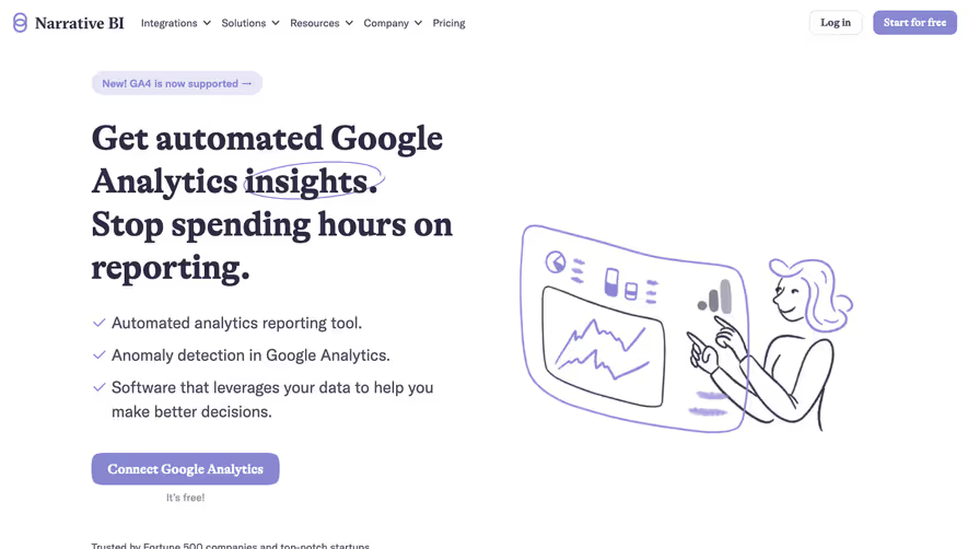
Supabase
The Open Source Firebase Alternative
Designed by
No items found.
Category
Patterns
Tech Stack
No items found.
Added on
August 5, 2023
No items found.

Upgrade to SaaSFrame Pro now to see similar examples.
Pay by invoice
Multi-annual billing
Compliance process
No automatic renewal
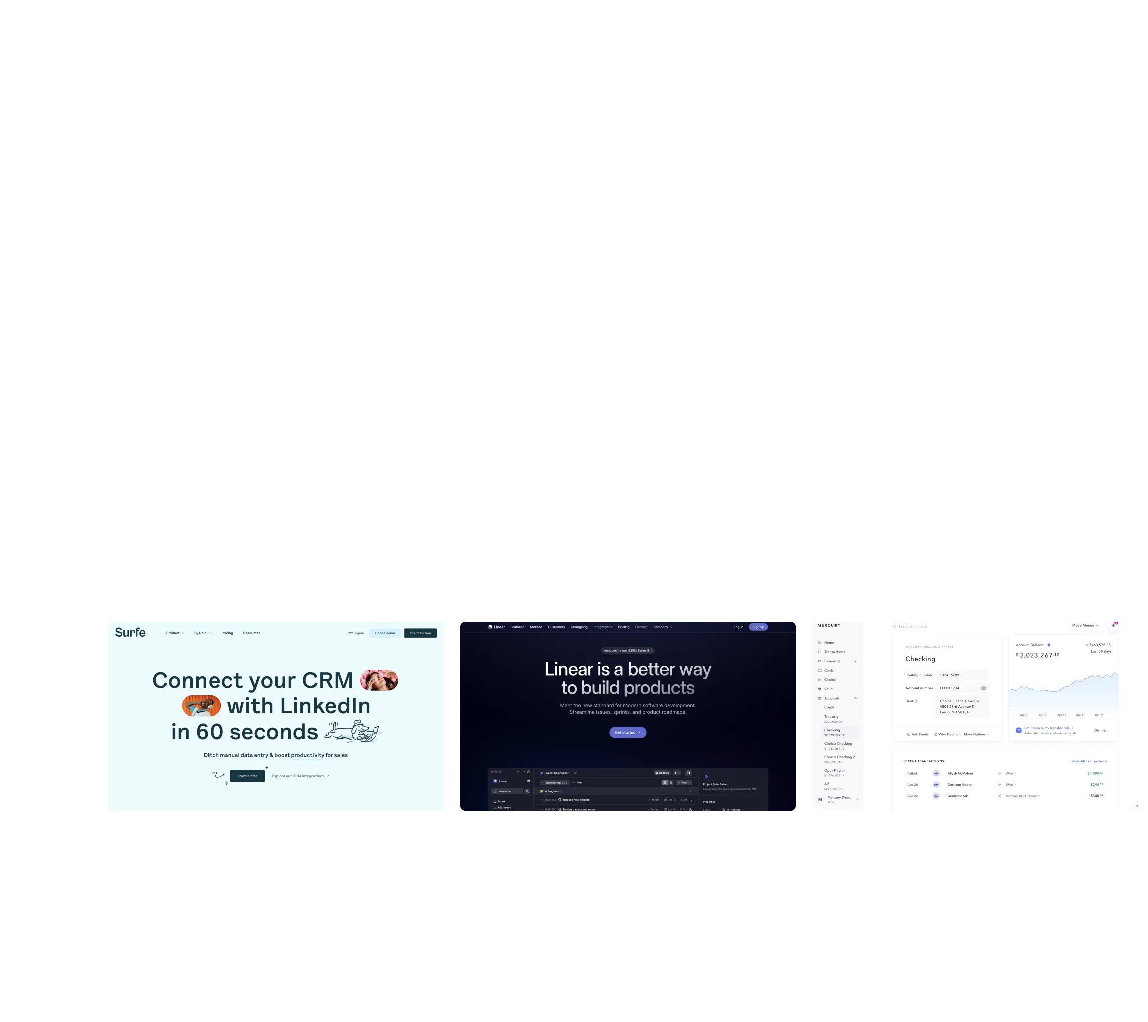
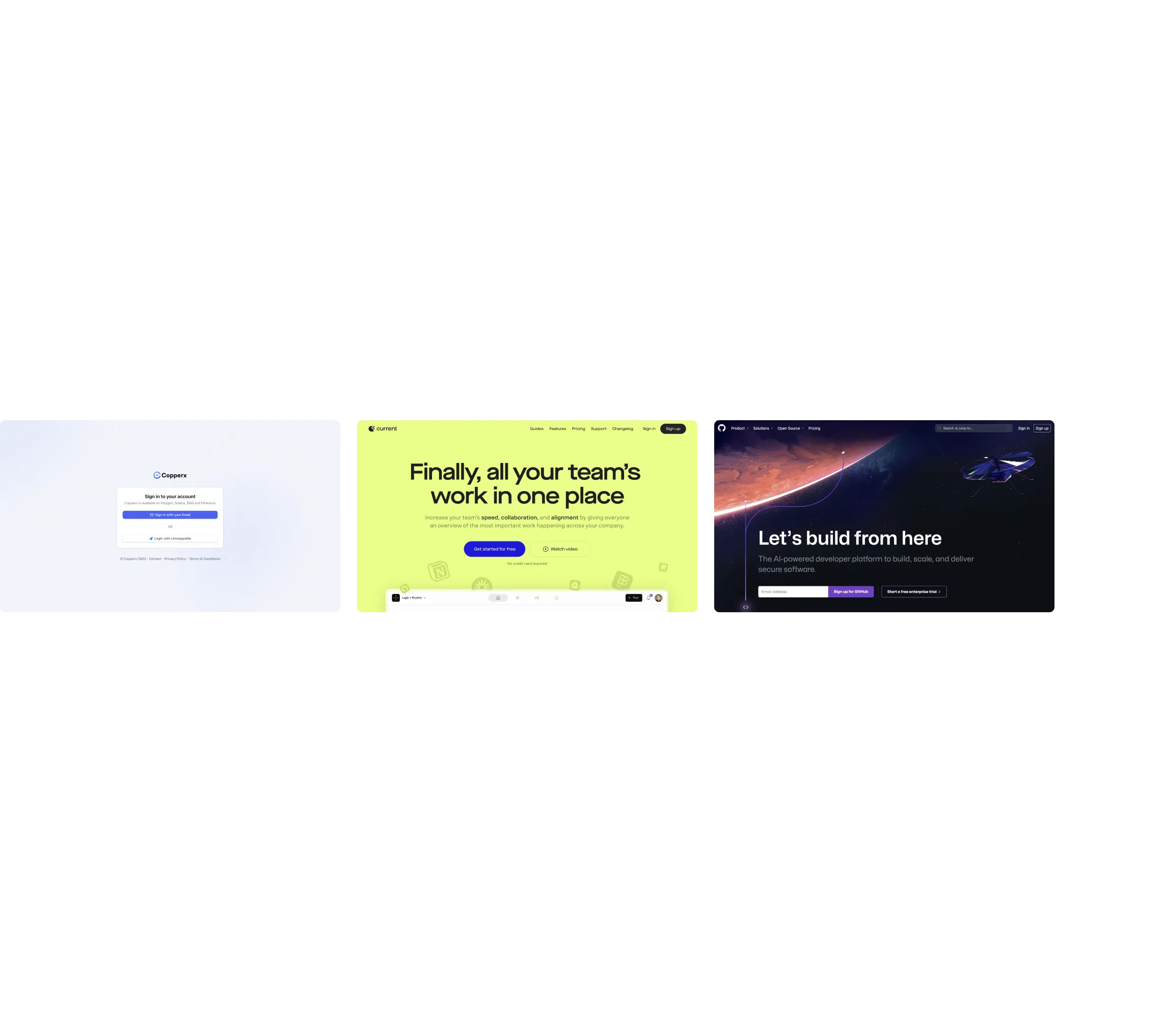
Biggest SaaS library.
Browse website pages, product interfaces and emails from a growing library of hundreds of SaaS.

.webp)


.webp)

Desktop & mobile versions.
Switch from desktop to mobile versions to see how the best designers make websites responsive.

Access the Figma files.
You like a design? Download the Figma file of any website page you see on SaaSFrame.


Advanced filtering.
Use filters to find the design or copywriting inspiration that you need in seconds.
Thank you! Your submission has been received!
Oops! Something went wrong while submitting the form.
Let it flow.
Discover the user journey of the best SaaS with interfaces organized in flows.
Save design inspirations.
Bookmark screens and flows so you can find them any time you need it.
⌘
B
BOOKMARK DESIGN
Start your design
research
research

How do you process payment?
SaaSFrame subscriptions are sold on Lemon Squeezy, a secured online selling platform for creators.
What about future updates and versions?
SaaSFrame gets updated all the time! Every new update and version will immediately be made available to all SaaSFrame users.
Can you send me an invoice?
You can generate an invoice on your Lemon Squeezy portal once you purchased SaaSFrame. You will find the link in the order confirmation email.
How can I cancel my membership subscription?
You can cancel your membership subscription at any moment on your profile page.
Can I get a refund?
If you're not satisfied, you can ask for a refund within 7 days. Just send me an email at antoine[at]unmake[dot]io
I have another question.
You can send me an email at antoine[at]unmake[dot]io, I'll be happy to help with any questions.
No items found.