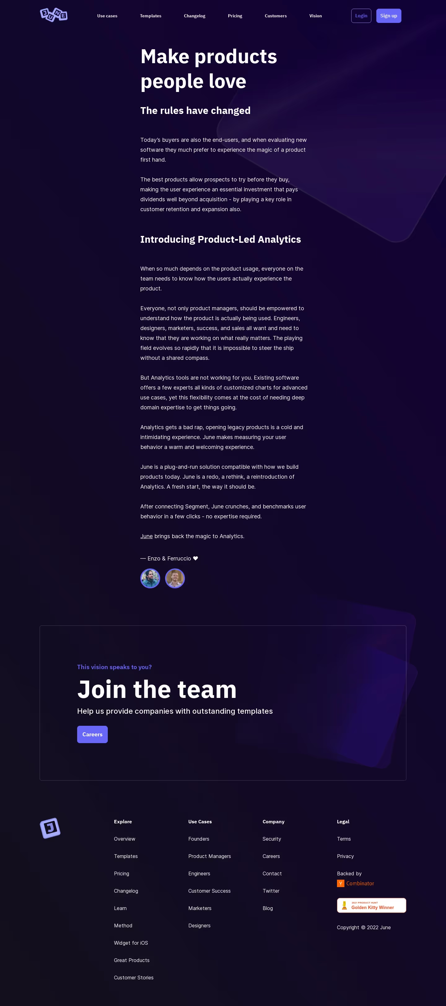
Overall Style and Aesthetic
June’s Vision page exemplifies minimalist sophistication fused with a modern, energetic vibe. Crisp white space anchors every section, allowing bold, saturated accent colors—mainly vibrant blues, purples, and subtle gradients—to direct attention and create visual momentum. The look is both polished and inviting, projecting an image of forward-thinking professionalism. Layout and Structure
The page opens with a commanding hero section featuring concise copy and a distinctive call-to-action, immediately conveying the product’s mission. Content below is presented in tidy, scroll-revealed blocks: inspiration, team, and principles are each given focused real estate. This clear segmentation keeps cognitive load low and guides users organically from story to substance. Visual Elements
Custom illustrations and playful line art adorn key sections, creating warmth and hinting at human touch behind the SaaS. Soft animations activate on scroll, adding dynamism without distraction. Subtle iconography, airy profile photos, and a textured background elevate the brand’s narrative and visual memorability. Color Palette and Typography
The palette centers on deep navy and white, accented by lively gradients and hints of lavender and pink. Typography employs a highly readable sans-serif for body content, paired with bolder, larger headings for hierarchy and punch. This careful contrast guides the user’s eyes and reinforces messaging priority. User Experience Patterns
Sticky navigation ensures seamless exploration, while anchored CTAs maintain visibility without intrusiveness. Smooth scroll interactions and micro-interactions on hover craft a fluid, engaging browsing experience. Minimal forms and single-action buttons reduce friction for user engagement. Unique or Notable Design Choices
Standout elements include animated lines that “draw” connections as users scroll and a transparent belief in company vision, showcased through candid team photography. The result feels innovative, authentic, and approachable—balancing aspirational storytelling with strong usability.