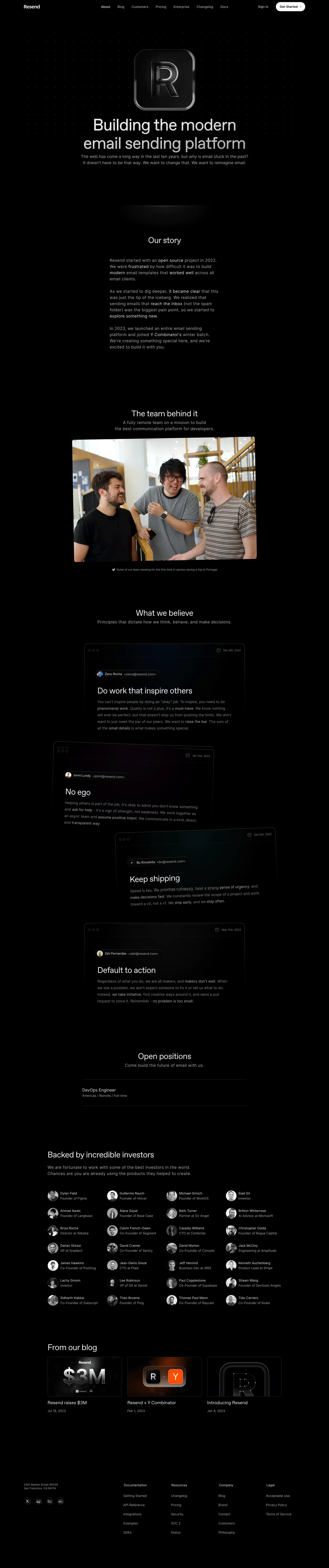
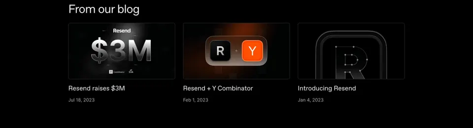
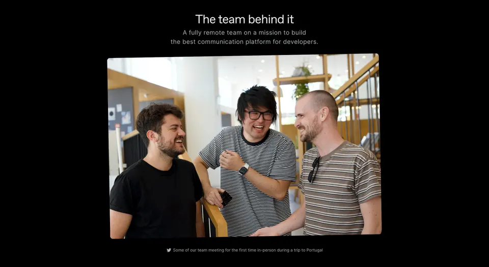
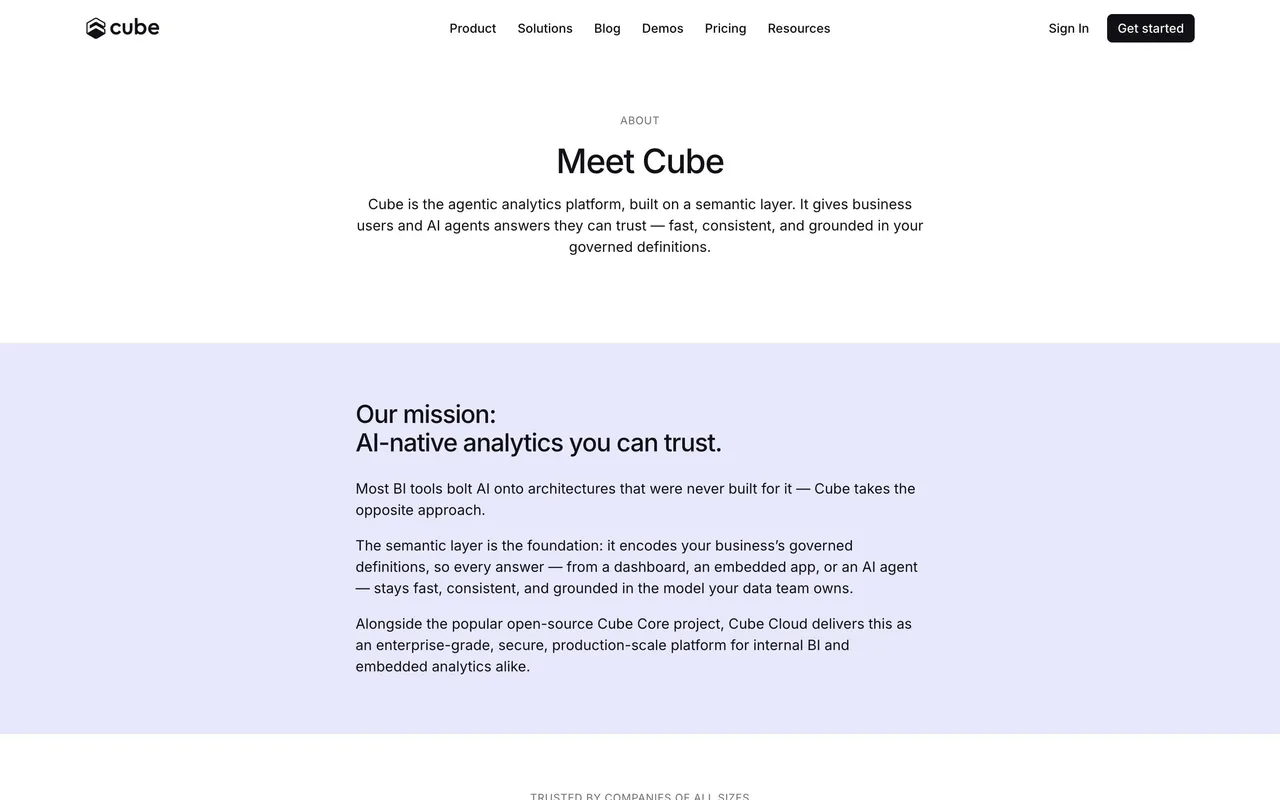
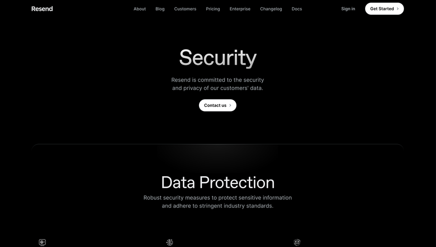
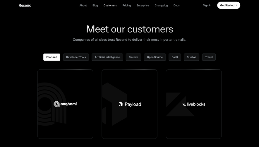
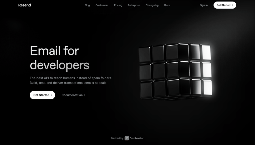
Resend's About page radiates a sleek, minimalist sophistication that feels thoroughly modern and polished. The design leans into generous whitespace, crisp alignment, and subtle microinteractions, creating a professional yet welcoming first impression. Every visual communicates clarity and focus, matching the SaaS ethos of streamlined efficiency.
Layout and Structure
The page unfolds with a bold but refined hero section, setting the tone with concise messaging and a subtle brand animation. This flows into a well-structured narrative divided by generous section spacing: company story, mission, team, and community engagement, all presented in digestible segments. There’s a clear hierarchy, making exploration intuitive without overwhelming visitors.
Visual Elements
Illustrations are prominent; abstract forms and product-inspired graphics deliver personality while reinforcing brand identity. There’s minimal reliance on stock photography, favoring custom illustrations and SVG graphics for a consistent, tailored look. Interactivity is understated—gentle hover animations and smooth scrolling add tactile delight without stealing focus.
Color Palette and Typography
The palette underscores trust and modernity: deep charcoal backgrounds contrast with crisp white and muted accent hues, punctuated by brand orange for highlights and CTAs. Typography is bold yet approachable—sophisticated sans-serifs headline, with lighter subtext for supporting content. Hierarchical spacing, weight, and size guide the reader’s journey seamlessly.
User Experience Patterns
Navigation is sticky and unobtrusive, always accessible but never intrusive. Calls-to-action are sparse and purposeful, maintaining momentum without derailing the narrative. Section-based scroll cues and gentle transitions invite exploration, ensuring the reading experience feels effortless.
Unique or Notable Design Choices
A standout: the subtle, looping product animation in the hero immediately conveys the product’s purpose without heavy exposition. The team section’s avatar illustrations add a human touch, reinforcing approachability. Overall, the tone is quietly confident, innovative, and transparent—perfect inspiration for SaaS brands aiming to blend credibility with warmth.
 SaaSFrame