Design with AI
Generate a new design based on this screen using your own content.
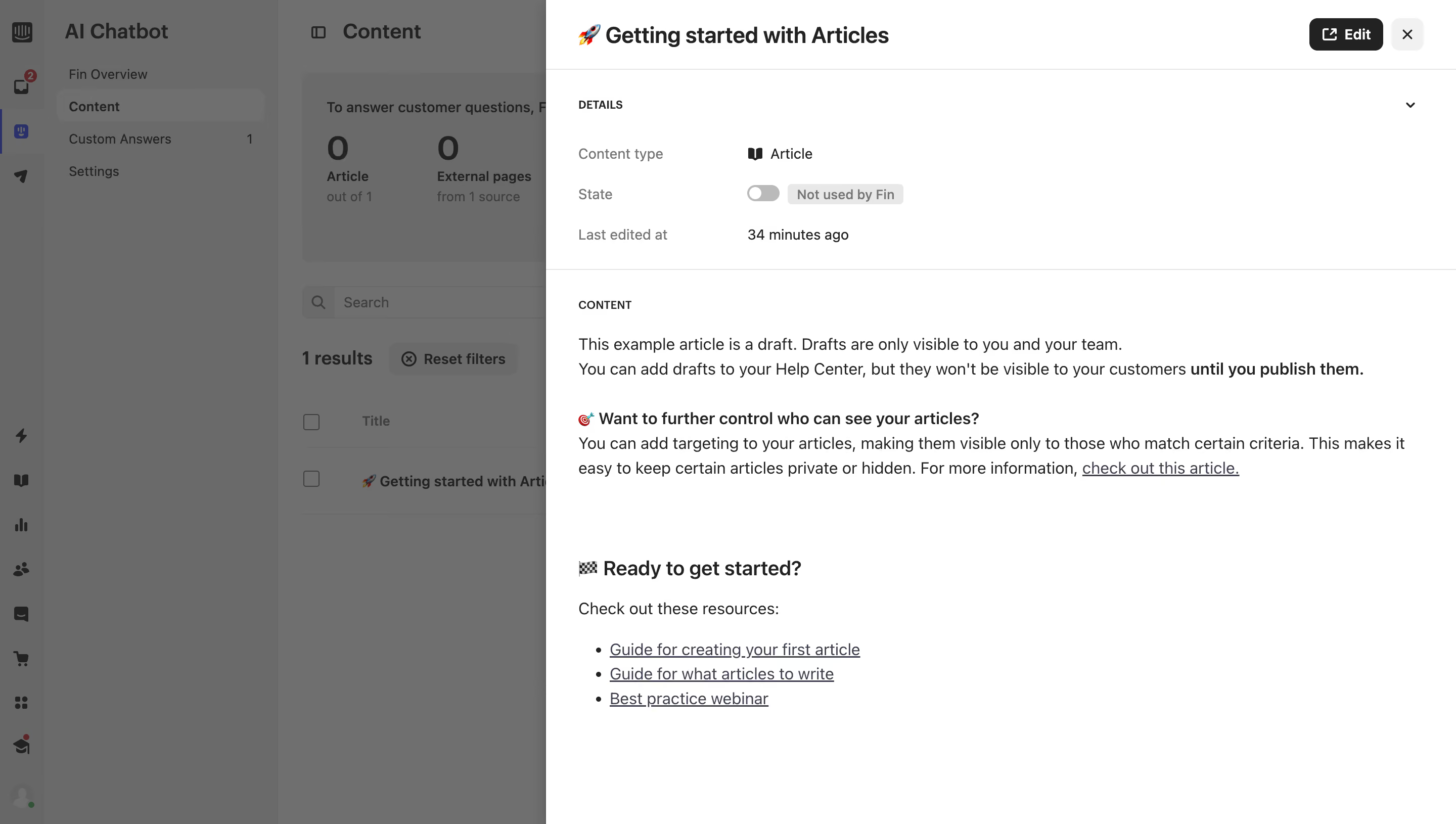
# Design from Reference: Intercom Content Details
Create an original, high-fidelity visual design inspired by the reference. Prioritize composition, typography, colors, spacing, and component styling over technical implementation.
## Reference
- **Product:** Intercom
- **Category:** Details
- **Screenshot:** https://cdn.prod.website-files.com/5e9dc792e1210c5325f7ebbc/6acad61dfef6904ce0090ccb_6acad55d701e38c79488d94d_cms-45de8e11cc93ba6b40b25d78.webp
Analyze the screenshot first. If inaccessible, request it rather than guessing.
## Content
{{content.instructions}}
{{content.data}}
Preserve essential messaging and factual accuracy. Adapt structure and copy length for visual balance; never invent product claims.
## Visual Design
### Overall aesthetic
- **Character:** Read-only article detail drawer over a dimmed AI-content dashboard, using simple text hierarchy and restrained controls.
### Page composition
- **Capture:** 2880 × 1630 screenshot pixels; estimated 2× CSS scale.
- **Structure:** Right drawer occupies about 63% width; title/Edit/close header, details grid and article body with subheadings and resource bullets.
### Information hierarchy
- **Priority:** Article title leads; type, usage toggle/state and last-edited metadata precede the content preview.
### Typography
- **Family:** Sans serif; exact family unverified.
- **Estimated CSS sizes:** Title 22px, body 16px, metadata 14px and uppercase group labels 11px.
### Colors & surfaces
- **Measured palette:** Drawer white #FFFFFF, dark #222222, link slate #3E4052 and dimmed backdrop #6A6A6A/#6F6F6F/#676767.
- **Treatment:** Backdrop gray includes overlay effects and does not establish underlying application colors.
### Components
- **Elements:** Black Edit button, close icon, collapsible Details, off-state toggle/badge, horizontal separators and underlined article links.
- **Estimated geometry:** Drawer approximately 900px wide, 32px padding, 32px actions and 6px control radii.
### Visual rhythm
- **Spacing:** Compact details grid gives way to spacious paragraphs and a clear lower resource section.
### Responsive
- **Suggested adaptation:** Use a full-screen detail sheet with accessible Edit/close controls. Mobile behavior is unverified.
### Adaptation guidance
- **Transfer:** Preserve metadata-before-content order and explicit AI-use state. Keep content preview separate from editing.
Use this context to reproduce the reference's visual language: layout, typography, colors, spacing, borders, radii, and distinctive elements. The screenshot takes priority if descriptions conflict.
## Direction
{{preferences.fidelityInstructions}}
## Output
{{output.instructions}}
Deliver a polished, cohesive design with precise alignment, hierarchy, and spacing. Produce the requested visual artifact, not just a description. If unsupported, explain the limitation.