Generate a new design based on this screen using your own content.
Thank you! Your submission has been received!
Oops! Something went wrong while submitting the form.
# Design from Reference: Stripe Integrations Page
Create an original, high-fidelity visual design inspired by the reference. Prioritize composition, typography, colors, spacing, and component styling over technical implementation.
## Reference
- **Product:** Stripe
- **Category:** Integrations Page
- **Screenshot:** https://cdn.prod.website-files.com/5e9dc792e1210c5325f7ebbc/6acbcc53e13ab9df8f0533c1_6acbcaff1790037d3e063df1_cms-170d378286788d6db2a31886.webp
Analyze the screenshot first. If inaccessible, request it rather than guessing.
## Content
{{content.instructions}}
{{content.data}}
Preserve essential messaging and factual accuracy. Adapt structure and copy length for visual balance; never invent product claims.
## Visual Design
Use this context to reproduce the reference's visual language: layout, typography, colors, spacing, borders, radii, and distinctive elements. The screenshot takes priority if descriptions conflict.
## Direction
{{preferences.fidelityInstructions}}
## Output
{{output.instructions}}
Deliver a polished, cohesive design with precise alignment, hierarchy, and spacing. Produce the requested visual artifact, not just a description. If unsupported, explain the limitation.
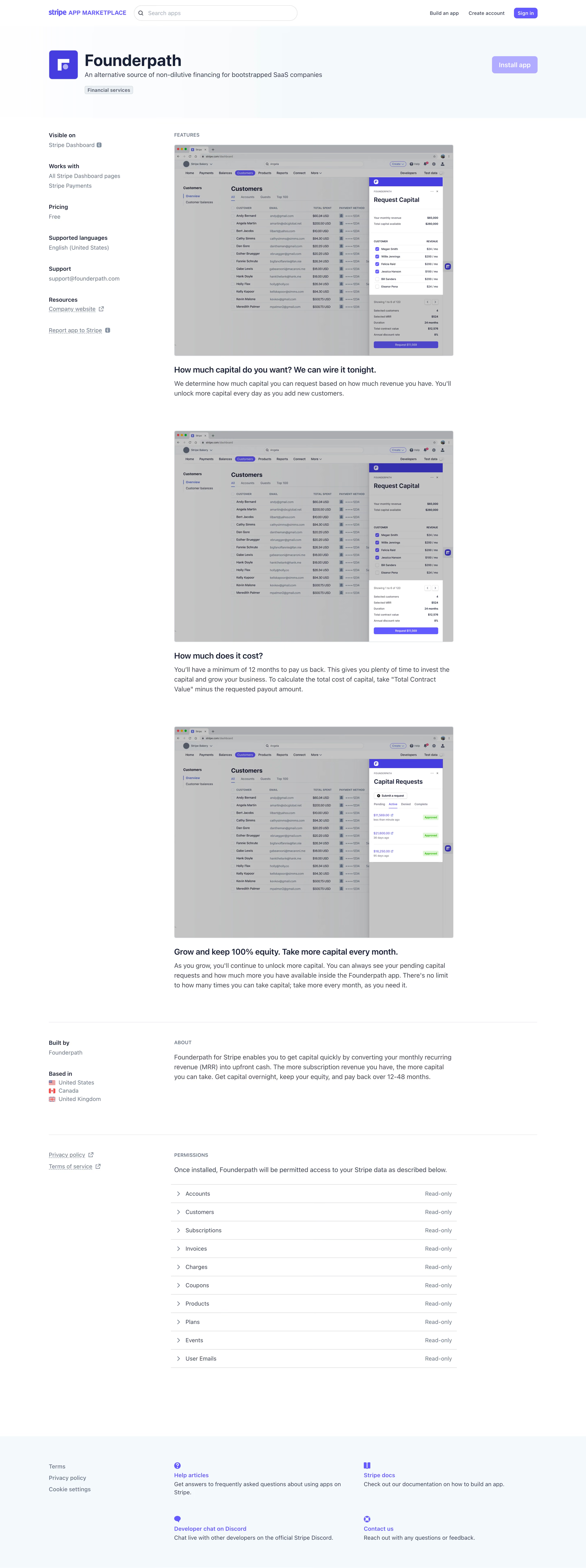
Stripe Marketplace’s Founderpath page radiates a clean, modern professionalism. The design is minimalist, leveraging ample white space and restrained color accents that ensure the core message and visuals stand out. This page feels purposeful and sophisticated, fostering immediate trust with users seeking a streamlined SaaS experience.
Layout and Structure
The page is anchored by a prominent hero section featuring a succinct product value proposition and a clear call-to-action. Content flows naturally, starting with key features and benefits, followed by a visually balanced app preview. Integrations and use cases are highlighted with scannable modules, leading down to support information and a practical, uncluttered footer. The structure is logical, minimizing cognitive load and guiding visitors toward conversion without friction.
Visual Elements
Illustrations and mockups replace photography, drawing attention to the product’s interface and its Stripe integration. Simple vector icons efficiently communicate functionality, while subtle hover states animate clickable cards, adding interactivity without distraction. The visuals are approachable and product-focused, reinforcing credibility.
Color Palette and Typography
A cool, blue-and-white palette aligns with Stripe’s brand, using blue for primary accents and microinteractions. Clean, sans-serif typography establishes a crisp hierarchy—bold headlines, mid-weight subheaders, and open-body text enhance readability on any device.
User Experience Patterns and Unique Choices
Navigation remains intuitive, with primary CTAs (“Get Started,” “Learn More”) consistently positioned above the fold and repeated strategically throughout. Notable is the compact use of app badges and Stripe logos for instant context. The entire tone is confident yet welcoming—a compelling mix of authority and accessibility that makes users feel supported and encouraged to act.