Design with AI
Generate a new design based on this screen using your own content.
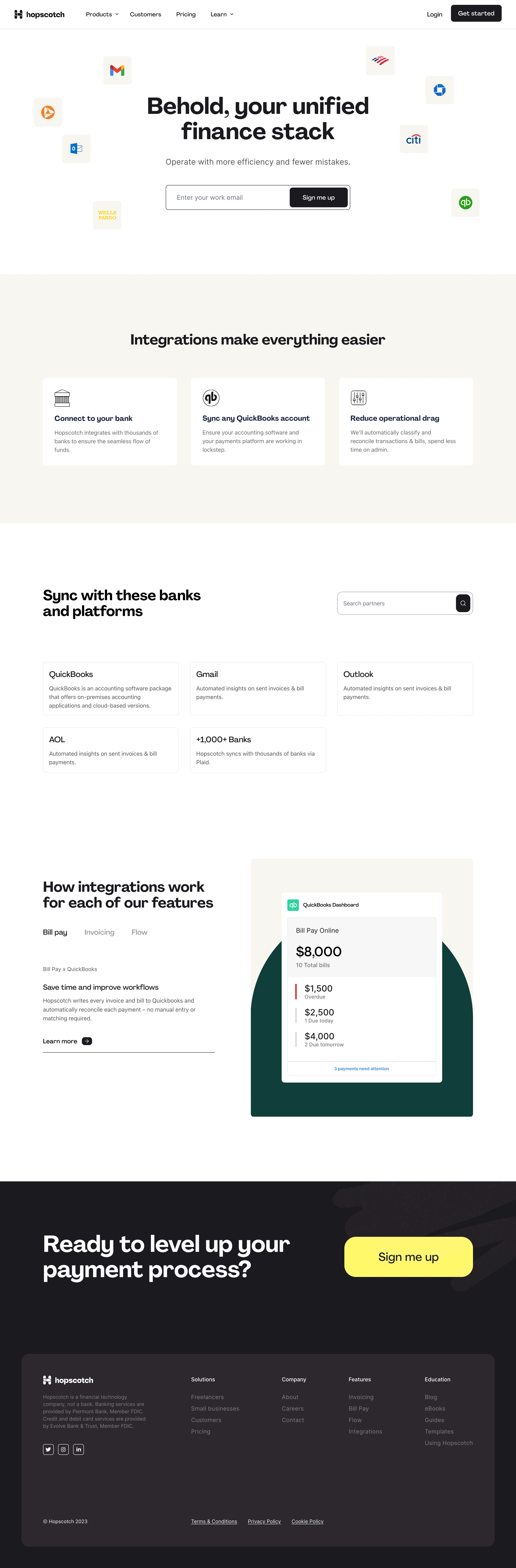
# Design from Reference: Hopscotch Integrations Library
Create an original, high-fidelity visual design inspired by the reference. Prioritize composition, typography, colors, spacing, and component styling over technical implementation.
## Reference
- **Product:** Hopscotch
- **Category:** Integrations Library
- **Screenshot:** https://cdn.prod.website-files.com/5e9dc792e1210c5325f7ebbc/6acb65d5b206c0d3f8f0f90f_6acb6552c2d837f8f41f904d_cms-d0acacf2493db228944397f8.webp
Analyze the screenshot first. If inaccessible, request it rather than guessing.
## Content
{{content.instructions}}
{{content.data}}
Preserve essential messaging and factual accuracy. Adapt structure and copy length for visual balance; never invent product claims.
## Visual Design
### Overall aesthetic
- **Character:** Friendly finance-integration landing page with white/cream sections, charcoal typography and a dark closing band.
- **Visual language:** Floating partner-logo tiles, simple line icons and a stylized accounting dashboard communicate connected tools.
- **Scale:** The source measures 2880 × 8744 px. Dimensions below estimate a 1440 × 4372 CSS layout at 2× scale; device ratio and zoom are unverified. Three portions were inspected.
### Page composition
- **Header/hero:** Horizontal navigation precedes a centered two-line headline, subtitle and joined work-email/signup control, surrounded by partner logos.
- **Benefits:** A cream band contains a centered heading and three white cards.
- **Library:** A white section pairs a large left title with right search, then five outlined partner cards in three columns.
- **Feature detail:** A split section has tabbed explanatory copy left and a large cream/green accounting illustration right.
- **Closing/footer:** Dark background holds a large white conversion headline/yellow action above a slightly lighter rounded footer card with four link groups.
### Information hierarchy
- **Proposition:** The hero emphasizes a unified finance stack.
- **Benefits:** Three icon/title/paragraph cards introduce bank connection, accounting sync and reduced administration.
- **Discovery:** Search and partner cards organize available integrations.
- **Feature tabs:** Bill pay is active, with Invoicing and Flow muted.
- **Conversion:** Signup repeats in hero, header and large final yellow button.
- **Evidence:** No search, integration connection or signup is performed.
### Typography
- **Family:** Rounded modern sans-serif; exact identity is unverified.
- **Hero:** Approximately 60–64 CSS px, bold with tight leading.
- **Section headings:** Around 38–42 px bold.
- **Body:** Approximately 16–18 px with 24 px leading; hero subtitle larger.
- **Cards:** Titles about 22 px, descriptions around 16 px.
- **Footer:** Compact 14–16 px text with muted secondary/legal copy.
### Colors & surfaces
- **Measured base:** ICC-aware sRGB sampling yields #FFFFFF and cream #F8F6F0.
- **Measured dark:** #1C1A1F and #2D282F define closing/footer regions.
- **Measured green:** #003F3A appears in product artwork.
- **Measured accent:** Yellow #FFF84B marks the final action.
- **Depth:** Most cards use thin borders/small corners; floating logo grounds are pale cream.
### Components
- **Hero form:** Long outlined email field contains a dark signup button at the right.
- **Logo tiles:** Small pale rounded squares float around the headline.
- **Benefit cards:** Three equal white rectangles pair line icons with bold titles and short copy.
- **Library cards:** Thin bordered partner summaries use plain title/description stacks.
- **Search:** Wide outlined control with dark square magnifier action.
- **Feature preview:** White accounting card sits over a dark-green arch and cream ground.
- **Footer card:** Large rounded dark panel groups brand/legal copy, links and social controls.
### Visual rhythm
- **Container:** Broad centered content with about 120 CSS px side margins.
- **Sections:** Large white/cream pauses distinguish hero, benefits, library and detail.
- **Grid:** Three-column cards share consistent gutters and alignment.
- **Contrast:** Dark closing region provides a strong final milestone.
### Responsive
- **Evidence limit:** Only desktop is shown; recommendations follow.
- **Hero:** Simplify floating logos and stack joined form controls if necessary.
- **Grids:** Reduce three columns to one.
- **Feature:** Stack copy above preview and preserve tab accessibility.
- **Footer:** Wrap link groups and retain readable legal text.
### Adaptation guidance
- **Reusable pattern:** Combine integration value, searchable partner summaries and a concrete feature example.
- **Visual system:** Use cream/white for discovery and dark/yellow for closing conversion.
- **State clarity:** Distinguish illustrated dashboards from live account data.
- **Accessibility:** Label search/email fields and expose tab selection and keyboard focus.
Use this context to reproduce the reference's visual language: layout, typography, colors, spacing, borders, radii, and distinctive elements. The screenshot takes priority if descriptions conflict.
## Direction
{{preferences.fidelityInstructions}}
## Output
{{output.instructions}}
Deliver a polished, cohesive design with precise alignment, hierarchy, and spacing. Produce the requested visual artifact, not just a description. If unsupported, explain the limitation.