
Thank you! Your submission has been received!
Oops! Something went wrong while submitting the form.
Get SaaSFrame Pro
Monthly
$18
Quarterly
$48
Yearly
$180
Upgrade to access this feature
Browse all screens & flows
Filter and search screens & flows
Access Figma files
Access mobile versions
Bookmark screens & flows
Join now
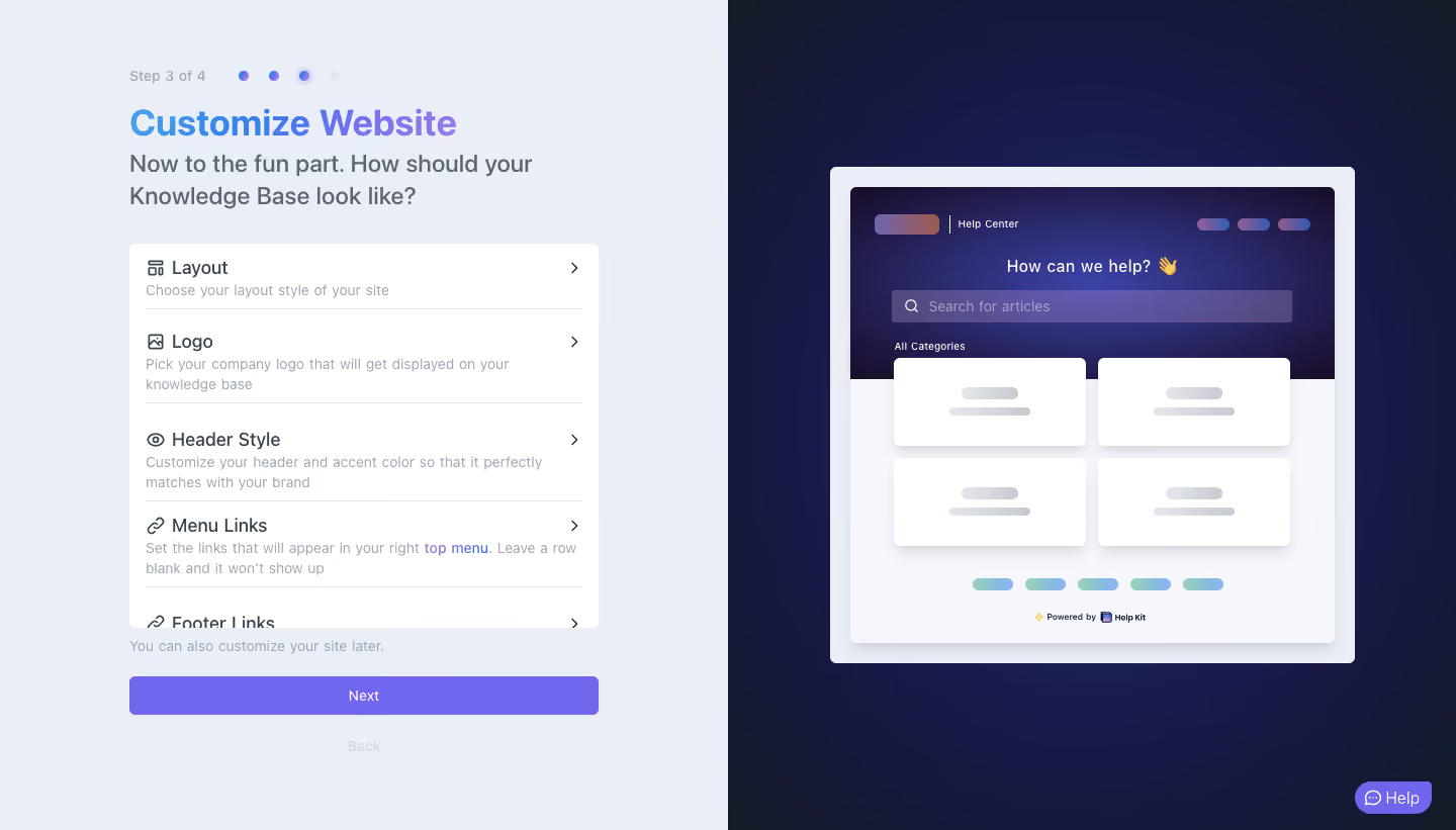
Help Kit Account Setup

Help Kit
Turn Notion into a Help or Doc site
Designed by
No items found.

Bookmark
Bookmark

Design with AI
Thank you! Your submission has been received!
Oops! Something went wrong while submitting the form.
# Design from Reference: Help Kit Account Setup
Create an original, high-fidelity visual design inspired by the reference. Prioritize composition, typography, colors, spacing, and component styling over technical implementation.
## Reference
- **Product:** Help Kit
- **Category:** Account Setup
- **Screenshot:** https://cdn.prod.website-files.com/5e9dc792e1210c5325f7ebbc/6acbbb5a151c40fa40745f69_6acb71c84f32bb8f1823ee1b_cms-be4c5f78e39d2953363b6d57.webp
Analyze the screenshot first. If inaccessible, request it rather than guessing.
## Content
{{content.instructions}}
{{content.data}}
Preserve essential messaging and factual accuracy. Adapt structure and copy length for visual balance; never invent product claims.
## Visual Design
### Overall aesthetic
- **Style:** Split-screen onboarding step with a calm pale form side and a dark indigo product-preview side.
- **Character:** Friendly gradient heading, purple progression action, soft rounded white settings surface, and an illustrative knowledge-base mockup.
- **Depth:** The preview uses a pale outer frame, a raised inner page, and small white cards with soft shadows.
### Page composition
- **Capture and scale:** 1440 × 821 image px. CSS estimates assume approximately 1× capture; scale is unverified.
- **Split:** Equal left/right halves around x=720px, with no visible global navigation.
- **Left column:** Approximately 464px wide, centered within its half at x≈128px. Step indicator, headline, explanatory text, settings list, helper sentence, Next, and Back stack vertically.
- **Progress:** Step 3 of 4 appears beside four dots; the third dot has a pale halo, while the fourth is muted.
- **Settings area:** White rounded panel about 464 × 380px. Layout, Logo, Header Style, and Menu Links are fully visible; Footer Links begins at the clipped lower edge.
- **Right preview:** Centered framed mock website, approximately 520 × 490px, with a dark gradient hero, search strip, two-by-two content tiles, small footer links, and attribution.
- **Help:** Purple chat pill anchors the bottom-right corner.
### Information hierarchy
- **Current task:** Gradient Customize Website heading dominates the left column.
- **Guidance:** Larger gray explanatory text sits directly beneath, wrapping over two lines.
- **Customization choices:** Icon/title/description rows expose discrete configuration areas, each ending in a right chevron.
- **Progression:** Full-width purple Next is visually stronger than the pale Back label below it.
- **Preview role:** Abstract skeleton-like content demonstrates appearance rather than presenting a second editable form.
### Typography
- **Family:** Neutral proportional sans serif; font identity is unverified.
- **Heading:** Approximately 36px bold with 43px line-height, colored by a blue-to-purple gradient.
- **Intro:** Approximately 24px medium with 32px line-height in slate gray.
- **Step and descriptions:** Around 14px regular with 20px line-height.
- **Setting titles:** Approximately 18px medium, paired with small line icons.
- **Actions:** Approximately 14px labels; preview microcopy is much smaller because it represents a scaled website.
- **Precision:** All CSS sizes, weights, and line-heights are reconstruction estimates.
### Colors & surfaces
- **Left canvas:** Sampled #EAEEF6.
- **Settings and preview cards:** Sampled #FFFFFF.
- **Preview light area:** Sampled #F5F7FC.
- **Primary purple:** Sampled #7167EF on the main action and help treatment.
- **Dark preview surround:** Sampled near-indigo #161941, with neighboring #161940, #171A47, and #151939 reflecting its gradient.
- **Text and rules:** Slate text, pale blue-gray descriptions, and thin light-gray separators create the left-side hierarchy.
- **Accent gradients:** Blue/purple heading, small warm-to-cool preview branding marks, and green-to-blue footer placeholders add controlled color.
### Components
- **Progress dots:** Four small circles with about 20px spacing; completed/current dots use saturated color and the current one has a larger translucent ring.
- **Settings panel:** Approximately 6px radius with about 16px inner horizontal padding; individual rows use fine separators.
- **Choice rows:** Roughly 64–96px tall depending on description wrapping, with icon and title aligned on the first line.
- **Clipped list:** Footer Links is partially cut by the panel boundary; scrolling or expansion behavior cannot be confirmed from the still image.
- **Next button:** Approximately 464 × 39px, purple fill, white centered label, and 5px radius.
- **Back control:** Centered pale text below Next, visually de-emphasized; operability is unverified.
- **Preview frame:** Pale border/frame around a white miniature site; rounded corners and shadows distinguish the nested surfaces.
- **Preview tiles:** Four white rounded rectangles with short gray placeholder lines, arranged in two columns beneath a dark hero.
- **Help pill:** Compact purple bottom-right control with chat icon and Help label.
### Visual rhythm
- **Left alignment:** Progress, title, body, list, and primary button share the same column edges.
- **Vertical spacing:** Tight title/body grouping contrasts with a larger gap before the white settings list.
- **Row rhythm:** Repeated icon-title-description-chevron anatomy supports quick scanning.
- **Split balance:** Dense functional controls on the left balance one large centered visual on the right.
### Responsive
- **Observed state:** Desktop split screen only; responsive and configuration states are unverified.
- **Layout recommendation:** Stack the form above an optional preview on narrow screens; keep progression controls within an easy reading width.
- **List recommendation:** Make all customization options reachable with deliberate scrolling and clear keyboard focus.
- **Preview recommendation:** Scale the illustrative site as one unit rather than reducing the real settings text.
- **Help recommendation:** Position the chat control clear of Next and Back on short screens.
### Adaptation guidance
- **Preserve:** Clear step progress, a short customization checklist, dominant Next action, and a complementary visual preview.
- **Starting geometry:** Approximately 464px form column, 36px heading, 39px action height, and equal desktop halves under the unverified 1× assumption.
- **Preview content:** Use supplied brand assets and representative content, keeping placeholder shapes distinct from editable fields.
- **Implementation recommendation:** Expose each choice’s current value or status when appropriate, and make the clipped final option discoverable.
- **State fidelity:** Treat the displayed step and preview as a single observed state; do not infer saved settings or button behavior.
Use this context to reproduce the reference's visual language: layout, typography, colors, spacing, borders, radii, and distinctive elements. The screenshot takes priority if descriptions conflict.
## Direction
{{preferences.fidelityInstructions}}
## Output
{{output.instructions}}
Deliver a polished, cohesive design with precise alignment, hierarchy, and spacing. Produce the requested visual artifact, not just a description. If unsupported, explain the limitation.


Category
Patterns
No items found.



Added on
February 27, 2023




Similar screens




Upgrade to SaaSFrame Pro now to see similar examples.
Monthly
$18 /month
Billed $18 monthly
Browse all screens & flows
Filter and search screens & flows
Search text in screenshots
Access Figma files
Access mobile versions
Join now
Quarterly
$16 /month
Billed $48 quarterly
Browse all screens & flows
Filter and search screens & flows
Search text in screenshots
Access Figma files
Access mobile versions
Join now
Yearly
$15 /month
Billed $180 yearly
Browse all screens & flows
Filter and search screens & flows
Search text in screenshots
Access Figma files
Access mobile versions
Join now