Design with AI
Generate a new design based on this screen using your own content.
# Design from Reference: Reveal Create company details
Create an original, high-fidelity visual design inspired by the reference. Prioritize composition, typography, colors, spacing, and component styling over technical implementation.
## Reference
- **Product:** Reveal
- **Category:** Account Setup
- **Screenshot:** https://cdn.prod.website-files.com/5e9dc792e1210c5325f7ebbc/6acbbe3c476aea3982e3fabc_6acbbd6caa23dc1cf5a8de17_cms-2cbf0a66f72e7643b6c1b24b.webp
Analyze the screenshot first. If inaccessible, request it rather than guessing.
## Content
{{content.instructions}}
{{content.data}}
Preserve essential messaging and factual accuracy. Adapt structure and copy length for visual balance; never invent product claims.
## Visual Design
### Overall aesthetic
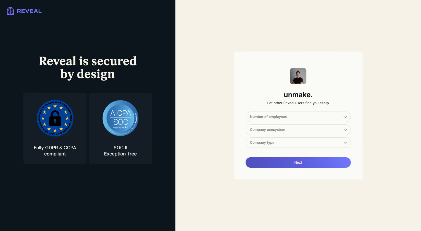
- **Character:** Split company-onboarding screen combining a dark security-reassurance panel with a warm cream form area and violet progression action.
- **Evidence and scale:** Screenshot measures 1440 × 789 image pixels. Sizes describe captured pixels with plausible 1× CSS scale; actual DPR and font identities remain unverified.
### Page composition
- **Left reassurance:** Approximately 600px-wide dark panel, with small violet brand at upper-left, centered two-line serif statement and two side-by-side security-badge cards.
- **Right form:** Cream ground fills the remaining width. A centered off-white card around 440 × 438px contains avatar/company identity, short guidance, three pill selects and Next.
- **Whitespace:** Both regions have large surrounding empty areas; no header navigation or footer is visible.
- **Form state:** Employee count, company ecosystem and company type are unselected in the capture.
### Information hierarchy
- **Trust message:** Large serif security statement and two blue compliance-style seals provide the main left-side emphasis.
- **Company identity:** Small portrait and bold company name lead the form before the requested details.
- **Data task:** Three equal dropdowns create a simple sequence; the wide violet Next action is the main progression control.
- **Supporting copy:** Short guidance under company name remains smaller than labels/actions.
### Typography
- **Security statement:** Approximately 42px captured size, bold serif with 44px leading.
- **Company name:** Approximately 24px bold sans-serif.
- **Form text:** Guidance and dropdown labels around 12–13px; Next around 12px medium.
- **Badge captions:** Approximately 16px medium white sans-serif, centered over two lines. Exact serif/sans families and computed weights are unverified.
### Colors & surfaces
- **Measured darks:** #0C151B fills the left ground; #141C26 forms raised badge cards.
- **Measured warm ground:** #F6F2E8 fills the right side; #FAFAF6 forms the card.
- **Measured local accent:** Deep blue #004098 appears in security artwork; violet/periwinkle branding and the Next gradient provide progression emphasis.
- **Boundaries:** Pale warm-gray outlines define selects, with little visible shadow on the main form card.
### Components
- **Badge cards:** Approximately 216 × 242px, dark slightly raised rectangles, radius near 8px, large circular seals and centered captions.
- **Identity:** Small rounded portrait around 56px square above company name, separated by generous vertical spacing.
- **Dropdowns:** Approximately 360 × 36px pill controls, thin warm-gray borders, muted bold placeholder labels and chevrons aligned right.
- **Next:** Approximately 360 × 37px pill, violet gradient, white centered label and no visible icon.
- **Form shell:** Off-white rectangle with 8px radius and roughly 40px horizontal padding.
### Visual rhythm
- **Centering:** Trust content and form each have their own vertical/horizontal center, producing a balanced asymmetrical split.
- **Control cadence:** Three dropdowns use small 8–10px gaps; a larger roughly 32px gap separates them from Next.
- **Trust spacing:** Statement and paired badge cards are separated by about 44px, while badges/captions form self-contained units.
### Responsive
- **Observed limit:** Only desktop is visible; dropdown menus, validation, progression and mobile layouts are unobserved.
- **Recommended stacking:** Prioritize the form on phones and shorten or move reassurance content below it.
- **Recommended controls:** Keep selects fluid, preserve meaningful labels and increase touch heights if necessary.
- **Recommended typography:** Scale the serif statement without crowding, and keep badge captions readable rather than shrinking whole cards.
### Adaptation guidance
- **Preserve the contrast:** Use dark trust content and a warm, simple form region to separate reassurance from data entry.
- **Keep scope small:** Ask only a few company-profile questions per step and use one clear continuation action.
- **Implementation:** Provide accessible select labels, keyboard interaction and visible focus. Compliance seals and security statements are captured visual claims, not independently verified certifications.
Use this context to reproduce the reference's visual language: layout, typography, colors, spacing, borders, radii, and distinctive elements. The screenshot takes priority if descriptions conflict.
## Direction
{{preferences.fidelityInstructions}}
## Output
{{output.instructions}}
Deliver a polished, cohesive design with precise alignment, hierarchy, and spacing. Produce the requested visual artifact, not just a description. If unsupported, explain the limitation.