
Thank you! Your submission has been received!
Oops! Something went wrong while submitting the form.
Get SaaSFrame Pro
Monthly
$18
Quarterly
$48
Yearly
$180
Upgrade to access this feature
Browse all screens & flows
Filter and search screens & flows
Access Figma files
Access mobile versions
Bookmark screens & flows
Join now
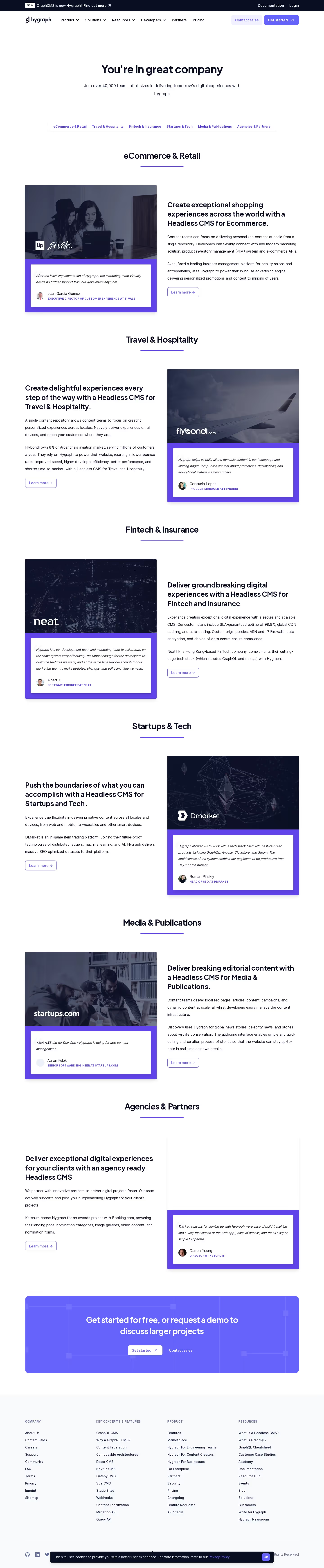

GraphCMS Customers Page

GraphCMS
Rapidly deliver digital content at scale
Designed by
No items found.

Bookmark
Bookmark

Design with AI
Thank you! Your submission has been received!
Oops! Something went wrong while submitting the form.
# Design from Reference: GraphCMS Customers Page
Create an original, high-fidelity visual design inspired by the reference. Prioritize composition, typography, colors, spacing, and component styling over technical implementation.
## Reference
- **Product:** GraphCMS
- **Category:** Customers Page
- **Screenshot:** https://cdn.prod.website-files.com/5e9dc792e1210c5325f7ebbc/62ec9c873da29e1d91f53b2d_1659625101256-screenshot-device-7cc20a70fb429f192b39595f5b7637ef-1659605209833.webp
Analyze the screenshot first. If inaccessible, request it rather than guessing.
## Content
{{content.instructions}}
{{content.data}}
Preserve essential messaging and factual accuracy. Adapt structure and copy length for visual balance; never invent product claims.
## Visual Design
### Overall aesthetic
- **Style:** Clean customer-proof page with white space, dark navy typography, violet accents and repeated photo/testimonial compositions.
- **Character:** The design combines an orderly technical SaaS identity with industry-specific photography and compact customer quotations.
- **Capture:** The image measures 1440 × 6966 pixels. CSS estimates assume approximately 1:1 capture scale; actual browser scale and font identities are unverified. The visible brand is Hygraph.
### Page composition
- **Announcement and navigation:** A dark top strip announces the brand transition. Beneath it, a white header contains the wordmark, grouped navigation and sales/start actions.
- **Hero:** A centered headline and two-line supporting sentence introduce the customer community with generous whitespace.
- **Sector navigation:** A slim horizontal strip lists six industry categories in violet text.
- **Industry sequence:** Six sections cover commerce, travel, finance, technology, media and agencies. Each has a centered sector heading with a short violet underline.
- **Alternating rows:** Each sector pairs descriptive copy and a learn-more control with a customer-photo/testimonial card; the card alternates between left and right.
- **Captured empty media:** The agency card retains a large blank white upper region above its violet testimonial area; no photograph is visible there.
- **Closing conversion:** A wide violet rounded banner offers start and sales routes over a faint node-and-line pattern.
- **Footer:** A pale-gray region contains four dense link columns, a bottom divider and social/legal details. A dark cookie bar overlays part of the baseline.
### Information hierarchy
- **Opening message:** A large centered customer-community heading leads; a smaller sentence provides scale and purpose.
- **Sector hierarchy:** Each centered industry heading and underline creates a strong repeated section marker.
- **Row narrative:** A bold multi-line benefit heading precedes two body paragraphs and one outlined learn-more action.
- **Customer evidence:** Dark-tinted photography and white customer logos lead into white quote cards within violet bases.
- **Attribution:** Customer names use regular dark text, with smaller uppercase violet roles beneath.
- **Conversion:** The lower banner has bright white copy and a white primary control, with a simpler sales link beside it.
- **Footer structure:** Small uppercase category labels distinguish company, concepts/features, product and resources.
### Typography
- **Family:** A rounded geometric sans-serif is visible in headings, paired with a compact sans-serif body treatment; exact font identities are unverified.
- **Hero heading:** Approximately 48-pixel CSS size, bold, with around 58-pixel line height and tight tracking.
- **Sector headings:** Approximately 36 pixels, bold, with 44-pixel line height.
- **Row headings:** Approximately 30 pixels and bold, with 40-pixel line height, usually spanning three lines.
- **Body copy:** Approximately 16 pixels with generous 30–32-pixel line height.
- **Quotation:** Approximately 14 pixels, italic, with around 27-pixel line height.
- **Attribution:** Names around 16 pixels; uppercase role labels around 12 pixels, bold and slightly tracked.
- **Navigation and footer:** Main navigation around 16 pixels; sector links around 14 pixels and bold; footer links around 14 pixels.
### Colors & surfaces
- **Measured base:** White #FFFFFF dominates the page; pale gray #F8FAFB fills the footer.
- **Measured violet palette:** #6663FD appears in the closing banner/action family, while #6245EA supports testimonial frames and other violet accents.
- **Measured navy:** #090E23, #0D1026 and #0C1227 occur among dark text and tinted media pixels.
- **Photography:** Customer images receive a strong navy overlay, allowing white logos to remain prominent.
- **Card treatment:** White inner quotation panels sit within solid violet lower card regions, with small rounding and soft shadows.
- **Cookie surface:** The bottom overlay uses dark navy, small white text, violet link emphasis and a compact violet acknowledgment button.
### Components
- **Header controls:** Pale-violet Contact sales and solid-violet Get started buttons sit at right; several navigation items include down chevrons.
- **Sector strip:** Six compact category links share a thin lightly outlined horizontal container.
- **Section underline:** A short violet rule approximately 190 pixels wide sits beneath each centered industry heading.
- **Two-column rows:** The main container is about 1215 pixels wide, with roughly 585-pixel columns and a 48-pixel gutter.
- **Customer cards:** Wide rectangular media areas sit above violet testimonial bases. Cards use minimal 4-pixel rounding and a subtle lower shadow.
- **Quote panels:** White inset rectangles have roughly 24-pixel padding, italic quotation, a small circular portrait and stacked attribution.
- **Learn-more controls:** Small outlined violet rectangles, approximately 140 × 44 pixels, combine text with a right arrow.
- **Closing banner:** A roughly 1215-pixel-wide rounded violet panel uses centered white copy, two actions and decorative thin grid/node lines.
- **Footer links:** Four equal-width groups present compact vertical lists with broad horizontal separation.
- **Cookie notice:** A narrow dark bar sits near the bottom center with privacy text and a small Ok control, partially covering footer content.
- **State scope:** No sector scrolling behavior, expanded navigation or destination page is shown.
### Visual rhythm
- **Desktop gutters:** Approximately 112 pixels align header, customer rows, closing banner and footer content.
- **Repeated section structure:** Centered sector title, underline and alternating proof row recur consistently across the long page.
- **Vertical spacing:** Large 90–120-pixel breaks separate industry groups; smaller 30–40-pixel gaps separate text blocks within each row.
- **Alternation:** Left/right card changes create visual movement while the copy and evidence structure remain stable.
- **Color cadence:** White reading space is interrupted by repeated violet quotation bases, then a larger violet conversion panel.
- **Footer density:** Link-heavy content is contained within a pale-gray region after the more spacious customer narrative.
### Responsive
- **Recommendation — sector navigation:** Allow categories to wrap or scroll explicitly with visible overflow affordances.
- **Recommendation — rows:** Stack customer cards and explanatory text in a consistent reading order on narrow screens.
- **Recommendation — media:** Preserve image aspect ratios and readable quotation text rather than shrinking complete cards.
- **Recommendation — headings:** Reduce large hero and sector titles fluidly while preserving hierarchy.
- **Recommendation — footer and cookies:** Wrap columns and keep the cookie notice from obscuring legal or social controls. No mobile state is evidenced.
### Adaptation guidance
- **Preserve industry grouping:** Keep each sector's benefit narrative, customer evidence and learn-more route together.
- **Standardize proof cards:** Share photo overlay, logo placement, violet frame, quote inset and attribution formatting.
- **Maintain alternating layout:** Use the left/right rhythm on desktop and a deliberate consistent order on smaller screens.
- **Handle missing imagery explicitly:** The final card's blank upper area is a captured limitation; do not invent a customer image to describe it.
- **Reuse visual tokens:** Carry the sampled navy/violet palette, white reading surfaces, narrow rules and restrained shadows into related pages.
- **Define interactions separately:** Sector anchors, menu expansion and cookie acknowledgment require implementation beyond the static state shown.
Use this context to reproduce the reference's visual language: layout, typography, colors, spacing, borders, radii, and distinctive elements. The screenshot takes priority if descriptions conflict.
## Direction
{{preferences.fidelityInstructions}}
## Output
{{output.instructions}}
Deliver a polished, cohesive design with precise alignment, hierarchy, and spacing. Produce the requested visual artifact, not just a description. If unsupported, explain the limitation.


Category
Patterns
No items found.
Tech Stack



Added on
June 6, 2020
Similar screens
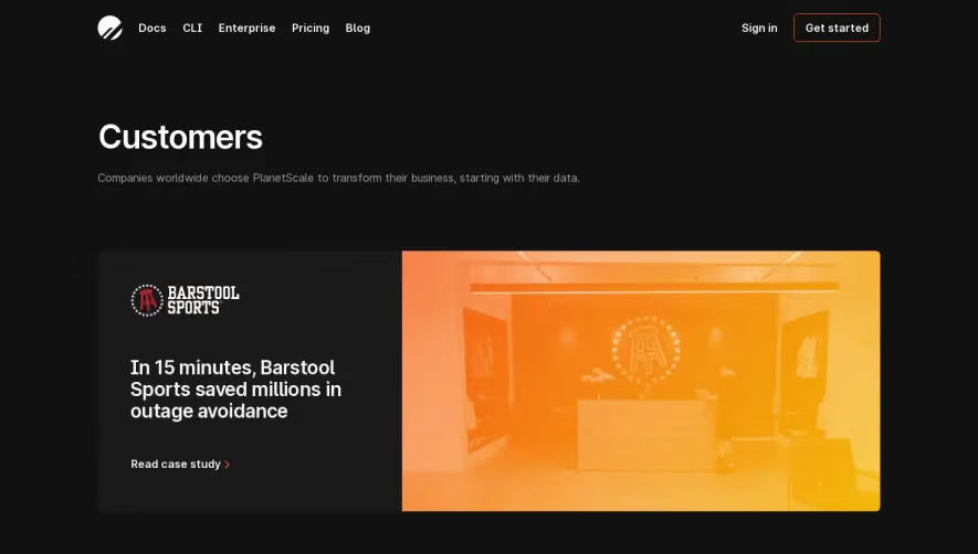


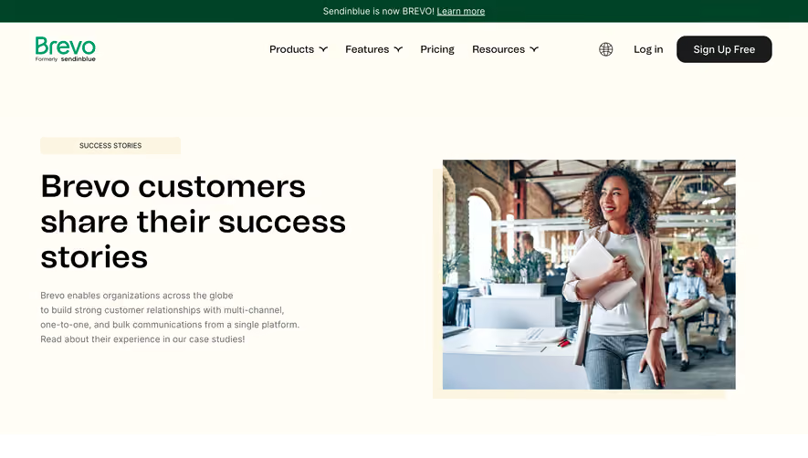

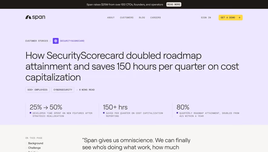

Upgrade to SaaSFrame Pro now to see similar examples.
Monthly
$18 /month
Billed $18 monthly
Browse all screens & flows
Filter and search screens & flows
Search text in screenshots
Access Figma files
Access mobile versions
Join now
Quarterly
$16 /month
Billed $48 quarterly
Browse all screens & flows
Filter and search screens & flows
Search text in screenshots
Access Figma files
Access mobile versions
Join now
Yearly
$15 /month
Billed $180 yearly
Browse all screens & flows
Filter and search screens & flows
Search text in screenshots
Access Figma files
Access mobile versions
Join now