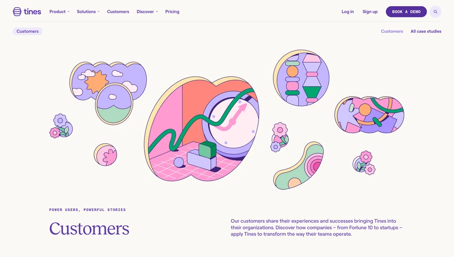
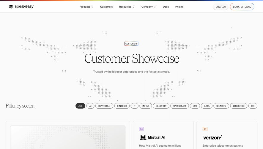
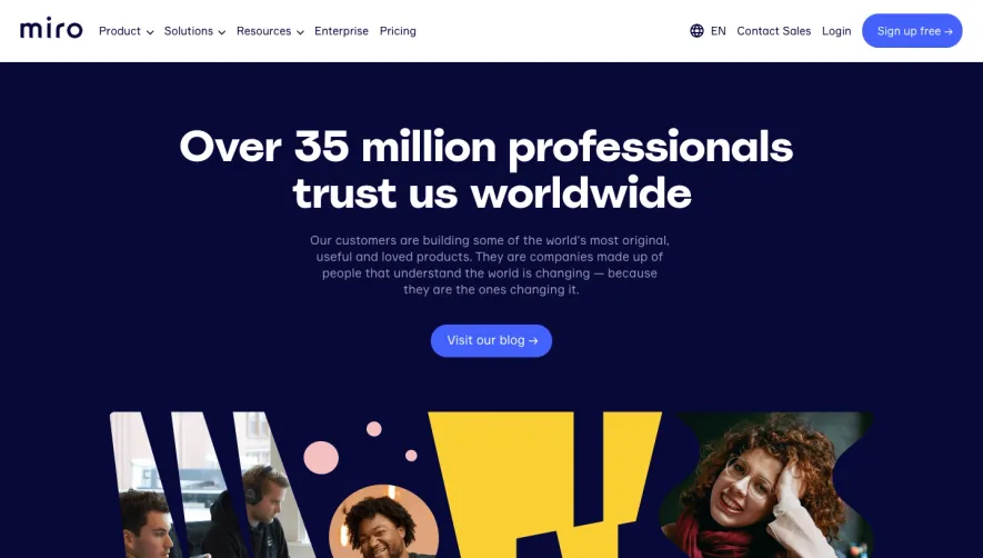
Generate a new design based on this screen using your own content.
Thank you! Your submission has been received!
Oops! Something went wrong while submitting the form.
# Design from Reference: Brevo Customers Page
Create an original, high-fidelity visual design inspired by the reference. Prioritize composition, typography, colors, spacing, and component styling over technical implementation.
## Reference
- **Product:** Brevo
- **Category:** Customers Page
- **Screenshot:** https://cdn.prod.website-files.com/5e9dc792e1210c5325f7ebbc/6acb675d994832179b56059a_6acb656da88b2511fbea92ad_cms-3c0b2d47ec20fc92338e8c12.webp
Analyze the screenshot first. If inaccessible, request it rather than guessing.
## Content
{{content.instructions}}
{{content.data}}
Preserve essential messaging and factual accuracy. Adapt structure and copy length for visual balance; never invent product claims.
## Visual Design
Use this context to reproduce the reference's visual language: layout, typography, colors, spacing, borders, radii, and distinctive elements. The screenshot takes priority if descriptions conflict.
## Direction
{{preferences.fidelityInstructions}}
## Output
{{output.instructions}}
Deliver a polished, cohesive design with precise alignment, hierarchy, and spacing. Produce the requested visual artifact, not just a description. If unsupported, explain the limitation.
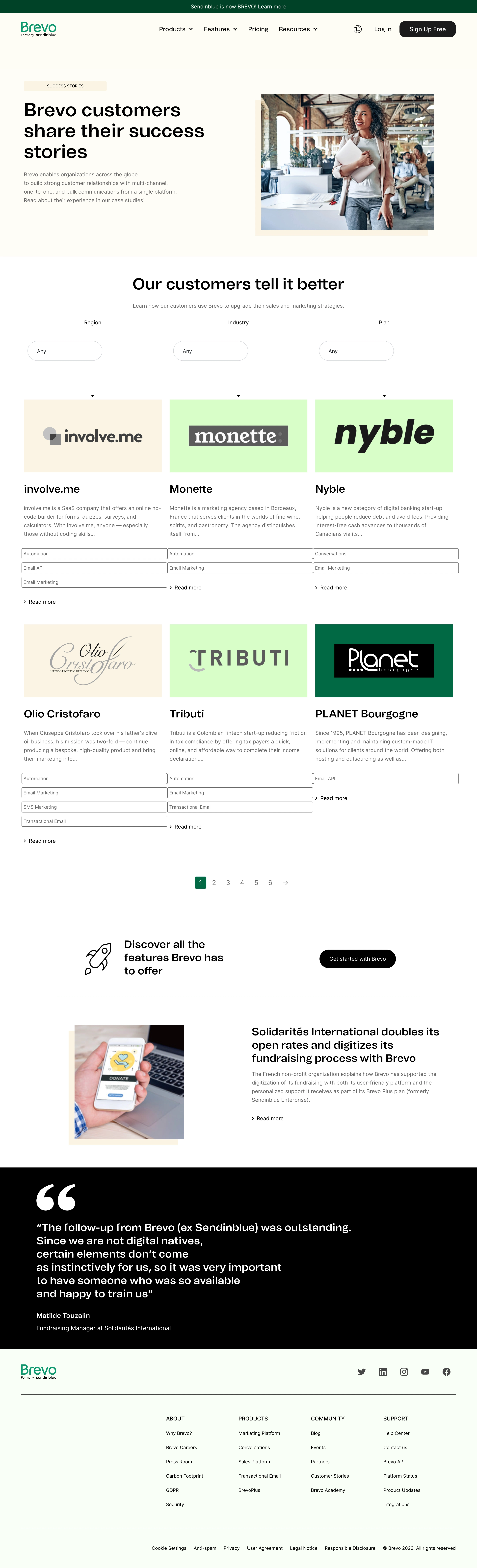
Brevo’s success stories page embodies a polished, modern minimalism that strikes a confident, trustworthy chord. Crisp lines and ample white space foster a clean, professional atmosphere, punctuated by curated use of Brevo’s vibrant brand accent colors that inject energy without overwhelming the eye.
Layout and Structure
The page opens with a visually inviting hero section, neatly framing the purpose (“Success Stories”) with a bold headline atop a subtle gradient backdrop. Content is organized into easily browsable success story cards, arranged in a responsive grid—making it effortless to scan through various case studies. There’s a subtle filter bar, allowing visitors to sort stories by industry or solution, which enhances navigation and content discovery.
Visual Elements
Photography takes center stage, as each story is paired with authentic, high-quality client portraits and logos, boosting credibility and relatability. Custom-styled icons and smooth hover animations add dynamism to interactions while keeping visual clutter at bay. The restrained use of subtle micro-animations (such as card elevation and color-shift on hover) adds a sense of interactivity and modernity.
Color Palette and Typography
A dominant clean white background allows deep blues, fresh teals, and lively green accents to pop, creating a memorable and on-brand look. Typography favors geometric sans-serif fonts, with clear hierarchy—large, impactful headings draw attention while body copy maintains readability.
User Experience Patterns & Notable Design Choices
Navigation is intuitive, aided by a sticky site header and clear filters. Each case study card includes concise teasers and a strong CTA—inviting deeper exploration. The strategic use of real customer images, brand-matched headings, and seamless hover states crafts a reassuring, human-centric tone that sets the page apart and fosters visitor trust.