Overall Style and Aesthetic
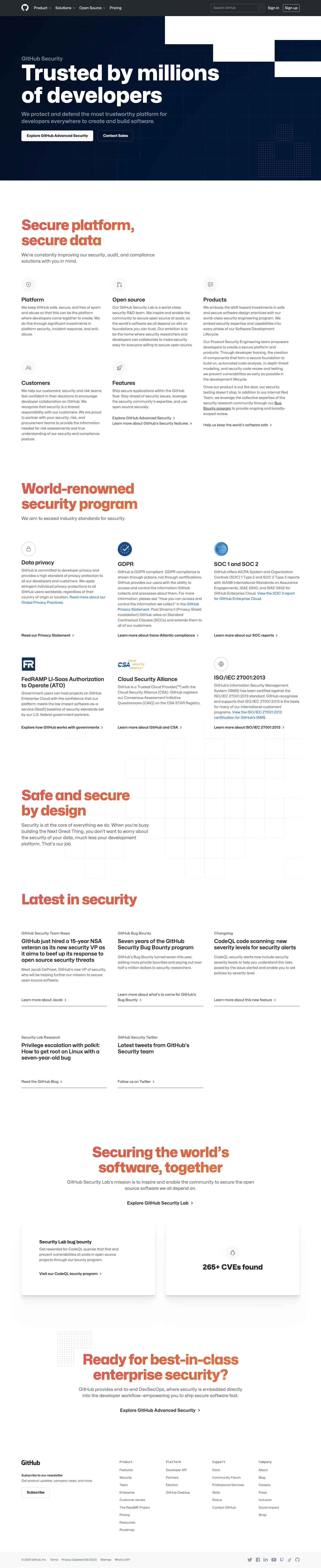
The GitHub Security page showcases a sleek, modern, and highly professional aesthetic with a distinctly technical edge. Minimalist UI components are combined with bold, confident messaging for a sense of trust and authority. The visual styling feels advanced yet approachable—ideal for organizations seeking robust security solutions without unnecessary frills. Layout and Structure
The layout is intuitively structured for SaaS clarity: a powerful hero section captures attention with impactful text and subtle, animated backgrounds. Features are presented in clear, digestible blocks with generous white space, each section focused on key security benefits and workflows. There’s a strong narrative flow—moving from high-level value propositions to deeper technical details and trust signals, including security partners and open source adoption. The footer is compact, packed with relevant links, and maintains visual alignment with the overall style. Visual Elements
Custom illustrations and iconography lean into a technical motif—think padlocks, shields, and code-based graphics—animated subtly for visual interest without distraction. Hover effects and micro-interactions enliven the experience, enhancing clarity and engagement. Instead of stock photography, on-brand visuals and diagrams clarify abstract concepts like vulnerability management and code scanning. Color Palette and Typography
A dark, sophisticated palette dominated by deep blues and charcoal sets a secure, reliable tone, offset with vibrant accent hues in blue and purple gradients for CTAs and highlights. Typography is modern and readable; a geometric sans-serif (Mona Sans) is used for headlines and section titles, with classic body text underneath. Ample size hierarchy guides the eye and emphasizes key points. User Experience Patterns
Persistent, minimal navigation offers clear pathways for both discovery and deep dives. CTAs (“Start a free trial,” “Learn more”) are visually distinct and action-oriented, driving conversion without overwhelming the page. Smooth scroll effects and anchored sub-navigation in longer sections support user flow. Trust signals—like partner logos and integrated workflows—reinforce credibility at every scroll. Unique or Notable Design Choices
Animated backgrounds in the hero area and interactive diagrams in the features sections set the page apart, illustrating complexity in approachable ways. The tone is assertive yet reassuring—delivering confidence, transparency, and technical prowess without sacrificing warmth or accessibility. The site balances information density with digestibility, making it an ideal reference for SaaS teams seeking to inspire confidence through design.