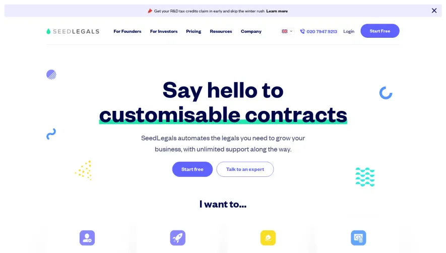
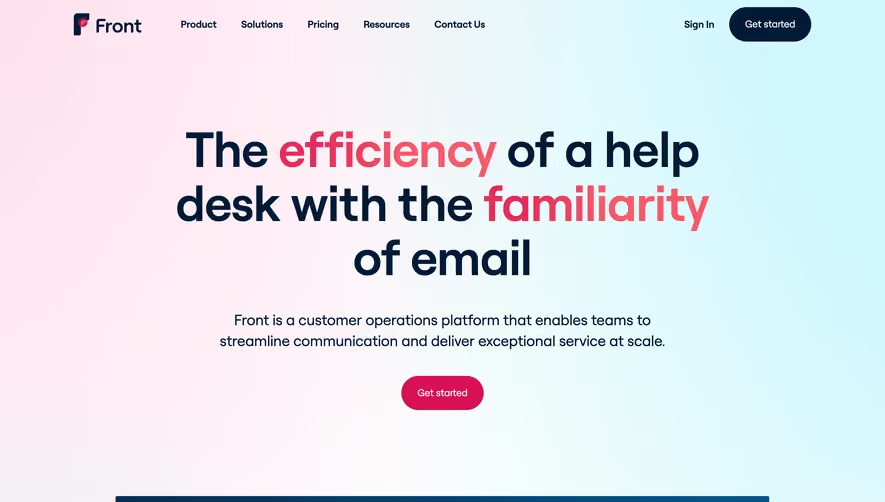
Overall Style and Aesthetic
FullStory’s homepage showcases a modern, polished SaaS design, balancing professionalism with approachability. Subtle use of whitespace creates a spacious, uncluttered feel, while intentional bursts of color provide energy without distraction. The result is both trustworthy and friendly—precisely the vibe that resonates with product teams and enterprise buyers alike. Layout and Structure
The homepage layout follows familiar best practices for conversion: a bold hero section introduces the product’s value proposition with concise messaging and a primary call-to-action. Below, feature rows alternate imagery and copy, guiding the user’s eye down the page. Expanded by carousel testimonials and recognizable customer logos, the footer anchors the page with concise navigation, trust marks, and resources. Visual Elements
Custom, line-art-style illustrations and animated data visualizations reinforce FullStory’s focus on digital experience analytics. Thoughtful iconography supports scannability, while embedded product preview videos add depth. Minimal photography maintains a clean aesthetic, ensuring core brand colors and illustrations remain the focus. Color Palette and Typography
A calming base of cool blues and grays sets a tech-forward tone, punctuated by vibrant accent colors for CTAs and highlights. Typography is crisp, pairing a geometric sans-serif for headings with legible body copy. Text hierarchy is expertly managed—large headlines, punchy subheadings, and easily digestible copy blocks keep content accessible. User Experience Patterns
Navigation is sticky and streamlined, supporting both product exploration and quick conversion. Prominent, consistent CTAs invite trial or demo requests. Engaging scroll interactions—subtle content fades, animated transitions—add delight and clarity without overwhelming the user. Unique or Notable Design Choices
Distinctive motion graphics in the hero section immediately communicate product value. The “Product Demo” callout is visually prioritized, encouraging hands-on engagement early. Content is context-aware, with smart microcopy that speaks directly to pain points. The overall tone is innovative, empathetic, and laser-focused on empowering users.