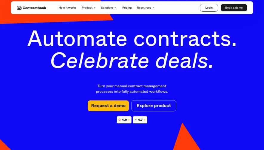
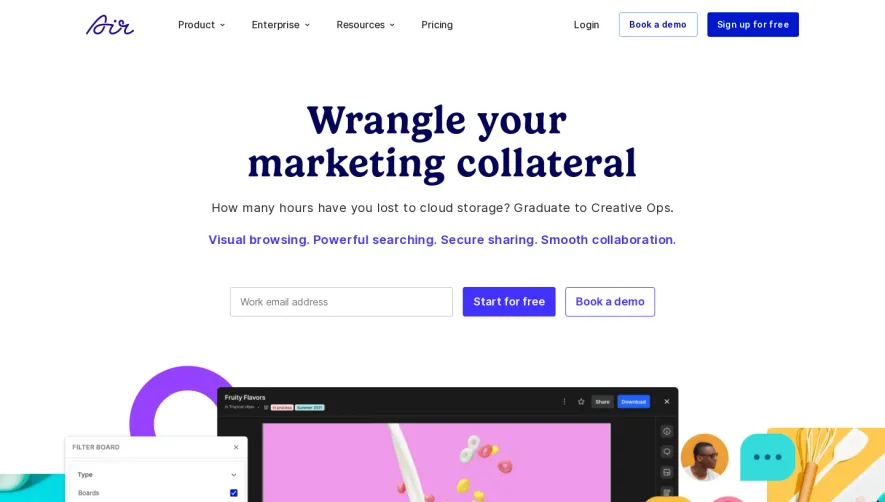
Generate a new design based on this screen using your own content.
Thank you! Your submission has been received!
Oops! Something went wrong while submitting the form.
# Design from Reference: Front Landing Page
Create an original, high-fidelity visual design inspired by the reference. Prioritize composition, typography, colors, spacing, and component styling over technical implementation.
## Reference
- **Product:** Front
- **Category:** Landing Page
- **Screenshot:** https://cdn.prod.website-files.com/5e9dc792e1210c5325f7ebbc/6acb67fac08cd859ff86938e_6acb66d646a91b1bd896ae7d_cms-409d8c5586e5c9cf399f295a.webp
Analyze the screenshot first. If inaccessible, request it rather than guessing.
## Content
{{content.instructions}}
{{content.data}}
Preserve essential messaging and factual accuracy. Adapt structure and copy length for visual balance; never invent product claims.
## Visual Design
Use this context to reproduce the reference's visual language: layout, typography, colors, spacing, borders, radii, and distinctive elements. The screenshot takes priority if descriptions conflict.
## Direction
{{preferences.fidelityInstructions}}
## Output
{{output.instructions}}
Deliver a polished, cohesive design with precise alignment, hierarchy, and spacing. Produce the requested visual artifact, not just a description. If unsupported, explain the limitation.
Front.com greets visitors with a meticulously modern and inviting aesthetic. The style is clean and professional, balancing generous white space with vibrant pops of color that draw attention without overwhelming. The interface feels approachable yet authoritative, fostering trust while maintaining an energetic vibe that’s appealing to fast-paced SaaS decision-makers.
Layout and Structure
The page is structured with clarity and flow in mind. A bold hero section immediately articulates the brand’s value proposition, paired with concise calls to action. Scrolling reveals well-delineated features sections, animated customer testimonials, high-impact client logos, and a concise pricing area—each with clear headings and ample breathing room. The footer offers navigation to essential resources without clutter.
Visual Elements
Custom illustrations and soft, animated graphics inject personality while supporting key messaging. Playful microinteractions—such as subtle hover animations—add a layer of delight. Screenshots and video snippets provide real-product context, breaking up text while reinforcing functionality. Icons are minimalist yet distinctive, contributing to seamless visual storytelling.
Color Palette and Typography
A blue and purple primary palette is elegantly accented with lively coral and firm black for contrast. Crisp, sans-serif fonts command attention and guide the eye hierarchically from bold headlines to easy-to-read body copy. This typographic harmony ensures information is accessible while exuding SaaS sophistication.
User Experience Patterns and Unique Choices
Navigation is sticky and intuitively organized, making exploration frictionless. Calls to action are persistent and varied in placement for conversion optimization. Form fields are minimal, reducing user effort. Notably, the blend of animated highlights and real-case metrics creates a uniquely dynamic, credible persuasion throughout, positioning the brand as both innovative and reliable.