Design with AI
Generate a new design based on this screen using your own content.
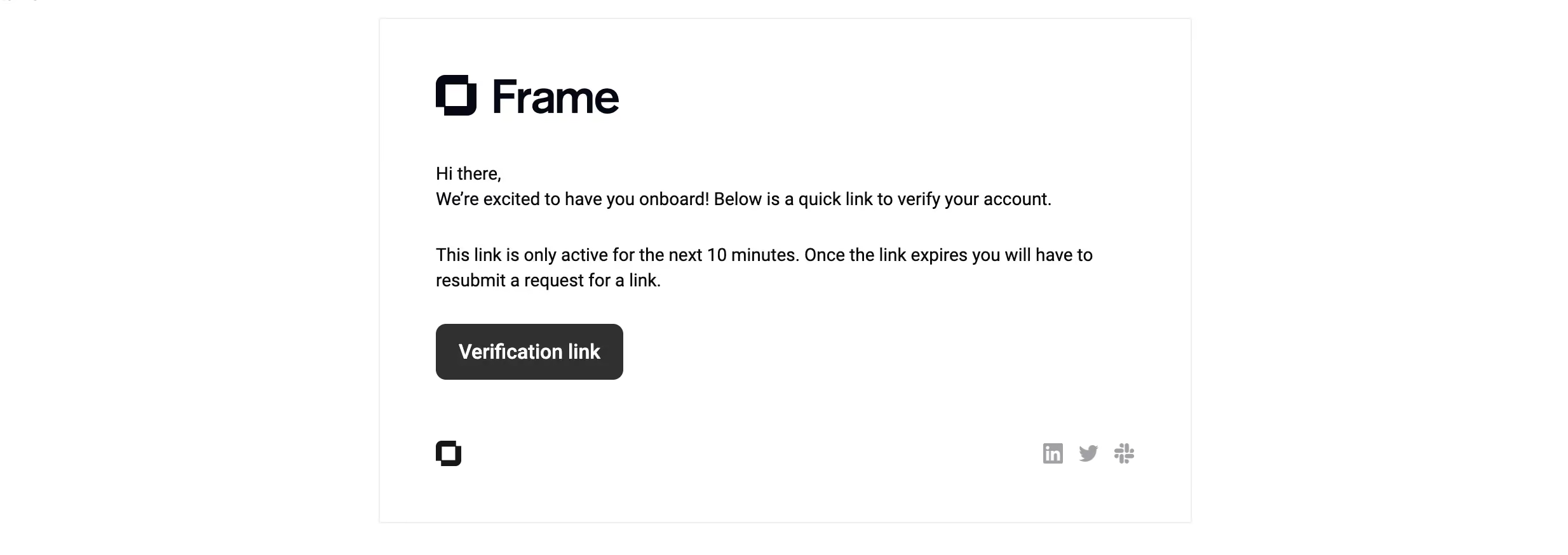
# Design from Reference: Frame Verification Email
Create an original, high-fidelity visual design inspired by the reference. Prioritize composition, typography, colors, spacing, and component styling over technical implementation.
## Reference
- **Product:** Frame
- **Category:** Verification Email
- **Screenshot:** https://cdn.prod.website-files.com/5e9dc792e1210c5325f7ebbc/6acad9c1a43009b06fe6bf67_6acad948567bc9a3079be2bf_cms-af79d77919738c72952fc4f1.webp
Analyze the screenshot first. If inaccessible, request it rather than guessing.
## Content
{{content.instructions}}
{{content.data}}
Preserve essential messaging and factual accuracy. Adapt structure and copy length for visual balance; never invent product claims.
## Visual Design
### Overall aesthetic
- **Character:** A minimal verification email uses a white bordered panel, large dark brand mark, plain black text, and one charcoal action.
- **Evidence:** The source is 2468 × 874 px, inspected at 1400 px width. Dimensions below use inspection pixels; actual email CSS scale is unverified.
### Page composition
- **Panel:** A centered outlined rectangle approximately 725 × 450 inspection px contains all content.
- **Brand:** A large Frame symbol/wordmark sits at the upper left inside the panel.
- **Message:** Greeting, short welcome/explanation, and a two-line expiration note appear below.
- **Action:** A left-aligned verification button follows the message.
- **Footer:** A small brand symbol sits left and three muted social/service icons align right.
### Information hierarchy
- **Identity:** The large dark wordmark is the strongest brand element.
- **Purpose:** Short prose introduces account verification without a separate headline.
- **Timing:** A second paragraph explains the link's limited validity.
- **Action:** One filled button provides the clear verification route; footer icons are secondary.
### Typography
- **Family:** A conventional sans serif is used; exact identity is unverified.
- **Body:** Approximately 16 px with 22 px line-height in the inspection image.
- **Button:** Around 18 px bold white text.
- **Brand:** Separate heavy graphic lettering around 42 px tall.
### Colors & surfaces
- **Measured palette:** Source samples include white #FFFFFF, charcoal #303030, near-black #0A090B, border gray #EEEEEE, dark navy #050714, and muted #A1A0A3.
- **Semantic use:** Near-black grounds branding/text; charcoal fills the action; muted gray identifies footer icons.
- **Flat surface:** No prominent shadow or colored background is visible.
### Components
- **Container:** Thin light-gray border, square corners, roughly 50 px internal side padding in the inspection image.
- **Button:** Approximately 168 × 50 px, charcoal, with 9–10 px radii.
- **Footer icons:** Three small gray marks share one baseline and even spacing.
- **Brand mark:** A smaller standalone symbol repeats at the lower left.
### Visual rhythm
- **Alignment:** Logo, prose, button, and footer symbol share a left edge.
- **Paragraph gaps:** Broad 28–32 px breaks distinguish greeting/explanation, timing, and action.
- **Footer spacing:** A large pause separates the verification action from footer branding.
- **Whitespace:** Wide outer margins reinforce the simple single-purpose message.
### Responsive
- **Observed limit:** Only one rendering is supplied; mobile/email-client behavior is unverified.
- **Recommended layout:** Use a fluid max-width email panel with 20–24 CSS px mobile gutters.
- **Recommended copy:** Keep text live and allow the timing paragraph to wrap naturally.
- **Recommended action:** Maintain a comfortable touch target and descriptive link name.
### Adaptation guidance
- **Preserve:** Keep a single verification action, concise timing explanation, and restrained monochrome branding.
- **Implement:** Use email-compatible markup, inline styles, image alternatives, and accessible link text.
- **Content:** Generate appropriate verification destinations rather than copying screenshot links.
- **Validate:** Check image-blocked rendering, narrow widths, contrast, and focus. Verification outcomes are not shown.
Use this context to reproduce the reference's visual language: layout, typography, colors, spacing, borders, radii, and distinctive elements. The screenshot takes priority if descriptions conflict.
## Direction
{{preferences.fidelityInstructions}}
## Output
{{output.instructions}}
Deliver a polished, cohesive design with precise alignment, hierarchy, and spacing. Produce the requested visual artifact, not just a description. If unsupported, explain the limitation.