Design with AI
Generate a new design based on this screen using your own content.
# Design from Reference: Clay Verification Email
Create an original, high-fidelity visual design inspired by the reference. Prioritize composition, typography, colors, spacing, and component styling over technical implementation.
## Reference
- **Product:** Clay
- **Category:** Verification Email
- **Screenshot:** https://cdn.prod.website-files.com/5e9dc792e1210c5325f7ebbc/6acb69935e515b69c7964df2_6acb67d246a91b1bd896f039_cms-8beaf69f8a770d99cf1a2ebb.webp
Analyze the screenshot first. If inaccessible, request it rather than guessing.
## Content
{{content.instructions}}
{{content.data}}
Preserve essential messaging and factual accuracy. Adapt structure and copy length for visual balance; never invent product claims.
## Visual Design
### Overall aesthetic
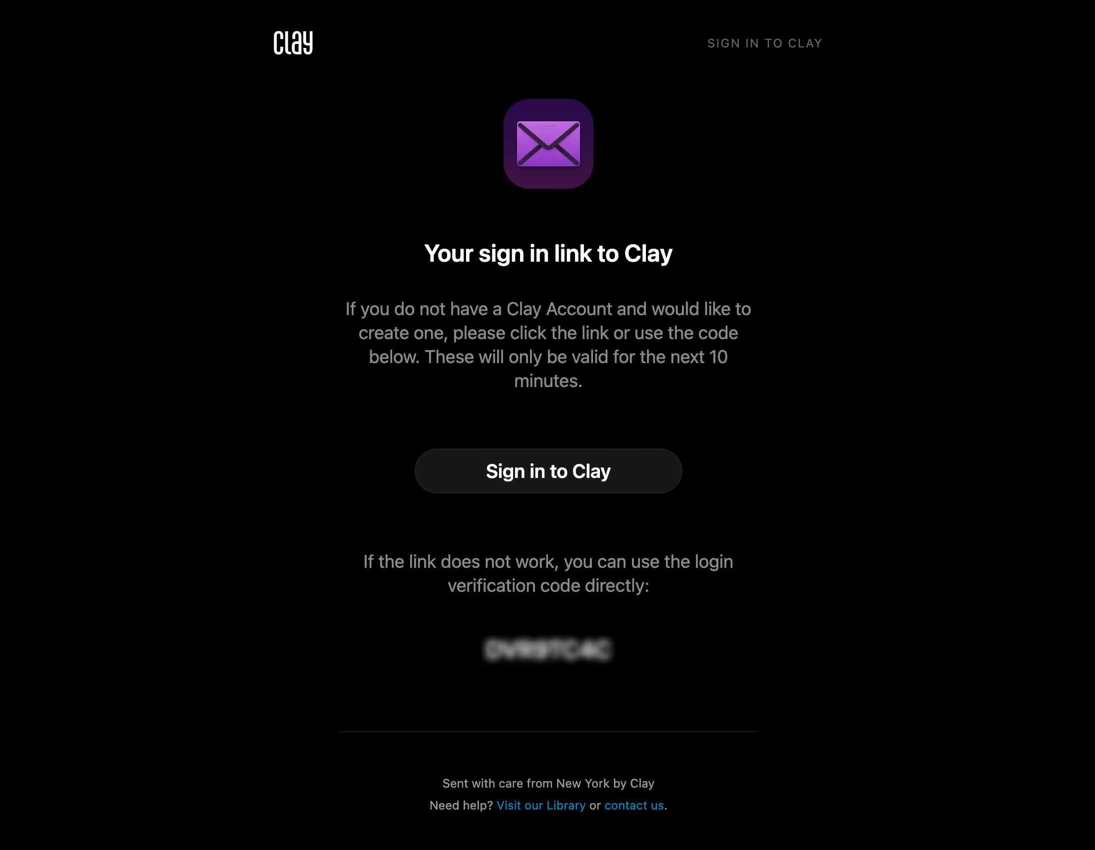
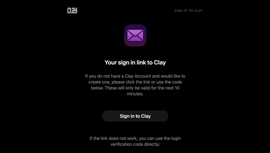
- **Direction:** A sparse black authentication email with centered content, muted explanatory text and a single purple envelope illustration.
- **Treatment:** Flat surfaces and generous empty space make the white heading and rounded sign-in action the principal anchors.
### Page composition
- **Observed canvas:** The source is 2192 × 1702 pixels; measurements below use the 1400-pixel-wide inspection rendering. CSS scale and email-client zoom are unverified.
- **Header:** A small white Clay wordmark sits near x350, y40; a widely tracked uppercase utility label aligns opposite it near x905.
- **Content column:** The centered message occupies roughly 540 pixels, with the envelope at y127, title at y310, action at y574 and footer divider at y935.
### Information hierarchy
- **Primary sequence:** Envelope illustration, bold sign-in heading, account/expiry explanation, then the main action.
- **Fallback route:** A separate instruction block and blurred verification code follow the button. The code is visually emphasized but its contents are not recoverable from this image.
- **Support:** Two compact footer lines sit beneath a thin divider; cyan links distinguish help destinations.
### Typography
- **Heading:** Approximately 30px bold sans serif, around 36px line height, centered and tightly tracked in inspection pixels.
- **Message:** Approximately 23px regular, 30px line height; the main explanation wraps to four lines and the fallback instruction to two.
- **Action and footer:** Button text is around 24px bold; footer around 16px with 28px baseline spacing. The uppercase header label is around 15px with expanded tracking. Font identity is unverified.
### Colors & surfaces
- **Measured neutrals:** Source pixel samples include black #000000, button-like charcoal #171717, gray #8C8C8C, white #FFFFFF and darker boundary tones #212121 and #1A1A1A.
- **Accent roles:** The envelope uses a violet-to-magenta treatment over a dark purple rounded tile. Support links appear cyan; these accent descriptions are observed, without an asserted exact hex sample.
- **Surface hierarchy:** The email stays on one black plane; the action is differentiated by its charcoal fill and subtle outline rather than a bright accent.
### Components
- **Illustration:** Approximately 116 × 116px in the inspection rendering, with a strongly rounded square silhouette and inset envelope graphic.
- **Primary button:** Approximately 343 × 58px, fully pill-shaped, centered, with a subtle 1px outline and white text.
- **Divider and links:** A roughly 538px horizontal gray hairline separates the support footer. Inline cyan links have no visible button container.
- **Captured state:** The email presents a sign-in link and an alternate code. Hover, focus, successful verification and expired-link states are not shown.
### Visual rhythm
- **Vertical grouping:** About 65px separates the illustration from the heading, 40px separates heading from explanation, and roughly 75px separates explanation from action.
- **Fallback spacing:** Around 70px follows the action before the alternate instruction; the code receives its own generous breathing room.
- **Alignment:** All message elements share a center axis, while the header uses two opposed anchors.
### Responsive
- **Observed scope:** Only one email rendering is supplied; narrower layouts and email-client behavior are unverified.
- **Recommended adaptation:** Use a fluid column with a maximum width, 20–24px mobile side padding and a button that fits the available width.
- **Recommended type:** Reduce the apparent desktop message scale while preserving comfortable line height, readable help links and a distinct fallback-code block.
### Adaptation guidance
- **Preserve:** Keep the black canvas, restrained purple icon, clear heading/action sequence and separate fallback route.
- **Implement:** Use email-compatible table alignment and conservative inline styles; treat illustration dimensions and spacers as scalable estimates rather than recovered CSS.
- **Complete states:** Provide accessible button naming and a readable text fallback, then design expiry and support states consistently with the same hierarchy.
Use this context to reproduce the reference's visual language: layout, typography, colors, spacing, borders, radii, and distinctive elements. The screenshot takes priority if descriptions conflict.
## Direction
{{preferences.fidelityInstructions}}
## Output
{{output.instructions}}
Deliver a polished, cohesive design with precise alignment, hierarchy, and spacing. Produce the requested visual artifact, not just a description. If unsupported, explain the limitation.