Generate a new design based on this screen using your own content.
Thank you! Your submission has been received!
Oops! Something went wrong while submitting the form.
# Design from Reference: Forest Admin Demo Request
Create an original, high-fidelity visual design inspired by the reference. Prioritize composition, typography, colors, spacing, and component styling over technical implementation.
## Reference
- **Product:** Forest Admin
- **Category:** Demo Request
- **Screenshot:** https://cdn.prod.website-files.com/5e9dc792e1210c5325f7ebbc/6acb61a9c08cd859ff851993_6acad1770c49d10a7abd381c_cms-bf17e7fb09f56989fab208e2.webp
Analyze the screenshot first. If inaccessible, request it rather than guessing.
## Content
{{content.instructions}}
{{content.data}}
Preserve essential messaging and factual accuracy. Adapt structure and copy length for visual balance; never invent product claims.
## Visual Design
Use this context to reproduce the reference's visual language: layout, typography, colors, spacing, borders, radii, and distinctive elements. The screenshot takes priority if descriptions conflict.
## Direction
{{preferences.fidelityInstructions}}
## Output
{{output.instructions}}
Deliver a polished, cohesive design with precise alignment, hierarchy, and spacing. Produce the requested visual artifact, not just a description. If unsupported, explain the limitation.
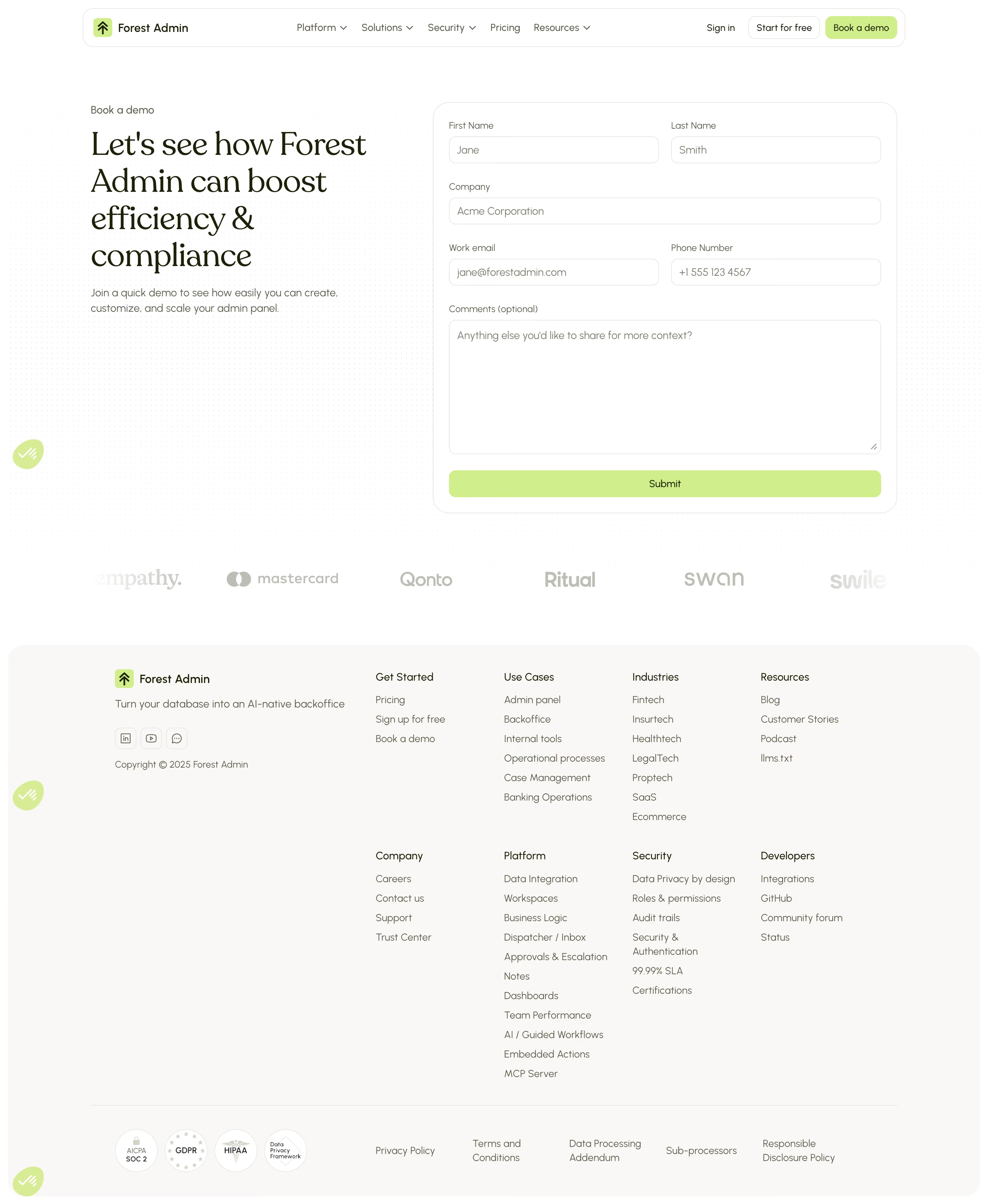
Forest Admin's demo booking page nails the "less is more" approach. The left side hits you with a bold serif headline that's doing real work, selling the value prop around efficiency and compliance without drowning you in words. The right side is a straightforward form. No distractions, no gimmicks.
Smart Use of Restraint
The color palette is almost entirely black, white, and olive green. That muted green on the submit button feels intentional and earthy, not the usual SaaS electric blue. Typography pairs a strong serif for the headline with clean sans-serif body text. It breathes well.
The Footer Does Heavy Lifting
Scroll down and you get a logo bar with names like Mastercard, Qonto, and Swan. Instant credibility. The footer itself is dense but well-organized into clear columns: Use Cases, Industries, Platform, Security. Trust badges (SOC 2, GDPR, HIPAA) sit at the very bottom. Smart placement.
What Makes It Stand Out
That floating green chat widget in the corner adds a subtle organic touch. The whole page feels grounded and mature, like a product that doesn't need to shout.