Overall Style and Aesthetic
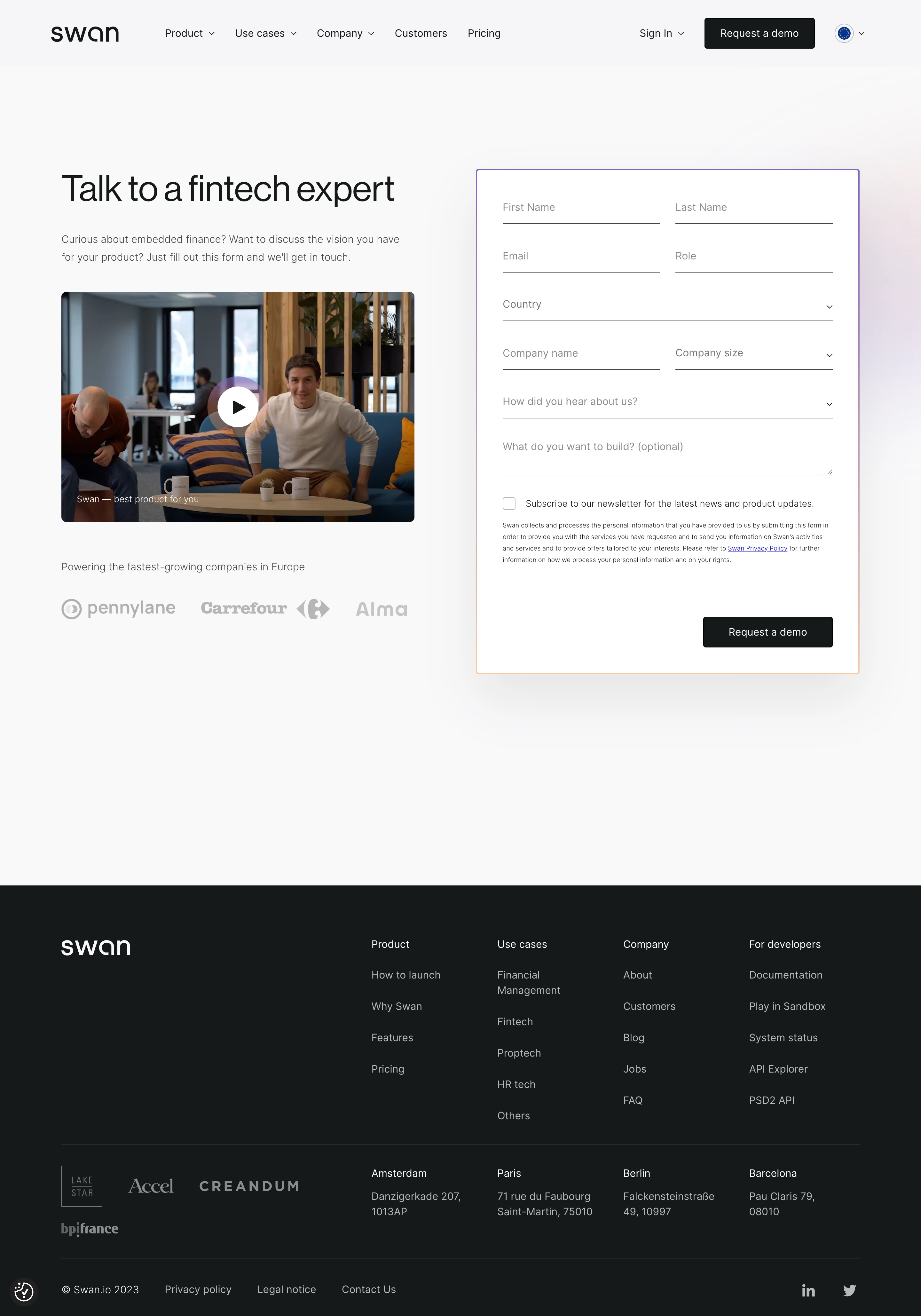
Swan.io’s “Talk to an Expert” page exudes a clean, modern, and professional vibe. Striking a perfect balance between minimalism and approachability, the design employs ample white space, refined lines, and restrained use of color. The vibe is trustworthy yet welcoming, appealing to both innovators and established companies looking for reliable fintech solutions. Layout and Structure
The structure is straightforward, with a visually commanding hero section that instantly communicates the page purpose. The carefully placed headline leads into a succinct subheading, subtly encouraging action. The form is prioritized above the fold, reducing friction for users seeking consultation. No extraneous modules like feature banners or testimonials clutter this page—everything is focused on conversion. Visual Elements
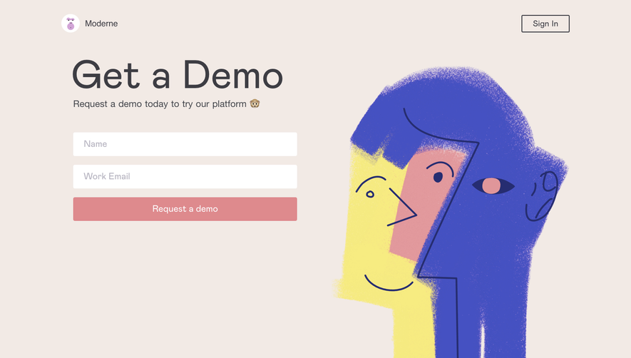
Bold but playful illustrations accent the interface, with a combination of abstract shapes and subtle movement, conveying innovation without distraction. Icons are used sparingly yet effectively to highlight form fields and CTAs, while micro-animations add polish without overwhelming the experience. Color Palette and Typography
A harmonious blend of deep blues, soft grays, and vivid accent colors (notably Swan’s signature orange) guide attention and reinforce the brand. Typography is sleek and confident, with clear hierarchy—large, sans-serif headings contrast against readable subtext, ensuring scannability. User Experience Patterns & Unique Touches
Navigation remains pared down, keeping the user laser-focused on the primary objective. The prominent CTA button stands out, and the multi-field form uses smart placeholders and clear error validation. Subtle hover and focus states add dynamism, while the conversational and transparent microcopy humanizes the digital interaction. Overall, the experience feels personal, efficient, and cleverly on-brand.