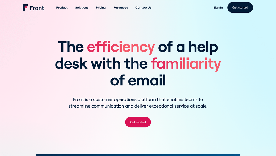
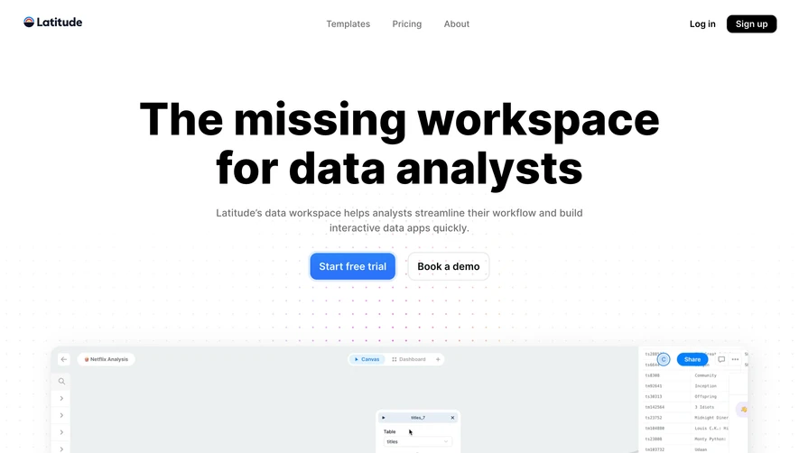
Generate a new design based on this screen using your own content.
Thank you! Your submission has been received!
Oops! Something went wrong while submitting the form.
# Design from Reference: Folk Landing Page
Create an original, high-fidelity visual design inspired by the reference. Prioritize composition, typography, colors, spacing, and component styling over technical implementation.
## Reference
- **Product:** Folk
- **Category:** Landing Page
- **Screenshot:** https://cdn.prod.website-files.com/5e9dc792e1210c5325f7ebbc/6acb6d8db206c0d3f8f3a0ed_6acb6b96d8a653ae3d58dcb1_cms-ec03b15d5d61604583c3072d.webp
Analyze the screenshot first. If inaccessible, request it rather than guessing.
## Content
{{content.instructions}}
{{content.data}}
Preserve essential messaging and factual accuracy. Adapt structure and copy length for visual balance; never invent product claims.
## Visual Design
Use this context to reproduce the reference's visual language: layout, typography, colors, spacing, borders, radii, and distinctive elements. The screenshot takes priority if descriptions conflict.
## Direction
{{preferences.fidelityInstructions}}
## Output
{{output.instructions}}
Deliver a polished, cohesive design with precise alignment, hierarchy, and spacing. Produce the requested visual artifact, not just a description. If unsupported, explain the limitation.
folk.app embodies a modern and minimalist approach, harnessing abundant white space and clean lines to deliver a fresh, professional appearance. The overall vibe is sophisticated yet accessible, blending subtle animation and lively hues to create an inviting, high-end SaaS brand presence.
Layout and Structure
The page opens with a hero section featuring concise headline copy and a vibrant product demo video, immediately framing the app’s value. Information flows logically: features are presented through visually engaging modules, complemented by succinct testimonials, and straightforward pricing cards. Each section stands out through careful spacing and visual separation, making exploration intuitive.
Visual Elements
Distinctive, custom illustrations and animated UI mockups breathe life into the core value props. Playful yet polished icons punctuate information. Occasional microinteractions—such as subtle hover effects—add interactivity without distraction. The featured video gives visitors a rapid, digestible overview of product functionality.
Color Palette and Typography
A calming yet energetic palette fuses soft blues and teals with pops of coral and yellow for highlights and CTAs. Modern, sans-serif typography (likely with generous weights for headings) establishes clear hierarchy, ensuring every headline, subtext, and button commands the right amount of attention.
User Experience Patterns
Sticky navigation, contrasting CTAs, and progressive disclosure patterns encourage seamless exploration. Simple onboarding prompts and minimal input forms lower friction. Strategic use of whitespace and anchored buttons guide users along a confident journey through content.
Unique or Notable Design Choices
folk.app stands out by embracing playful illustration, highly curated motion, and concise messaging—all while projecting trust and innovation. The design’s confident restraint ensures visual appeal never overshadows usability, offering visitors a benchmark for SaaS site clarity and charm.