
Thank you! Your submission has been received!
Oops! Something went wrong while submitting the form.
Get SaaSFrame Pro
Monthly
$18
Quarterly
$48
Yearly
$180
Upgrade to access this feature
Browse all screens & flows
Filter and search screens & flows
Access Figma files
Access mobile versions
Bookmark screens & flows
Join now


Flowrite Changelog

Flowrite
Supercharge your daily communication
Designed by
No items found.

Bookmark
Bookmark

Design with AI
Thank you! Your submission has been received!
Oops! Something went wrong while submitting the form.
# Design from Reference: Flowrite Changelog
Create an original, high-fidelity visual design inspired by the reference. Prioritize composition, typography, colors, spacing, and component styling over technical implementation.
## Reference
- **Product:** Flowrite
- **Category:** Changelog
- **Screenshot:** https://cdn.prod.website-files.com/5e9dc792e1210c5325f7ebbc/62ecbb5d8ef108e81010c9ed_1659680828822-screenshot-device-15f97963d59804c83523974a074377bb-1659680481080.webp
Analyze the screenshot first. If inaccessible, request it rather than guessing.
## Content
{{content.instructions}}
{{content.data}}
Preserve essential messaging and factual accuracy. Adapt structure and copy length for visual balance; never invent product claims.
## Visual Design
### Overall aesthetic
- **Style:** Spacious editorial changelog with a pale pastel header, white reading area and a contrasting charcoal conversion footer.
- **Character:** Rounded geometric sans-serif text and softly tinted product screenshots give the release notes an approachable, polished SaaS identity.
- **Capture:** The full desktop screenshot measures 1440 × 7663 image pixels. CSS estimates assume approximately 1:1 capture scale; actual browser scale and font identity are unverified.
### Page composition
- **Navigation:** A roughly 1224-pixel-wide centered header places the logo at left, five navigation links across the middle and an email/access form at right, with small social-proof avatars beneath it.
- **Hero:** A very pale blue-to-pink field extends to approximately 440 pixels down the capture. A centered product-updates title and short subtitle occupy its middle.
- **Update overview:** Five evenly spaced preview columns span the main container, each with a pastel thumbnail, bold date and muted multi-line summary.
- **Reading layout:** The article uses an approximately 600-pixel central column starting around x420, flanked by a small contents list on the left and an archive of dated updates on the right.
- **Article sequence:** The selected release opens with its date, summary, feature image and tinted introduction callout. Workflow and web-app sections alternate paragraphs with large interface illustrations, followed by UI updates, improvements and fixes.
- **Wide media:** Two large product illustrations expand beyond the reading column to the approximately 1224-pixel page container, breaking up the narrow text flow.
- **Ending:** Social sharing closes the article. A pale latest-updates band repeats the five previews, then a dark region contains a signup panel, three illustrated destination cards and a multi-column footer.
### Information hierarchy
- **Page title:** The large bold centered heading establishes the page type; the subtitle is quieter and considerably smaller.
- **Release navigation:** Dates are more prominent than preview summaries. The current article repeats its date above the detailed content.
- **Article levels:** Major headings introduce workflow and fixes; smaller bold subheadings distinguish web-app UI, UI updates, improvements and fixes.
- **Reading aids:** The left table of contents and right archive use subdued small type, preserving the central article as the primary reading path. Sticky behavior cannot be verified from this capture.
- **Conversion:** Email access requests appear in both the header and dark closing panel; the latter has a large centered headline.
- **Secondary destinations:** Three dark cards separate product updates, company information and blog content before the footer link groups.
### Typography
- **Family:** Rounded geometric sans-serif letterforms are visible; no exact font is verified.
- **Hero:** Estimated 56-pixel bold heading with roughly 68-pixel line height; subtitle approximately 22 pixels with 32-pixel line height.
- **Article headings:** Main section headings are approximately 32 pixels, bold, with around 42-pixel line height. Smaller headings are approximately 24 pixels with 32-pixel line height.
- **Body:** Approximately 16 pixels with a generous 30–32-pixel line height. The 600-pixel measure supports comfortable paragraph and bullet-list reading.
- **Preview dates:** Approximately 20 pixels, medium-to-semibold weight; summaries approximately 16 pixels with 26-pixel line height.
- **Utility text:** Navigation is approximately 14–15 pixels; contents and archive links around 12 pixels. Small uppercase labels use visibly increased tracking.
- **Dark closing region:** The signup headline is approximately 44 pixels and bold; footer group labels and links are around 14 pixels.
### Colors & surfaces
- **Measured reading surfaces:** White #FFFFFF dominates. Other sampled light surfaces include #F9FBFC and #F3F5F7.
- **Measured dark palette:** Common dark image samples include #292E37, #1C2129, #1D232A and #242933, supporting the charcoal footer and nested panels.
- **Text hierarchy:** Main text is charcoal; secondary copy and navigation are cool gray. Footer copy becomes muted gray on dark surfaces.
- **Accent treatment:** Access buttons use pale lavender with dark labels. Product artwork introduces very light blue, lavender and pink gradients.
- **Borders and shadows:** Most article content has no enclosing border. Screenshots have rounded edges and soft internal shadows; dark destination cards use subtle elevation.
- **Cookie notice:** A white floating panel overlays the bottom-right dark footer, with a pale lavender acknowledgment button.
### Components
- **Header signup:** A compact white email field and lavender request button form a single horizontal unit, approximately 330 pixels wide and 50 pixels high.
- **Preview tiles:** Each thumbnail is approximately 188 × 98 image pixels with small rounded corners; cards have no visible outer frame. The five-column gaps are approximately 70 pixels.
- **Introduction callout:** A pale gray-blue block spans the article width, with roughly 24-pixel padding, a small emoji-style icon at left and several lines of copy.
- **Contents and archive:** Text links form sparse vertical lists. The contents has a tracked uppercase label and indented subitems; the archive stacks dates beneath its title.
- **Embedded illustrations:** Images show the template selector, a three-part writing workspace, onboarding tutorial and alternative responses. These are illustrative article media, not evidenced live controls on this page.
- **Lists:** Standard circular bullets, indented about 24 pixels, carry the long improvements and fixes sections. Some UI-update bullets are followed by images.
- **Sharing:** A centered small label between thin rules sits above three compact social icon buttons.
- **Closing signup panel:** A wide rounded charcoal panel has approximately 70-pixel vertical padding, centered headline and a compact inline email form.
- **Destination cards:** Three equal-width rounded cards combine illustration and short text; their imagery includes product windows, portraits and category tags.
- **Footer and overlay:** Four link groups sit beside the brand/social column. The cookie panel is approximately 515 × 90 image pixels with rounded corners and a small cookie icon.
### Visual rhythm
- **Container:** Approximately 108-pixel outer gutters establish the wide grid, while the narrower article remains centered.
- **Section spacing:** Large whitespace separates hero, preview row and article start. Major article groups use roughly 64–90-pixel breaks; headings have smaller 24–32-pixel gaps to copy.
- **Reading cadence:** Short paragraphs and large media alternate before the denser bullet-list tail.
- **Media contrast:** Wide screenshots temporarily open the composition beyond the article measure, then text returns to the same central alignment.
- **Footer transition:** The light latest-updates strip creates a pause before the dark signup and navigation area.
### Responsive
- **Recommendation — article:** Preserve a readable single text column with fluid 20–24-pixel gutters on small screens.
- **Recommendation — side navigation:** Move contents and archive into compact expandable controls above the article; avoid squeezing them alongside body copy.
- **Recommendation — previews:** Reduce the five-column grids to two columns and then one, or use an accessible horizontal preview list.
- **Recommendation — media:** Fit large screenshots to the viewport and offer an enlarged view when embedded interface labels become unreadable.
- **Recommendation — forms and footer:** Stack email controls, destination cards and footer groups; ensure the cookie notice leaves content and navigation accessible. No mobile state is shown.
### Adaptation guidance
- **Preserve the editorial structure:** Keep release date, summary, visual introduction, feature explanations and categorized fixes distinct.
- **Use two content widths:** Pair an approximately 600-pixel reading measure with a wider 1224-pixel media and overview grid.
- **Build reusable previews:** Reuse the date-thumbnail-summary component in the top overview and latest-updates band.
- **Keep navigation subordinate:** Use small, low-emphasis contents and archive links while maintaining adequate contrast and focus visibility.
- **Apply surface contrast intentionally:** Retain a mostly white article and reserve the charcoal palette for closing conversion and footer content.
- **Treat screenshots as content:** Maintain image aspect ratios and avoid recreating captured product controls as page interactions without separate requirements.
Use this context to reproduce the reference's visual language: layout, typography, colors, spacing, borders, radii, and distinctive elements. The screenshot takes priority if descriptions conflict.
## Direction
{{preferences.fidelityInstructions}}
## Output
{{output.instructions}}
Deliver a polished, cohesive design with precise alignment, hierarchy, and spacing. Produce the requested visual artifact, not just a description. If unsupported, explain the limitation.


Category
Patterns
No items found.
Tech Stack


Added on
August 5, 2022
Similar screens
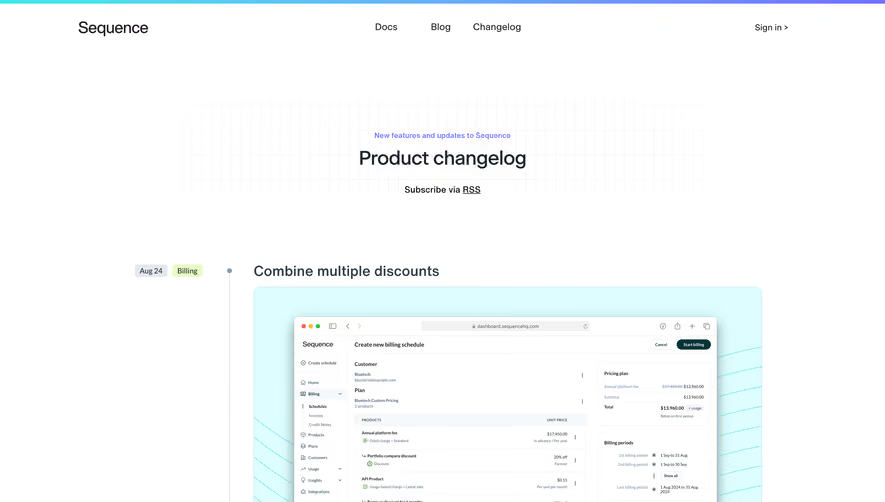


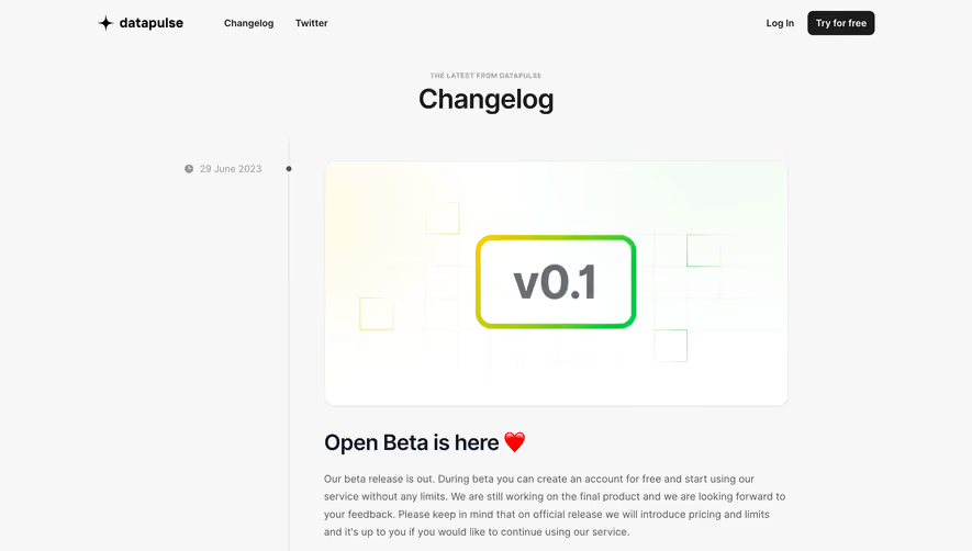

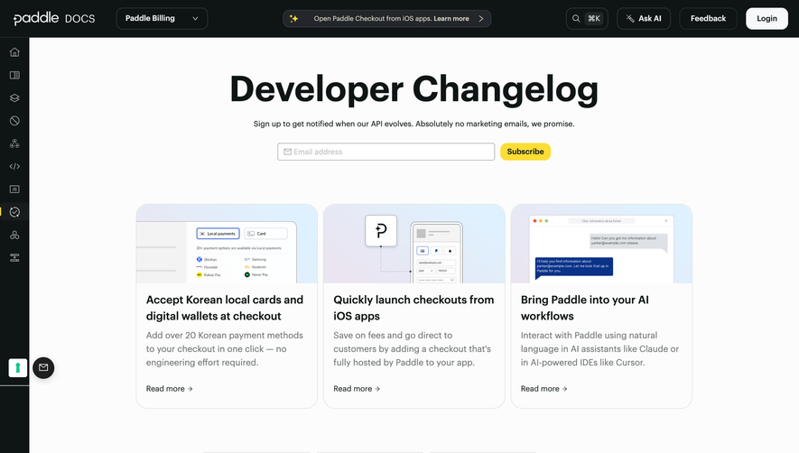

Upgrade to SaaSFrame Pro now to see similar examples.
Monthly
$18 /month
Billed $18 monthly
Browse all screens & flows
Filter and search screens & flows
Search text in screenshots
Access Figma files
Access mobile versions
Join now
Quarterly
$16 /month
Billed $48 quarterly
Browse all screens & flows
Filter and search screens & flows
Search text in screenshots
Access Figma files
Access mobile versions
Join now
Yearly
$15 /month
Billed $180 yearly
Browse all screens & flows
Filter and search screens & flows
Search text in screenshots
Access Figma files
Access mobile versions
Join now