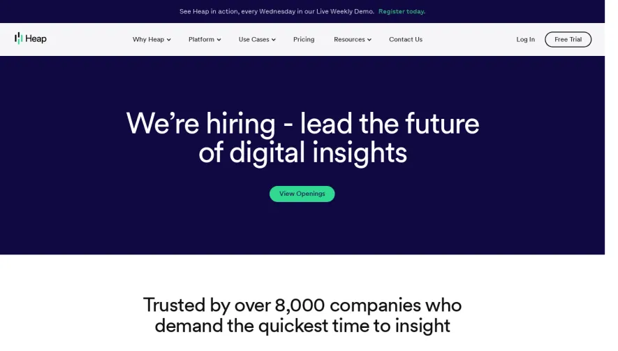
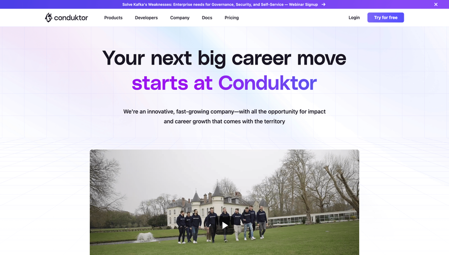
Generate a new design based on this screen using your own content.
Thank you! Your submission has been received!
Oops! Something went wrong while submitting the form.
# Design from Reference: Figma Careers Page
Create an original, high-fidelity visual design inspired by the reference. Prioritize composition, typography, colors, spacing, and component styling over technical implementation.
## Reference
- **Product:** Figma
- **Category:** Careers Page
- **Screenshot:** https://cdn.prod.website-files.com/5e9dc792e1210c5325f7ebbc/6acbd373e13ab9df8f0669dd_6acbd1b1151c40fa40793bae_cms-208d6545b647ac99fec12a64.webp
Analyze the screenshot first. If inaccessible, request it rather than guessing.
## Content
{{content.instructions}}
{{content.data}}
Preserve essential messaging and factual accuracy. Adapt structure and copy length for visual balance; never invent product claims.
## Visual Design
Use this context to reproduce the reference's visual language: layout, typography, colors, spacing, borders, radii, and distinctive elements. The screenshot takes priority if descriptions conflict.
## Direction
{{preferences.fidelityInstructions}}
## Output
{{output.instructions}}
Deliver a polished, cohesive design with precise alignment, hierarchy, and spacing. Produce the requested visual artifact, not just a description. If unsupported, explain the limitation.
Figma's careers page exudes a clean, modern sensibility balanced with playful touches that spotlight creative energy. Minimalist white space is punctuated by vibrant accent colors and abstract shapes, giving the page a lively yet professional vibe that's approachable and forward-thinking.
Layout and Structure
The page opens with a dynamic hero section featuring welcoming copy and animated elements that quickly convey Figma’s culture and mission. Content flows in digestible, well-spaced blocks—company overview, life at Figma, open positions—guiding visitors smoothly. Each block employs visual interest through custom illustration, employee spotlights, and dense but scannable text.
Visual Elements
Bespoke illustrations and animated graphics craft a memorable brand experience, toggling between organic lines and geometric forms. Moments of photography, featuring real team members, add authenticity. Subtle micro-animations enliven scrolling and transitions without being distracting.
Color Palette and Typography
The palette centers on crisp whites layered with Figma’s signature colors—purples, reds, and vibrant greens—used for CTAs and highlights. Typography is bold yet neutral, leveraging an accessible geometric sans-serif for clarity, partnered with larger headers and expressive subheads to reinforce hierarchy and usability.
User Experience Patterns
Navigation is simple: a sticky top nav includes direct links to teams and open roles. Clear CTAs (“See Open Roles”) stand out in vivid color blocks. Accessibility is prioritized through readable text sizes and contrast. Smooth scroll reveals content in stages, maintaining engagement.
Unique Design Choices and Tone
Playful, intersecting squiggles and bursts echo creative collaboration, subtly referencing Figma’s product ethos. The tone feels optimistic, welcoming, and distinctly human—inviting design talent to envision themselves as part of Figma’s vibrant team. The overall execution feels innovative and joyful, perfect for a design-driven SaaS.