Prompt 1,214 words Copy
# Design from Reference: Dimension Careers Page

Create an original, high-fidelity visual design inspired by the reference. Prioritize composition, typography, colors, spacing, and component styling over technical implementation.

## Reference

- **Product:** Dimension
- **Category:** Careers Page
- **Screenshot:** attached to this message (also available at https://media.saasframe.io/v/2ae7efcde4c69ba0f798-1600.webp)
- **Source:** https://www.dimension.dev/careers/

Analyze the attached screenshot first. If no image is attached, open the screenshot link; if neither is accessible, ask for it rather than guessing.

## Visual Design Context

### Overall aesthetic

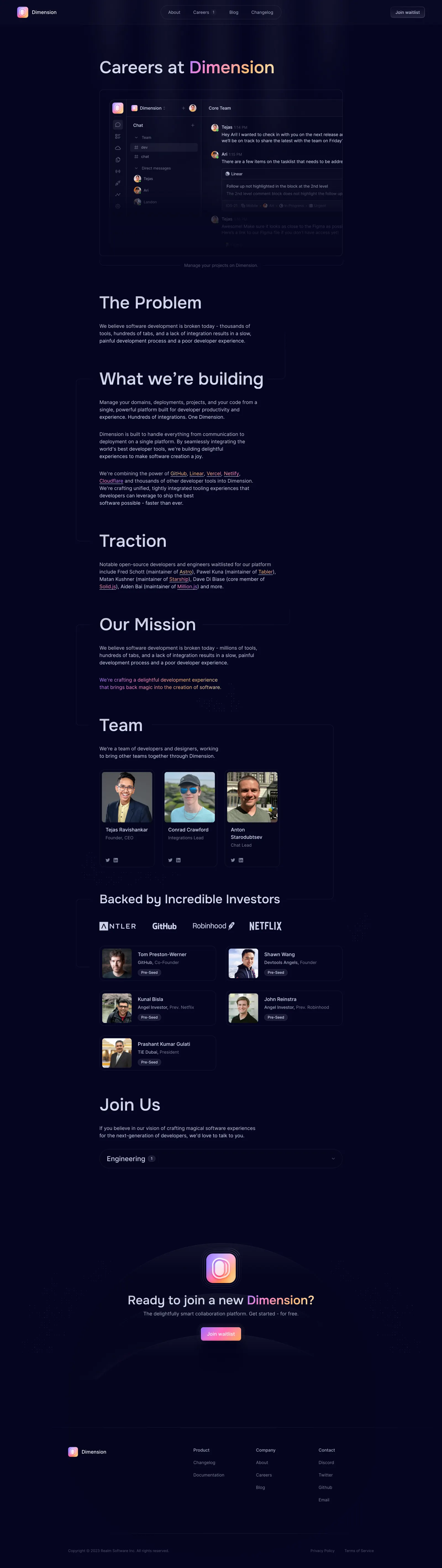
- **Style:** Dark developer-company careers page with pale lavender text, gradient brand words, outlined profile cards, and subtle circuit/orbit decoration.
- **Character:** Large light-weight headings, narrow editorial paragraphs, deep navy background, soft glow, and colorful brand tile.
- **Surface treatment:** Fine low-contrast outlines; most content sits directly on the page.

### Page composition

- **Capture and scale:** 2880 × 10212 image px. CSS estimates assume a 2× capture, approximately 1440 × 5106 CSS px; scale is unverified. All portions inspected.
- **Header:** Brand left, rounded navigation capsule center, waitlist action right.
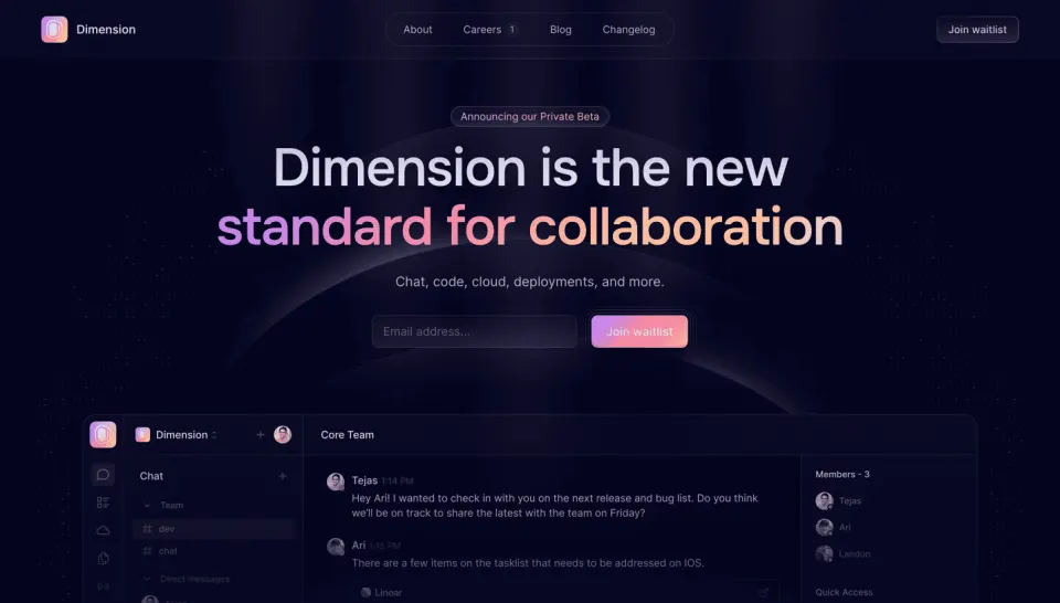
- **Hero:** Large Careers at Dimension heading with gradient brand name; outlined product screenshot below, fading toward the bottom, and small caption.
- **Narrative:** Narrow left-aligned sections for problem, product vision, traction, and mission, connected by faint rounded line motifs.
- **Team:** Three portrait cards in one row with name, role, and social icons.
- **Investors:** Heading, four muted brand marks, and five horizontal portrait cards in a two-column grid.
- **Recruitment:** Join Us heading, short paragraph, and one collapsed Engineering row with count and chevron.
- **Closing CTA:** Large gradient app icon, centered waitlist headline/subtitle/action over faint arcs and dotted decoration.
- **Footer:** Brand, three link groups, and low-contrast legal row.

### Information hierarchy

- **Recruitment identity:** Large hero heading leads, with gradient company name as emphasis.
- **Product context:** Screenshot introduces the collaboration product before company narrative.
- **Story progression:** Problem, solution, traction, mission, team, and backing precede open roles.
- **People:** Portraits carry the first emphasis within team/investor cards, followed by name, role, and small supporting badges.
- **Role discovery:** Engineering count row is the visible job-navigation entry.
- **Conversion:** Waitlist close is distinct from the careers role section.
- **Historical status:** Team, investors, traction, and opening counts are captured content, not verified current facts.

### Typography

- **Family:** Neutral proportional sans serif; exact identity is unverified.
- **Hero / section headings:** Approximately 56px medium with 66px line-height.
- **Investor heading:** Approximately 40px medium.
- **Body:** Approximately 16px with 24px line-height, narrow 560–600px measure.
- **Card names:** Approximately 16px; roles around 14px in muted lavender.
- **Role accordion:** Approximately 24px title with small count badge.
- **Closing heading:** Approximately 40px medium; subtitle around 16px.
- **Precision:** CSS sizes, weights, and leading are visual estimates.

### Colors & surfaces

- **Main navy:** Sampled #050522.
- **Nearby navy:** Sampled #050521.
- **Subtle panel/glow tones:** Sampled #070722, #060622, #080825, #090A26, and #0B0B27.
- **Text:** Pale lavender for headings/body; muted slate-lavender for roles and footer.
- **Brand gradient:** Violet/pink/coral/yellow accents in the company name, app tile, and waitlist action.
- **Narrative links:** Warm pink/orange gradient-like emphasis and underlines.
- **Treatment:** Fine outlines and faded lower screenshot overlay blend content into the dark canvas.

### Components

- **Product preview:** Approximately 790px wide, rounded outlined frame containing dark collaboration UI; lower area fades into background.
- **Narrative guides:** Thin rounded rectangular/circuit-like lines wrap beside sections without enclosing the text fully.
- **Team cards:** Three narrow outlined rectangles around 180px wide, 16px radius, inset square portrait, two-line identity, and small socials near bottom.
- **Investor marks:** Four pale monochrome logos in a horizontal row.
- **Investor cards:** Two-column horizontal units around 380 × 114px, small square portrait left, name/role and Pre-Seed pill right.
- **Role row:** Broad outlined capsule around 790 × 62px with Engineering label, count chip, and down chevron.
- **CTA tile:** Large gradient icon with multiple thin surrounding rounded outlines.
- **Waitlist action:** Small gradient rectangle with white label and layered border/glow.
- **Footer links:** Three sparse groups under muted headings.
- **State limits:** Role row is collapsed; no job details, application form, or waitlist confirmation is visible.

### Visual rhythm

- **Reading width:** Narrative paragraphs remain narrow within a wider approximately 790px content column.
- **Section gaps:** Large vertical intervals separate company-story chapters.
- **Grid contrast:** Three vertical team cards transition to two-column horizontal investor cards.
- **Decorative continuity:** Faint guide lines, dots, and arcs connect otherwise sparse sections.
- **Closing pause:** Broad empty space separates recruitment and the waitlist CTA.

### Responsive

- **Observed state:** Desktop only; mobile behavior is unverified.
- **Typography recommendation:** Reduce major headings toward 36–40px.
- **People-grid recommendation:** Stack team/investor cards or use two then one column.
- **Narrative recommendation:** Keep readable line lengths and 20–24px gutters.
- **Role recommendation:** Make the full role row keyboard/touch operable with explicit expanded state.
- **Decoration recommendation:** Simplify guide lines/arcs and honor reduced-motion preferences if animated.

### Adaptation guidance

- **Preserve:** Dark atmosphere, gradient brand emphasis, company narrative before roles, and consistent portrait-card system.
- **Starting geometry:** Approximately 790px content width, 56px headings, 16px body, 16px card radii, and 62px role row under the unverified 2× assumption.
- **Content fidelity:** Populate approved current team, backers, and openings rather than assuming screenshot data remains current.
- **Photography:** Use supplied portraits with appropriate permission and alternatives.
- **Implementation recommendation:** Provide accessible job discovery/application and waitlist routes, with sufficient contrast for muted text.
- **State fidelity:** Do not invent expanded roles or application details from the collapsed reference.

## Content

**Instructions:**

Generate realistic example content that fits the selected design reference.

Create appropriate headlines, descriptions, labels, buttons, and supporting copy based on the type of interface being designed.

If a product or business description is provided, use it to guide the content.

Otherwise, invent a plausible fictional SaaS product appropriate for the reference.

Keep the content concise, coherent, and visually balanced.

Do not present fictional statistics, customer names, or testimonials as verified facts.

## Design Direction

**Instructions:**

Use the reference screenshot as the main source of visual inspiration rather than a strict layout template.

Preserve its most distinctive design characteristics, such as typography, visual rhythm, color relationships, component treatments, and overall aesthetic.

Feel free to modify section arrangements, proportions, spacing, and individual components to better suit my content.

Introduce original design decisions where they improve usability, composition, or brand consistency.

The result should clearly reflect the reference's visual language without looking like a direct reproduction.

Follow the visual identity of the reference design.

Use its typography, color palette, component styling, and overall aesthetic as the primary design direction.

Do not introduce an unrelated visual identity.

## Output

**Instructions:**

Generate a high-fidelity visual mockup of the requested interface.

Present the design as a polished, realistic website or product UI screenshot.

Prioritize visual composition, typography, spacing, colors, alignment, and component details.

Use the available image-generation or visual-design capabilities.

Do not replace the mockup with source code, a written design specification, or a textual description.

If direct visual generation is unavailable, clearly explain the limitation.

## Constraints

- Use the actual screenshot as the primary visual reference.
- Preserve essential messaging and factual accuracy.
- Prioritize visual quality and consistency.
- Do not invent unsupported product claims.
- Adapt structure and copy length for visual balance.
Reference image Attach it to your message: assistants can’t open image links. Open in ChatGPT ↗ Open in Claude ↗
Build it in Lovable ↗ v0 ↗ Figma Make ↗
Opening a tool copies the screenshot so you can paste it with your prompt.
 SaaSFrame