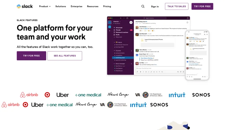
Design with AI
Generate a new design based on this screen using your own content.
# Design from Reference: Dust Features Page
Create an original, high-fidelity visual design inspired by the reference. Prioritize composition, typography, colors, spacing, and component styling over technical implementation.
## Reference
- **Product:** Dust
- **Category:** Features Page
- **Screenshot:** https://cdn.prod.website-files.com/5e9dc792e1210c5325f7ebbc/6acad346d5603a17eba5b781_6acad10ec5142fbf8922be99_cms-79d53113fa60844b7989c123.webp
Analyze the screenshot first. If inaccessible, request it rather than guessing.
## Content
{{content.instructions}}
{{content.data}}
Preserve essential messaging and factual accuracy. Adapt structure and copy length for visual balance; never invent product claims.
## Visual Design
### Overall aesthetic
- **Character:** Bright enterprise AI marketing page with playful geometric branding, pastel feature illustrations and generous white space.
### Page composition
- **Capture:** 2105 × 11871 screenshot pixels; CSS scale unverified.
- **Structure:** Centered hero, large framed product demo, customer-logo grid, alternating feature rows, capability/security accordions, oversized green testimonial, three use-case cards, pastel CTA and five-column footer.
### Information hierarchy
- **Priority:** Monospaced hero and paired actions lead into product evidence; feature explanations and security details precede social proof and closing conversion.
### Typography
- **Families:** Monospace hero and selected card headings; sans-serif body and section titles. Exact families unverified.
- **Estimated CSS sizes:** Hero 60–64px, section headings 40–44px, feature titles 32–36px, body 16–18px; screenshot scaling may differ.
### Colors & surfaces
- **Measured palette:** White #FFFFFF, gray #F7F7F7, pastel blue #E9F7FF, yellow #FFFAE0, pink #FFF1F7 and testimonial green #428B5C.
- **Accents:** Bright blue primary buttons and small multicolor brand shapes.
### Components
- **Elements:** Rounded product screenshot with play overlay, two-row customer logos, small floating UI illustrations, chevron accordions, testimonial attribution and carousel arrows.
- **Estimated geometry:** 16–24px panel radii, 44–48px buttons, 32px card padding and large rounded demo frame.
### Visual rhythm
- **Spacing:** Broad section gaps and alternating text/image columns create a slow explanatory rhythm. The solid green quote and geometric final CTA provide stronger visual punctuation.
### Responsive
- **Suggested adaptation:** Stack feature rows and use-case cards, wrap logo grids, reduce hero type and keep accordion targets accessible. Mobile behavior is not shown.
### Adaptation guidance
- **Transfer:** Preserve the white/pastel balance, clear demo focal point and alternating evidence sequence. Use verified claims and real customer proof.
Use this context to reproduce the reference's visual language: layout, typography, colors, spacing, borders, radii, and distinctive elements. The screenshot takes priority if descriptions conflict.
## Direction
{{preferences.fidelityInstructions}}
## Output
{{output.instructions}}
Deliver a polished, cohesive design with precise alignment, hierarchy, and spacing. Produce the requested visual artifact, not just a description. If unsupported, explain the limitation.