
Thank you! Your submission has been received!
Oops! Something went wrong while submitting the form.
Get SaaSFrame Pro
Monthly
$18
Quarterly
$48
Yearly
$180
Upgrade to access this feature
Browse all screens & flows
Filter and search screens & flows
Access Figma files
Access mobile versions
Bookmark screens & flows
Join now

Visitors Features Page

Visitors
Fast, private, realtime web analytics
Designed by
No items found.

Bookmark
Bookmark

Design with AI
Thank you! Your submission has been received!
Oops! Something went wrong while submitting the form.
# Design from Reference: Visitors Features Page
Create an original, high-fidelity visual design inspired by the reference. Prioritize composition, typography, colors, spacing, and component styling over technical implementation.
## Reference
- **Product:** Visitors
- **Category:** Features Page
- **Screenshot:** https://cdn.prod.website-files.com/5e9dc792e1210c5325f7ebbc/6acad3adc2028efdec71b07f_6acad15d0aa47f6da2c9b3b1_cms-be0298139f8838f0231c5247.webp
Analyze the screenshot first. If inaccessible, request it rather than guessing.
## Content
{{content.instructions}}
{{content.data}}
Preserve essential messaging and factual accuracy. Adapt structure and copy length for visual balance; never invent product claims.
## Visual Design
### Overall aesthetic
- **Style:** Airy analytics marketing page with white and near-white sections, dark rounded sans-serif headings, soft lavender accents and restrained interface demonstrations.
- **Capture scale:** Source screenshot is 2111 × 11834px. Sizes below refer to the 1200px-wide inspection rendering; underlying CSS scale is unverified.
### Page composition
- **Navigation and hero:** A compact centered dark navigation capsule precedes a two-line centered headline, short explanation, adjacent trial/demo pills and small reassurance text.
- **Product showcase:** A full-width pink-purple landscape frames a large white analytics screenshot, followed by three concise icon-led benefit columns.
- **Tracking and metrics:** A pale tracking section uses a centered label/headline/description and three feature columns. A white metrics section presents four evenly spaced metric examples.
- **Dashboard features:** Four alternating image/text rows explain pages, sources, locations and devices. Each interface fragment sits within a large pale rounded square.
- **Lower sections:** Framework logos, a pale privacy section with three columns, a narrow FAQ list and a broad rounded conversion panel lead into footer links and a huge cropped lavender ring motif.
### Information hierarchy
- **Hero message:** Privacy-friendly web analytics leads the page; a saturated trial action has more emphasis than the pale See demo button.
- **Proof through interface:** The main screenshot shows line charts, headline metrics, realtime activity and an experience score, while later fragments isolate specific dashboard tables.
- **Metrics overview:** People, Views, Bounced and Duration each pair a small icon, label, large example value and brief explanation.
- **Supporting material:** Seven framework marks appear beneath integration copy. Privacy principles and ten closed FAQ rows address setup and product questions before the repeated trial action.
### Typography
- **Family:** Rounded contemporary sans-serif; exact font identity is unverified.
- **Hero:** Approximately 48–52px/55px medium at inspection scale, with tight tracking. Supporting copy is around 15–16px/20px.
- **Section hierarchy:** Section headings are around 29–32px with a dark first line and lighter gray second line. Feature-row headings are around 20px; body copy around 14px/20px.
- **Small roles:** Eyebrow chips and footer links are approximately 12px. Metric values are around 25px. Navigation labels remain compact.
### Colors & surfaces
- **Sampled palette:** ICC-aware sRGB samples include white #FFFFFF, near-white #FAFAFA, pale lavender #DAD9FC, soft gray #F2F2F2, lavender accent #928DF6, dark ink #181925 and body gray #666666.
- **Accent placement:** Lavender identifies trial actions, line icons, small chevrons and the final ring motif. Brand/framework logos retain their own colors.
- **Showcase:** The scenic background introduces pink, purple and blue without spreading those tones across the reading sections.
- **Depth:** Interface fragments have very faint borders/shadows; most sections rely on whitespace and subtle surface shifts.
### Components
- **Navigation capsule:** Approximately 376 × 43px at inspection scale, fully rounded, containing a simple ring mark, compact links and a lavender Register pill.
- **Buttons:** Trial and demo controls are rounded pills around 36px high; the trial uses lavender with white text and the demo pale gray with gray text.
- **Main screenshot:** Approximately 804 × 502px white panel with modest corners, showing a wide chart and compact lower cards.
- **Feature fragments:** Pale square wrappers are roughly 402px wide with about 20px corners. Smaller white tables inside use horizontal gray proportional bars, tabs, icons/flags and right-aligned counts.
- **Framework row:** React, Next.js, Vue.js, Nuxt, SvelteKit, Astro and Angular marks form one centered horizontal row with small gray labels below.
- **FAQ:** Roughly 438px-wide stack of pale rounded rows, each with a left-aligned question and small lavender down chevron; no answer is expanded.
- **Final CTA and footer:** A broad pale rounded panel repeats heading, explanation and actions. Beneath it, brand text/status sits left of four small navigation columns.
### Visual rhythm
- **Spacing:** Large vertical pauses separate modules, with centered introductions consistently preceding grids or demonstrations.
- **Alternation:** Dashboard rows switch the interface fragment from left to right, while text remains centered within its half.
- **Density:** Compact product tables contrast with broad white margins; thin outline icons and small eyebrow chips recur throughout.
- **Ending:** The oversized lavender ring extends beyond the bottom edge, giving a deliberately cropped graphic finish.
### Responsive
- **Recommended adaptation:** Only desktop is observed. Collapse navigation, stack feature rows and reduce metrics/benefit grids to two columns and then one.
- **Media:** Keep interface fragments readable with deliberate cropping or simplified mobile arrangements rather than uniformly shrinking every label.
- **Lower regions:** Wrap framework logos, make FAQ width fluid, stack footer groups and reduce the final ring's scale.
### Adaptation guidance
- **Preserve:** Keep the quiet lavender system, centered two-tone headings, alternating interface demonstrations and repeated clear conversion actions.
- **Adapt:** Use actual metrics, supported frameworks and truthful privacy statements. Treat screenshot numbers as examples rather than evidence for another product.
- **Restraint:** Keep colorful scenery concentrated in the product showcase and retain whitespace around explanatory sections.
Use this context to reproduce the reference's visual language: layout, typography, colors, spacing, borders, radii, and distinctive elements. The screenshot takes priority if descriptions conflict.
## Direction
{{preferences.fidelityInstructions}}
## Output
{{output.instructions}}
Deliver a polished, cohesive design with precise alignment, hierarchy, and spacing. Produce the requested visual artifact, not just a description. If unsupported, explain the limitation.


Category
Patterns
No items found.
Tech Stack

Added on
January 7, 2026
Similar screens



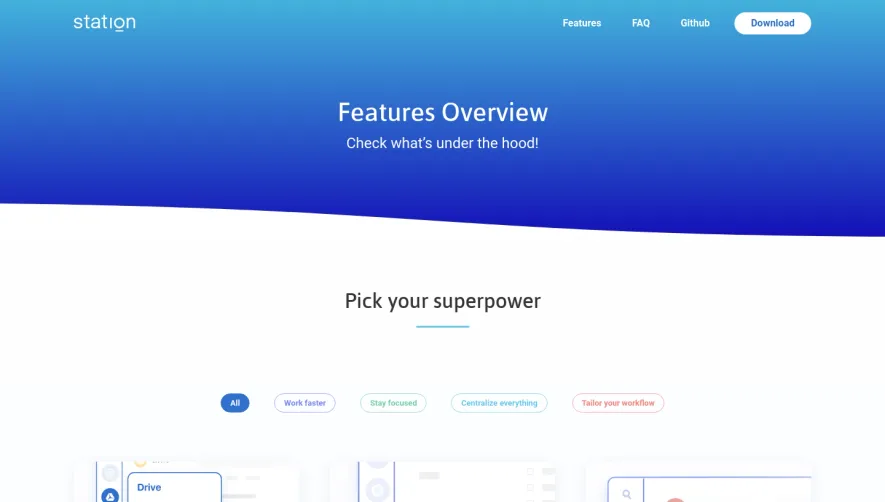

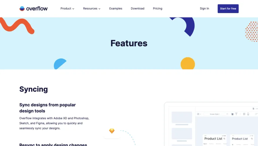

Upgrade to SaaSFrame Pro now to see similar examples.
Monthly
$18 /month
Billed $18 monthly
Browse all screens & flows
Filter and search screens & flows
Search text in screenshots
Access Figma files
Access mobile versions
Join now
Quarterly
$16 /month
Billed $48 quarterly
Browse all screens & flows
Filter and search screens & flows
Search text in screenshots
Access Figma files
Access mobile versions
Join now
Yearly
$15 /month
Billed $180 yearly
Browse all screens & flows
Filter and search screens & flows
Search text in screenshots
Access Figma files
Access mobile versions
Join now