Design with AI
Generate a new design based on this screen using your own content.
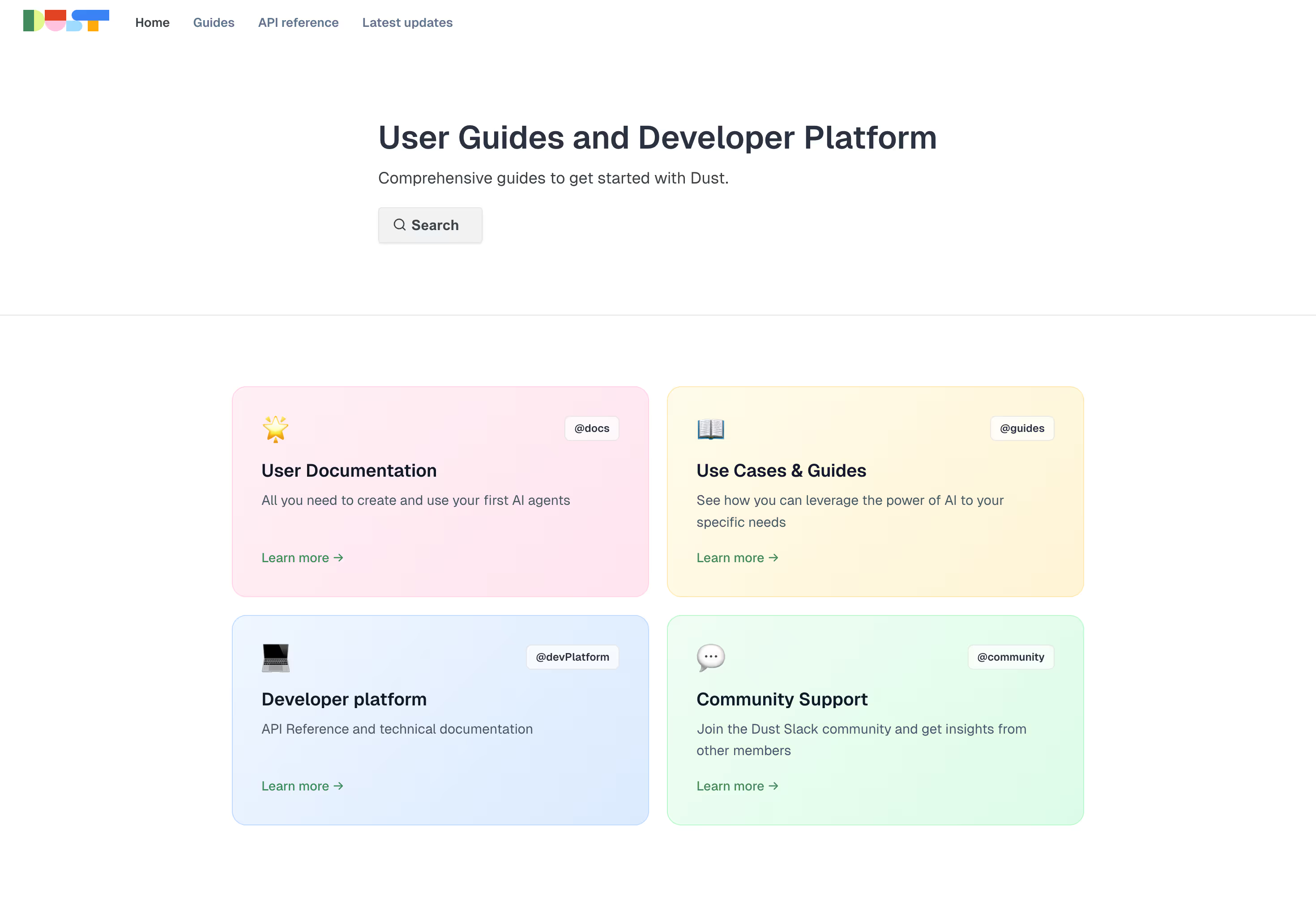
# Design from Reference: Dust Documentation
Create an original, high-fidelity visual design inspired by the reference. Prioritize composition, typography, colors, spacing, and component styling over technical implementation.
## Reference
- **Product:** Dust
- **Category:** Documentation
- **Screenshot:** https://cdn.prod.website-files.com/5e9dc792e1210c5325f7ebbc/696e0af7a82f0ac96aeed615_IWP8NdAsSBqinVtwFMchK-pp6JrQntJ5nLI0ODp81Ic.avif
Analyze the screenshot first. If inaccessible, request it rather than guessing.
## Content
{{content.instructions}}
{{content.data}}
Preserve essential messaging and factual accuracy. Adapt structure and copy length for visual balance; never invent product claims.
## Visual Design
### Overall aesthetic
- **Character:** Simple documentation landing page with bright white space and four softly colored resource cards.
### Page composition
- **Canvas:** 2940 × 2004 screenshot pixels; CSS estimates assume approximately 2× scale.
- **Structure:** Small logo/navigation at top; left-aligned title/search block within a centered region; horizontal rule; two-by-two resource grid below.
### Information hierarchy
- **Priority:** User-guide/developer-platform title, concise introduction and Search action lead into four distinct resource destinations.
### Typography
- **Family:** Neutral sans-serif; exact font is unverified.
- **Scale:** Estimated CSS title 34–36px bold, card headings 20px, body 16px and navigation/tag labels 12–14px.
### Colors & surfaces
- **Sampled palette:** White #FFFFFF; pink variants #FFECF3, #FFE8F1 and #FFEAF2; green #E5FDED and #E1FCEA.
- **Other surfaces:** Pale yellow and blue cards complement the pink/green pair; dark blue-gray text and green links remain consistent.
### Components
- **Resource cards:** Emoji-like icon upper left, small handle/tag upper right, bold title, short description and Learn more arrow link.
- **Geometry:** Estimated 16px card radius, 1px tinted borders, 32px padding and 20px grid gutters.
- **Search:** Small soft-gray rectangular button with magnifying-glass icon.
### Visual rhythm
- **Spacing:** Broad 72–96px CSS separation between hero and cards; generous internal card spacing makes each resource easy to identify.
### Responsive
- **Guidance:** Mobile is not shown. Stack resource cards, retain readable tags and make search easy to reach above the directory.
### Adaptation guidance
- **Transfer:** Keep the four-way resource taxonomy and pastel card differentiation. Adapt destinations and iconography to the target documentation ecosystem.
Use this context to reproduce the reference's visual language: layout, typography, colors, spacing, borders, radii, and distinctive elements. The screenshot takes priority if descriptions conflict.
## Direction
{{preferences.fidelityInstructions}}
## Output
{{output.instructions}}
Deliver a polished, cohesive design with precise alignment, hierarchy, and spacing. Produce the requested visual artifact, not just a description. If unsupported, explain the limitation.